My Role: Senior Staff UX/UI Designer
Team: Remote developers, Product Managers, Marketing, QA/Test Engineers
Timeline: August to October 2023, 2 months, 4 sprints
As a Senior UX/UI Designer at OrthoLogIQ, I redesigned the ‘Add Patient’ and ‘Edit Patient’ experiences to reduce cognitive load, improve accuracy, and streamline workflows for busy clinicians.
The original layout was cluttered, hard to navigate and time consuming…
I introduced a structured, step based flow for adding patients and a simplified tabbed layout for editing, making data entry faster, clearer and easier - even under time pressure.
Ultimately, Less time on admin means more time with patients.
Impact & Key Results
🕒 43% Time Reduction – Reduced clinician patient data entry time from 3 minutes to 1.7 minutes, helping clinicians complete entries more quickly, especially under time pressure.
✅ Fewer Data Entry Errors – Clearer UI and a structured step by step flow reduced common input mistakes and rework
👍 Higher Clinician Satisfaction – Clinicians found the platform easier to navigate and the summary confirmation step improved confidence before submission
♿ Improved Accessibility - WCAG compliant colour contrast, keyboard navigation, cognitive load reduction by design, and accessibility carried through to build via full component documentation.
Challenges
Healthcare professionals (HCPs), including surgeons and clinicians, face busy schedules, limited resources and staff, and high pressure environments. Within OrthoLogIQ, I identified several areas where information overload led to confusion and inefficiency.
The existing Add Patient screen crammed all fields into a three-column single-page layout, requiring excessive scrolling and making it easy to miss or mis-enter data under pressure. Clinicians reported cognitive overload and frustration. The Edit Patient screen replicated the same layout despite being a fundamentally different task: targeted correction, not guided data entry.
Key pain points identified (all contributing to cognitive overload and user errors):
Excessive scrolling and difficulty locating key details
A high risk of entry errors under time pressure
Poor accessibility across devices
A frustrating and inefficient workflow
My Role: Senior Staff UX/UI Designer
Team Composition: Remote Developers, Marketing, Product Managers and QA/Test Engineers.
Timeline: August - October 2023: approx. 2 months (4 Sprints)
What I Did
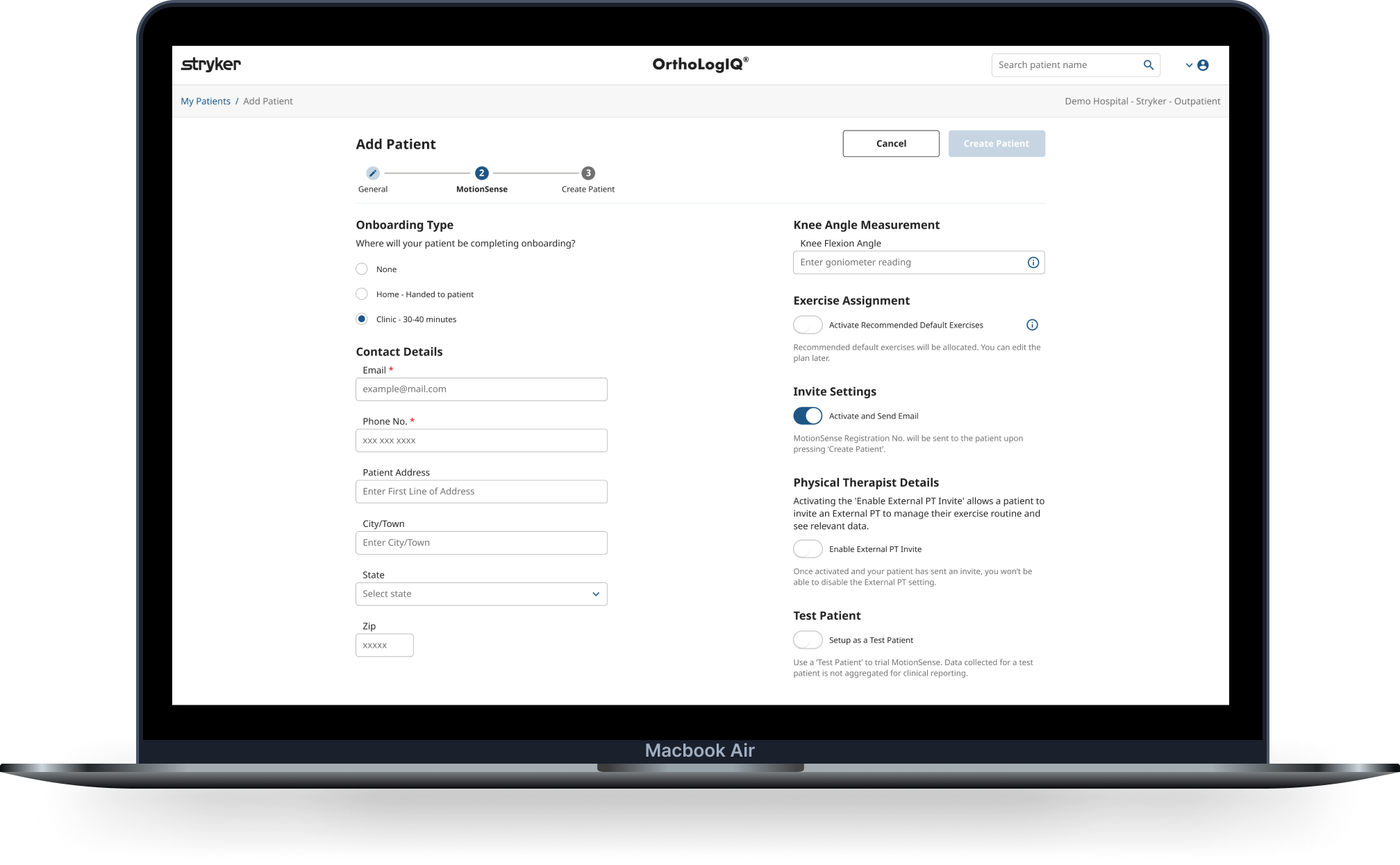
I audited the existing screens and ran live video observations (usability testing) to understand real workflow friction. I explored multiple layout structures (two-step, three-step, tabbed) and built interactive prototypes including unhappy paths to stress test the flows before development.
For Add Patient I introduced a three-step wizard: General, MotionSense setup, and a summary confirmation screen. The final step evolved from an existing success modal that was causing confusion, repurposed into a dedicated review stage that improved accuracy and confidence at the point of submission.
For Edit Patient I moved to a tabbed layout. Editing is a targeted task and doesn't benefit from guided sequencing. Tabs gave clinicians direct access to what they needed without forcing them through steps they didn't.
I aligned designs to Angular Material components early to reduce build complexity, documented all component states and interaction specs directly in Figma, defined custom Azure analytics events, and supported QA through to delivery.