Project Summary
Redesigned the Walmart Cold, Flu, and COVID Checker to enhance usability, reduce uncertainty, and drive engagement with Walmart’s health products.
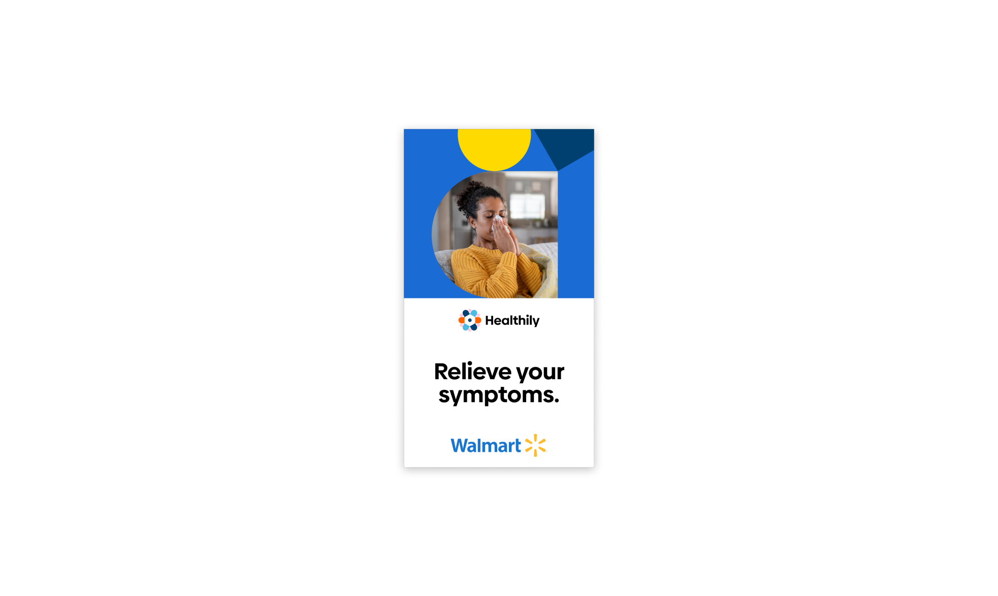
As one of my first projects at Healthily, I created a streamlined symptom checker for Walmart’s Medicine Cabinet, helping users quickly assess symptoms and find the right OTC medicine, driving increased sales.
Impact & Key Results
🚀 Successfully launched within Walmart’s ‘Medicine Cabinet’, reaching thousands of American users nationwide.
📈 Landing page conversion increased from ~10% to ~55% after A/B testing copy, hierarchy and layout.
🔻 Drop offs reduced by ~45%, following changes informed by exit survey insights - including adding an upfront time estimate to set clearer expectations and increase journey completion.
🧭 33% of exiting users cited CTA confusion, which was addressed through clearer microcopy and intent messaging to reduce hesitation and misclicks.
🛒 Increased engagement with Walmart’s OTC product recommendations, contributing to basket size growth and supporting Walmart’s wider Health & Wellness strategy.
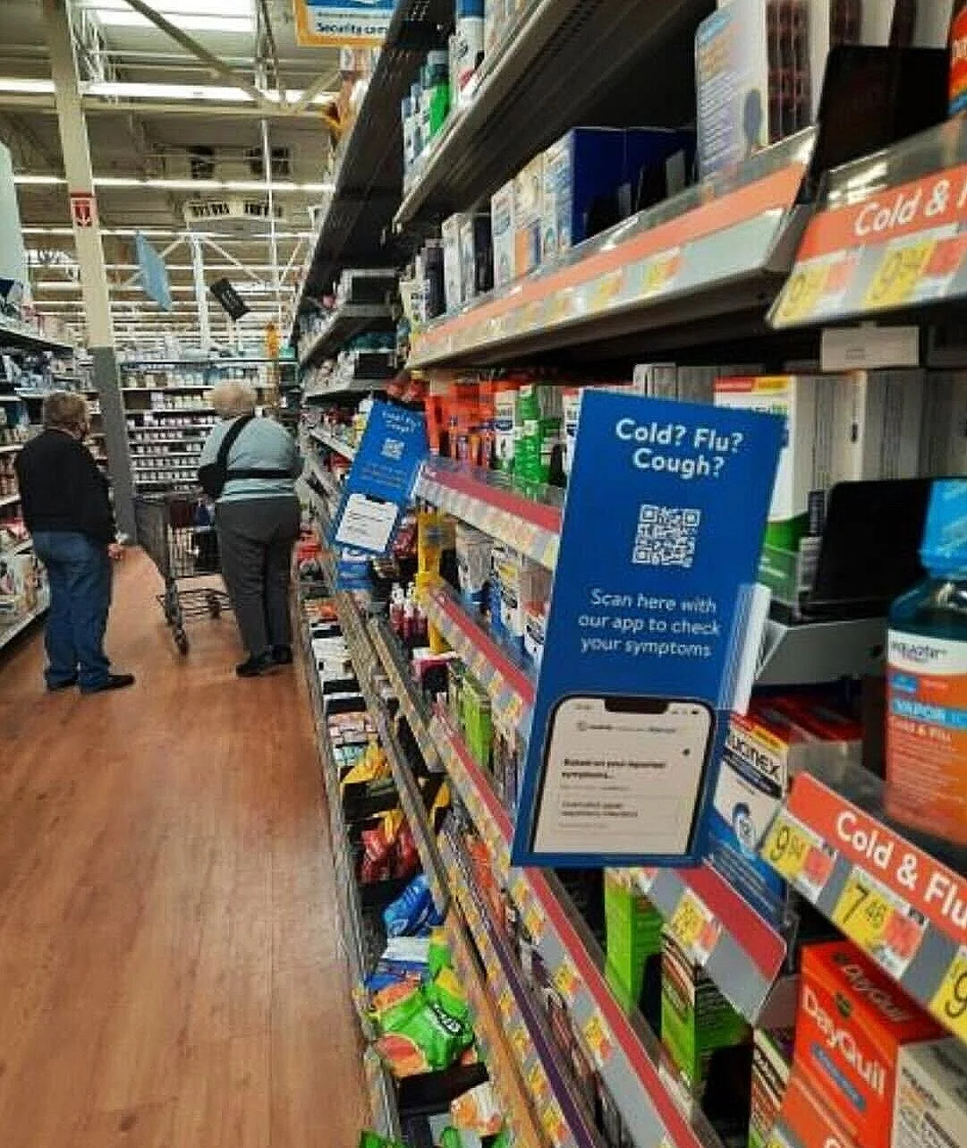
🔳 Supported in store promotion via QR codes, driving additional traffic and engagement with the checker experience.
🎯 Refined the post launch experience through ongoing A/B testing and exit-survey-led iteration.
⏳ Delivered the MVP in 3 months, aligning design, engineering, and data teams on a rapid delivery path.
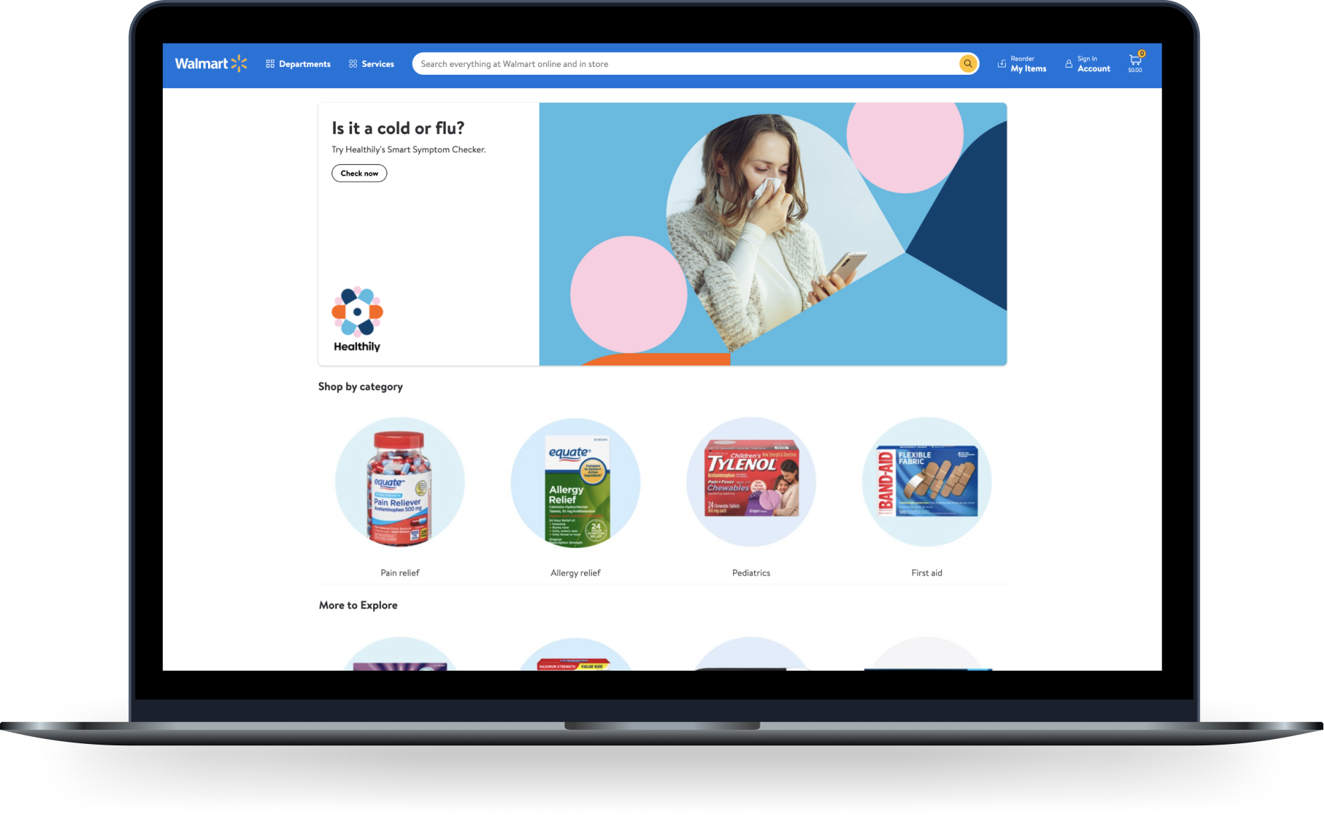
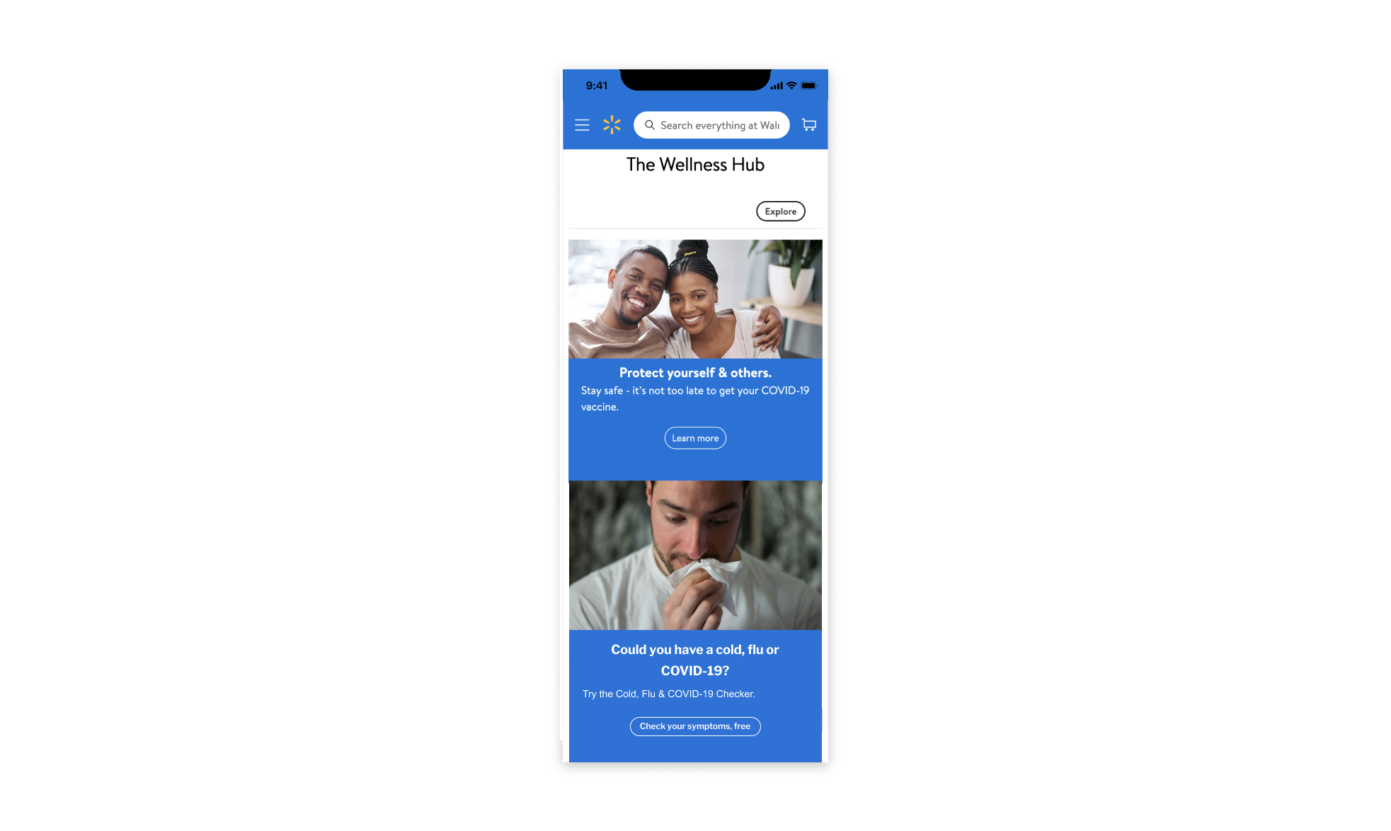
Walmarts online ‘Medicine Cabinet’
Challenges and Pain Points
🩺 Symptom confusion & decision fatigue:
Users struggled to differentiate between cold, flu, and COVID-19, leading to uncertainty when selecting the right OTC medicine. Many defaulted to a ‘worst-case’ self-diagnosis, increasing anxiety and hesitation in purchasing.
🛒 E-Commerce Underperformance:
Walmart’s online Medicine Cabinet lacked clear guidance, resulting in missed conversion opportunities. Users had decision fatigue, with too many medicine choices and no symptom-based recommendations.
🔍 Lack of symptom clarity:
Users needed reassurance about their symptoms and clear recommendations for self care or medical advice.
“As a Walmart shopper on Walmart.com, suffering from cold/flu/covid/respiratory symptoms, I want to check my symptoms easily, so that I can purchase the right products for me.”
Project Goals:
✅ Provide a fast, trusted tool that helps users assess symptoms with confidence.
✅ Clarify cold, flu, and COVID-19 differences to reduce uncertainty and decision fatigue.
✅ Support Walmart’s business goals by increasing basket sizes and health product sales.
✅ Improve user engagement by streamlining the journey and increasing completion rates.

Project Objectives
The primary goal of the Walmart Cold, Flu, and COVID Checker was to help users confidently assess symptoms and select the right OTC medicine while driving health product sales for Walmart.
The key objectives included:
✅ Improve symptom clarity
Help users differentiate between cold, flu, and COVID-19 to reduce uncertainty and decision fatigue.
✅ Increase conversions
Optimise the symptom checker flow to boost engagement and drive purchases through Walmart’s Medicine Cabinet.
✅ Enhance trust and usability
Deliver medically verified recommendations, ensuring users feel confident in their choices.
✅ Support Walmart’s e-commerce growth
Increase OTC sales by improving basket sizes and conversion rates.
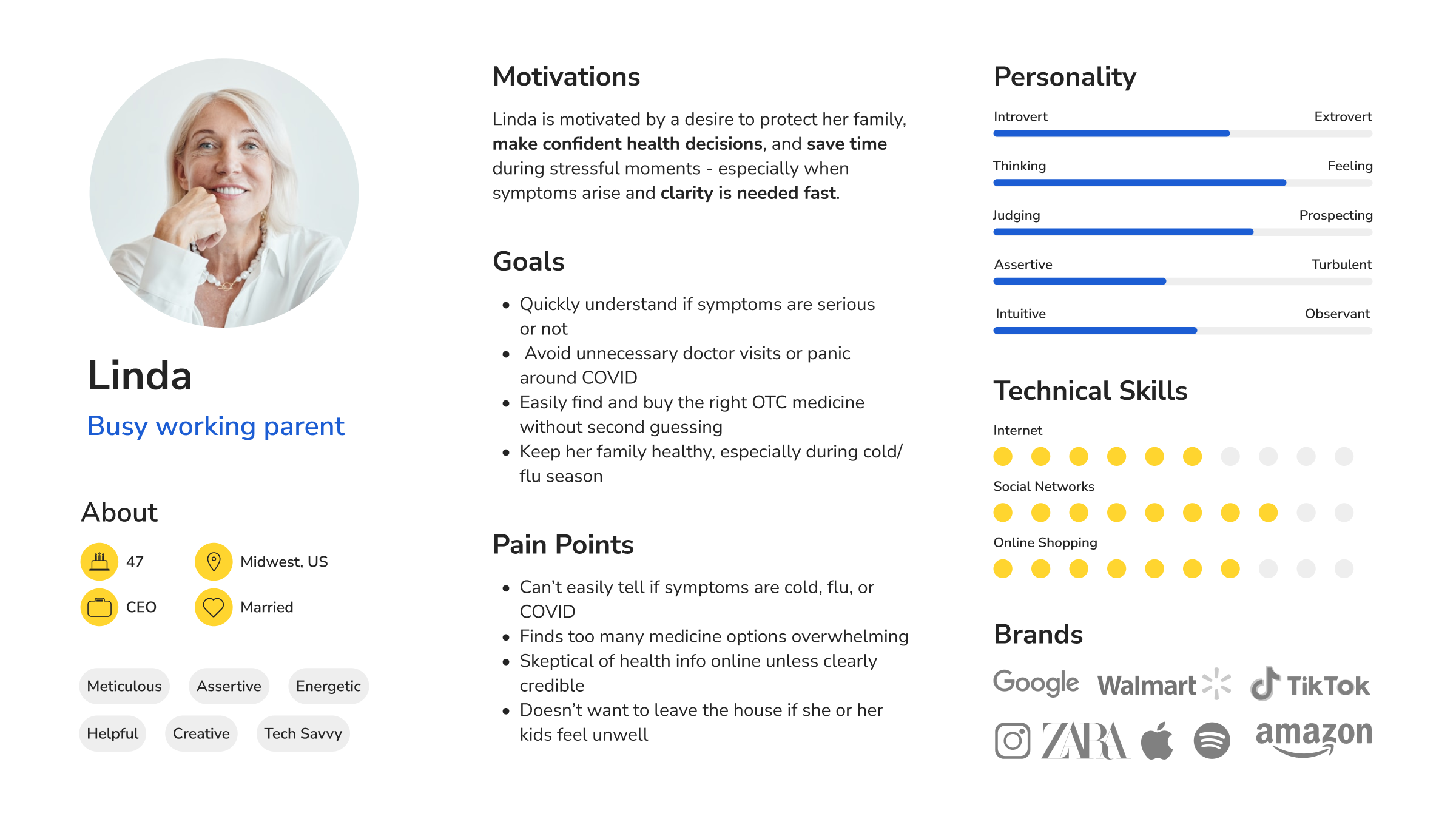
Target Audience:
Primarily females aged 35-55 and 55+, representing 70% of Walmart shoppers.
The Project Experience
My responsibilities throughout this project:
✔ Stakeholder Collaboration: Worked closely with Product Owners, Medical Team, and User Researchers to align on the user journey.
✔ Understanding Context: Quickly familiarised myself with the project, which was already underway, to ensure a smooth transition.
✔ Reviewing & Refining Proposals: Assessed Walmart’s initial proposals, providing feedback to address UX concerns.
✔ Design & Iteration: Created user flows, prototypes, and high-fidelity designs, refining based on feedback.
✔ Responsive Design: Developed both mobile and desktop versions for a seamless user experience.
✔ Cross-Functional Collaboration: Maintained continuous communication with Developers, Researchers, and the Medical Team to align efforts.
✔ User Feedback & Testing: Collected insights from usability testing and contributed to A/B testing to validate design decisions.
✔ Design Refinements: Continuously improved the UX based on testing, data insights, and evolving requirements.
✔ Developer & QA Coordination: Ensured smooth design handoff and collaborated with QA to maintain accuracy.
✔ Data Driven Improvements: Worked alongside Data Analysts to assess impact and optimise the product.
Measuring Success (KPIs & Business Impact)
Success was measured against both user outcomes and Walmart’s commercial health goals, ensuring the experience reduced friction while supporting downstream product engagement.
📈 Increase in landing-page and journey entry conversion
→ Ensured more users successfully entered the symptom checker, maximising the reach and value of Walmart’s health content.
🔻 Reduction in drop-offs across the checker journey
→ Reduced wasted traffic and improved completion, increasing the likelihood of users reaching relevant OTC recommendations.
🔗 Improved click through rates (CTR)
→ Validated clarity of intent and reduced misnavigation, particularly around transitioning from Walmart to the checker experience.
🛒 Increased engagement with OTC product recommendations
→ Supported Walmart’s Health & Wellness strategy by guiding users toward appropriate products and contributing to basket size growth.
Design Process and Strategy
1. Research & Alignment
I collaborated with Product Owners, UX Researchers, and the Medical Team to analyse initial user flows and align on key objectives.
Early research and usability testing highlighted four primary user pain points, which shaped our design strategy:
🚩 Symptom confusion
Users struggled to differentiate between cold, flu, and COVID-19, leading to uncertainty about which OTC products to purchase.
🚩 Unclear navigation
The symptom checker’s flow was unintuitive, causing drop-offs and lower completion rates.
🚩 Limited trust in recommendations
Users expressed concerns about whether the results and product suggestions were medically reliable.
🚩 Low engagement & conversions
The existing journey didn’t effectively guide users to relevant products, impacting both user experience and business performance.
Validating the Paint Points:
To ensure the solution directly addressed user needs, I validated these issues using a mix of usability research, competitor benchmarking, and internal data:
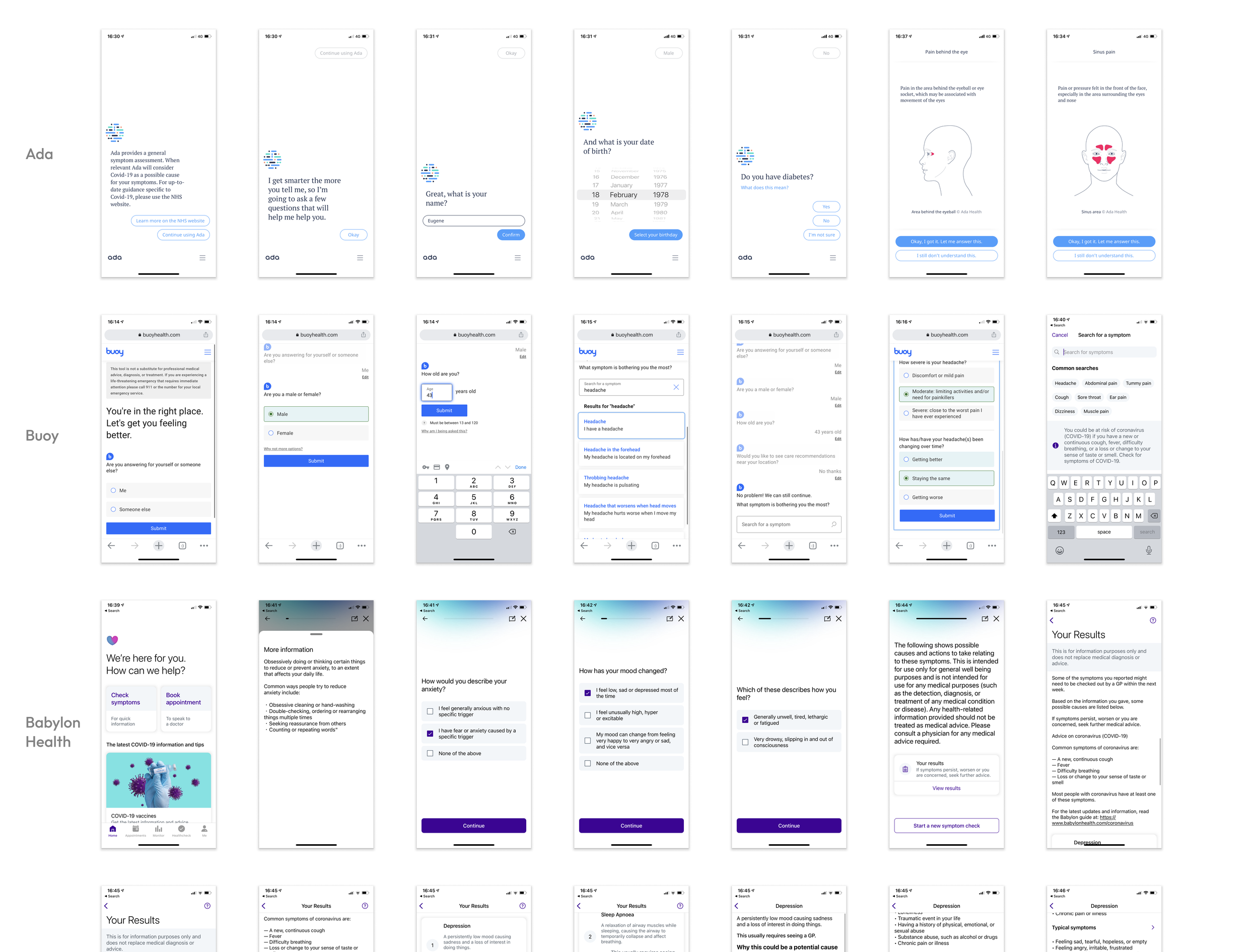
🔎 Heuristic review of competitor symptom checkers
Analysed usability, complexity, and visual clarity across top-performing tools
📞 Customer support data analysis
Partnered with Walmart’s team to identify common complaints around symptom confusion and product selection
📋 Survey insights
Reviewed research findings highlighting that decision fatigue and uncertainty were key blockers to purchase
Competitor Insights that shaped the strategy
Benchmarking helped surface best practices we could adapt to solve user problems:
✅ Step by step guidance & progress indicators
Improved clarity and reduced cognitive overload
✅ Trust signals & medical credibility
Highlighted verified sources to increase user confidence
✅ Simplified product recommendations
Streamlined filtering so users could quickly find relevant OTC medicines without friction
Collaborating on the Proposed User Journey:
When I joined, initial flows had been created by the Product Owner and Medical Team but lacked UX input. I took ownership of reviewing and refining the journey, ensuring a user centred approach.
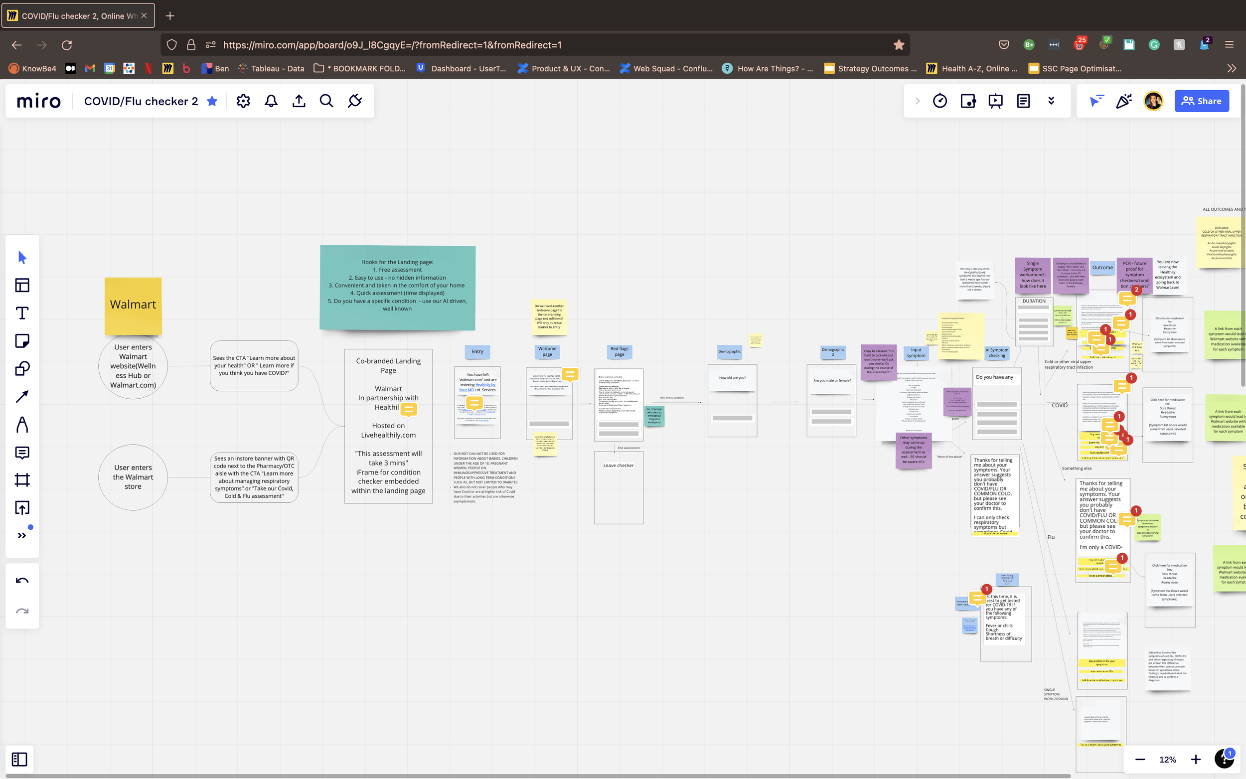
Refining the User Journey:
The initial flow guided users through these steps:
1️⃣ Enter Walmart’s Medicine Cabinet
2️⃣ Click the Symptom Checker banner
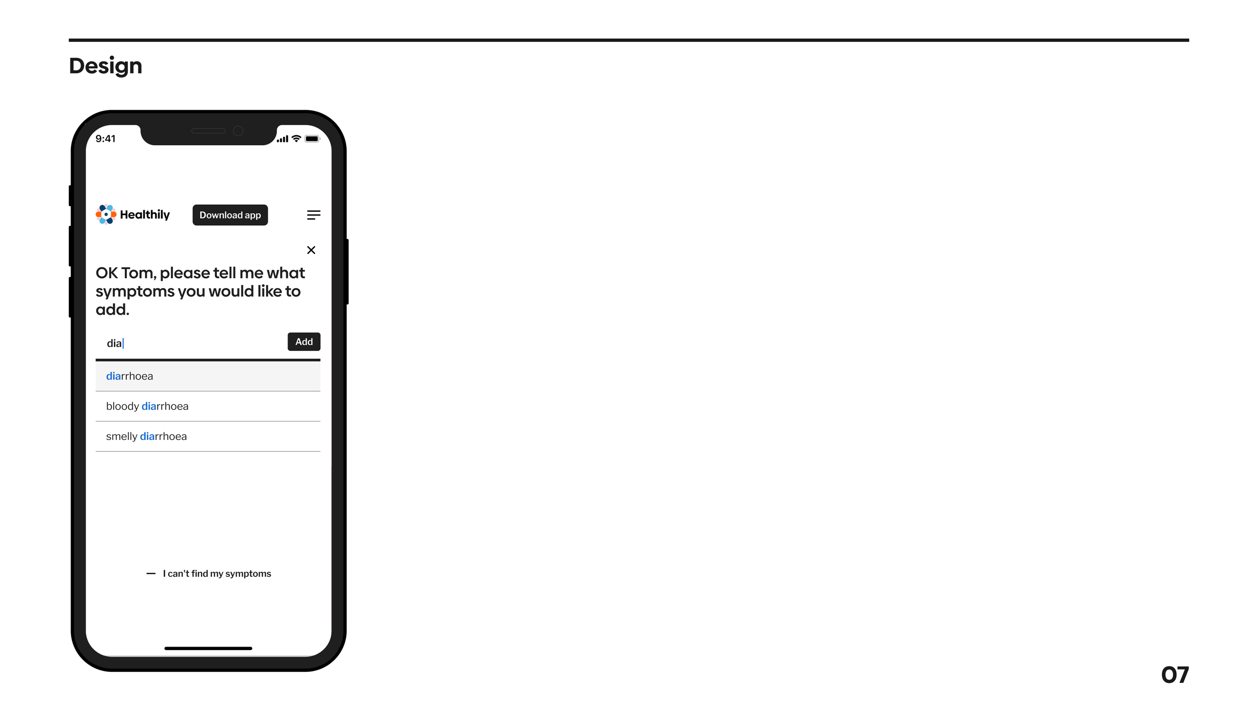
3️⃣ Select and enter symptoms
4️⃣ Receive a condition report based on inputs
5️⃣ Choose to purchase recommended medicine or read medically verified articles
I collaborated with UX Researchers to analyse existing insights, conducted competitor research, and developed a user persona to align our focus. I then refined the stakeholder proposed journey, presenting and iterating based on stakeholder and user feedback.
User Persona
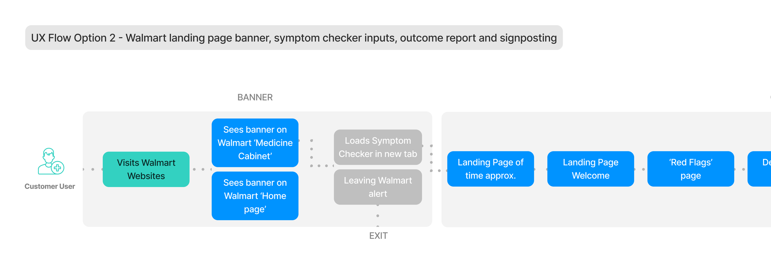
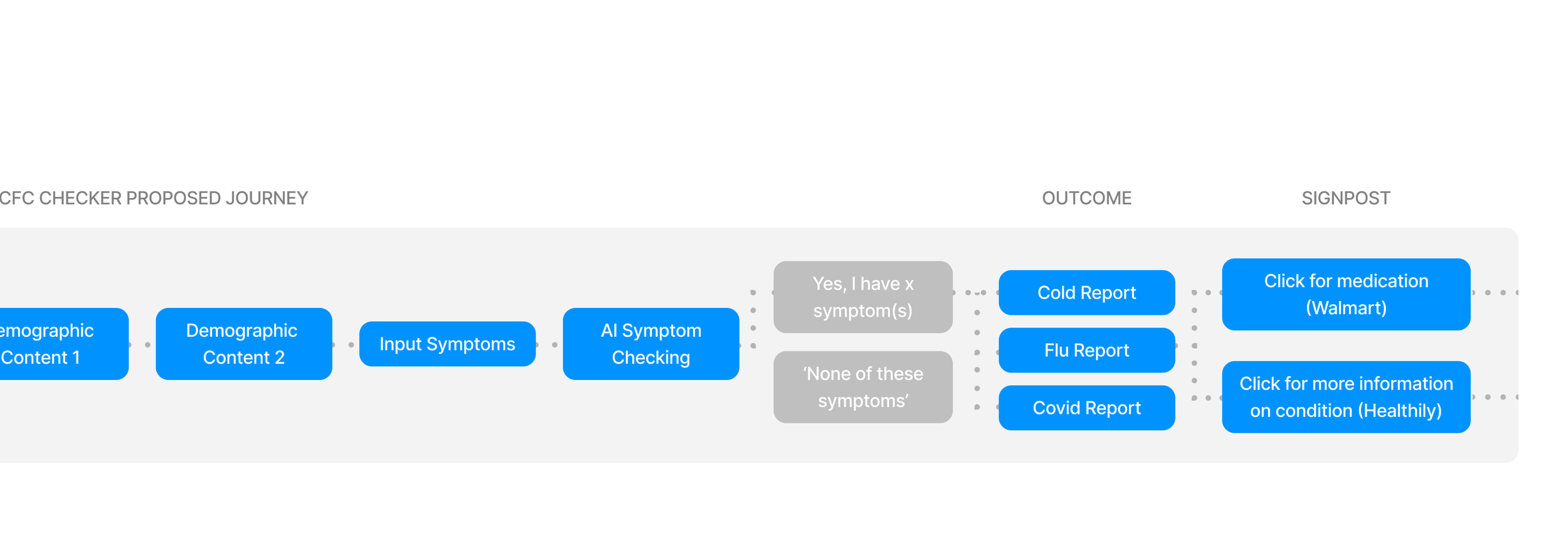
Newly Proposed Flow
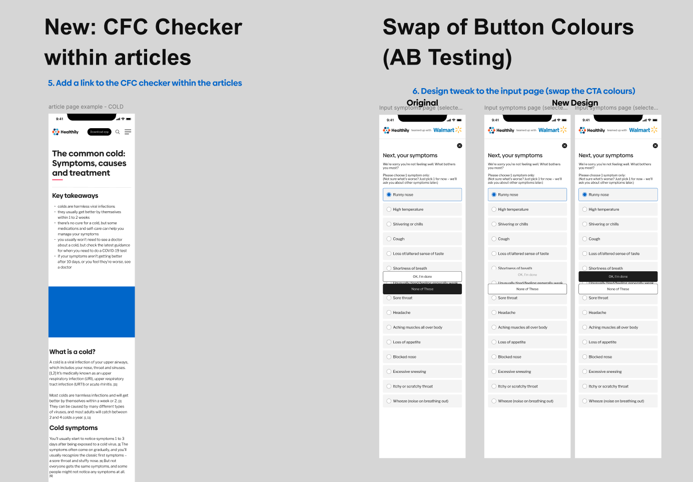
2. Concept Development & Wireframing
After defining the user persona, analysing competitors, and refining the symptom checker flow, I developed mid fidelity wireframes to structure the Symptom Checker. Given the tight timeline, these wireframes were more advanced early on, enabling rapid decision making and smoother developer collaboration.
Since core components had already been built, I worked closely with engineers to streamline feasibility checks and implementation.
Initial designs - mid-fidelity wireframes link
Wireframing & Early Prototyping
Developed mid-fidelity wireframes to define interactions and user flows.
Ensured early developer involvement to assess feasibility and prevent design bottlenecks.
Facilitated stakeholder reviews, aligning Product Owners, Researchers, and Medical Teams on the experience.
🎨 UI Design & High-Fidelity Mockups
After the wireframes for the initial MVP were approved, I created high-fidelity designs for both mobile and desktop, ensuring a seamless and responsive experience.
Key screens included:
📢 Entry Points & Navigation:
Walmart ‘Medicine Cabinet’ banner ad (entry to the Symptom Checker).
‘You’re leaving Walmart’ alert modal for a clear transition.
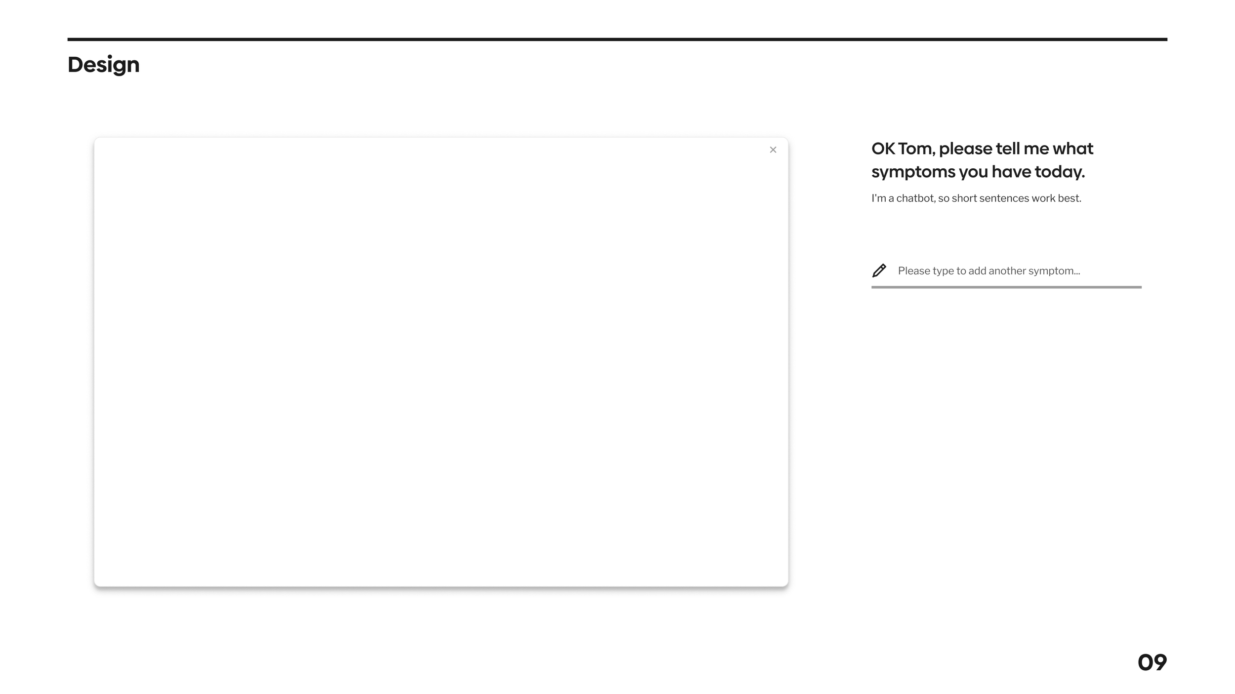
📝 Symptom Checker & Assessment:
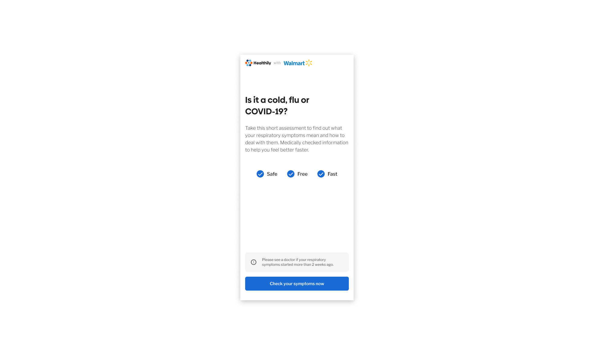
Landing page redesign (merged ‘time taken’ and ‘introduction’ screens for a streamlined start).
Privacy & legal pages to ensure compliance.
Red Flags screen to identify critical symptoms requiring emergency attention (911).
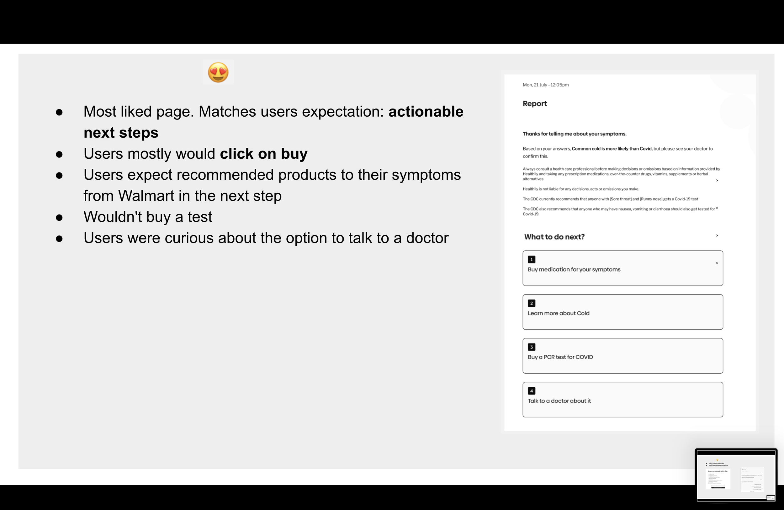
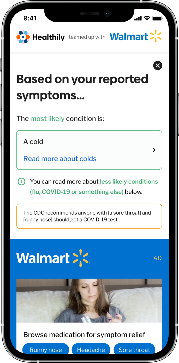
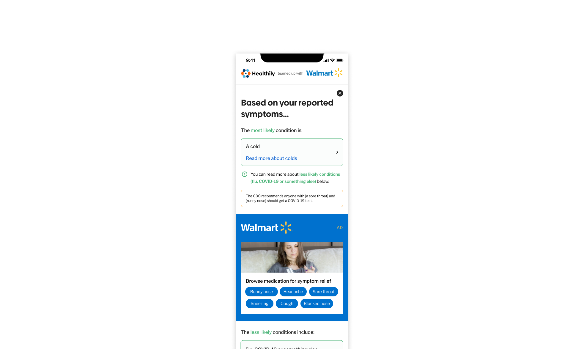
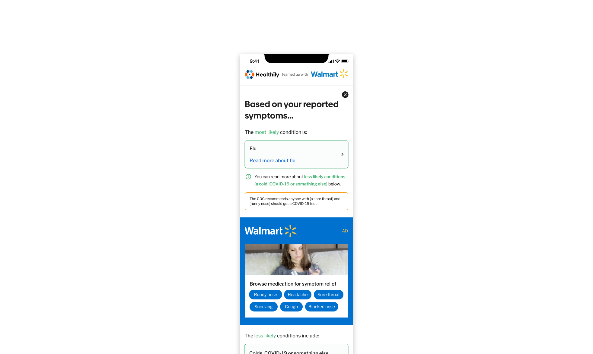
🔍 Diagnosis & Outcome Pages:
Symptom selection screen (multiple selection).
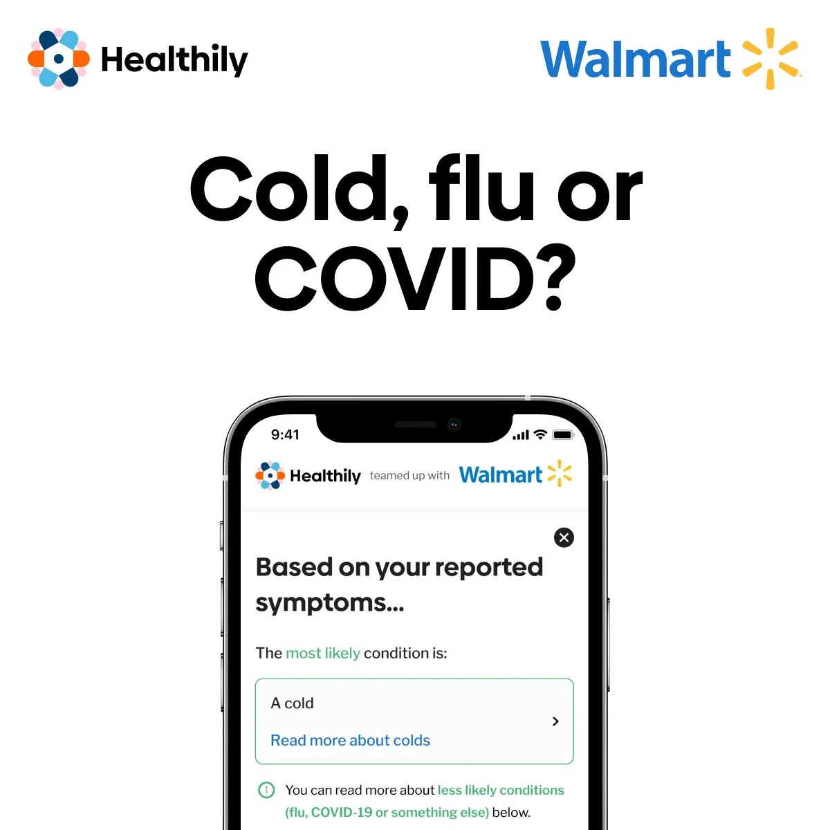
Condition outcome pages:
Cold, Flu, or COVID-19 report pages with personalised medical guidance.
End of journey page for users without matching symptoms.
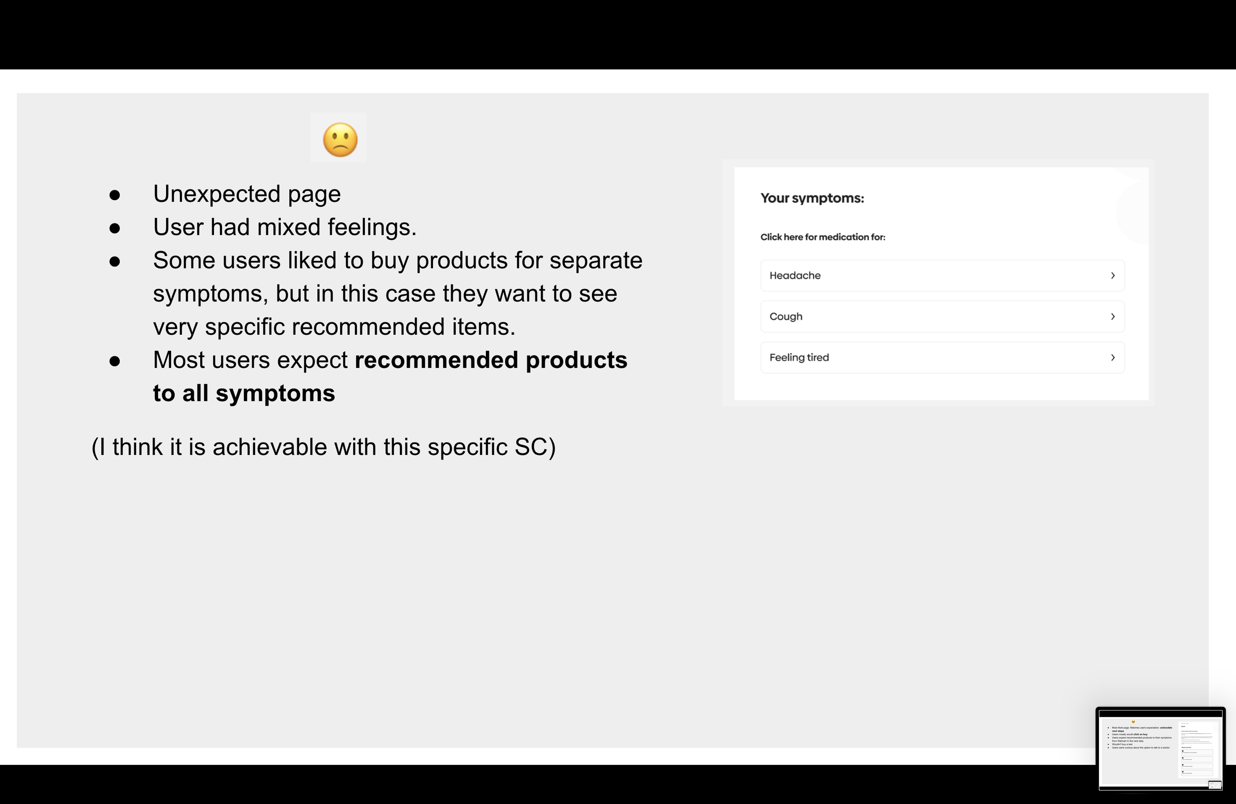
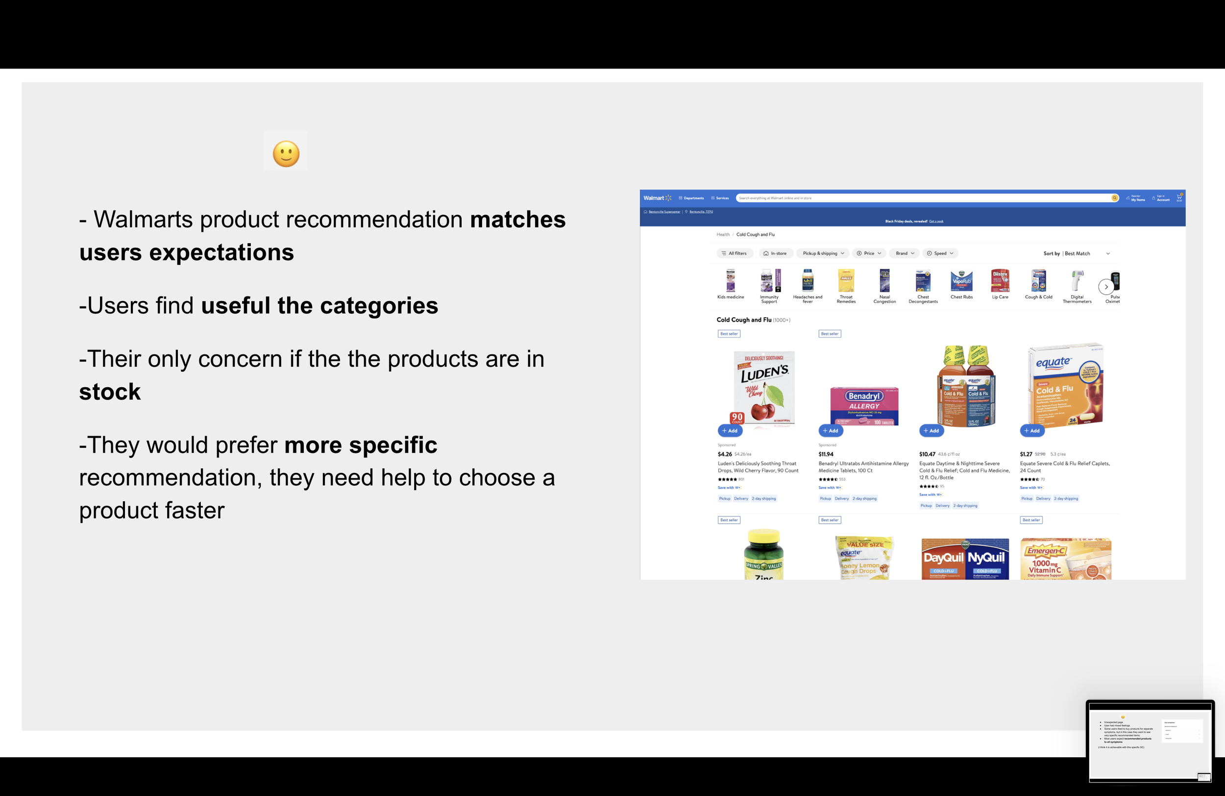
🛒 Product Recommendations & Purchase Flow:
Influencing factors page to refine symptom assessment.
AI-powered symptom checking page to provide data-driven health insights.
Product recommendations linked to Walmart’s OTC medicines for immediate purchase.
🛠 Additional UI Components Designed
Beyond the core journey, I also designed additional UI elements to enhance usability and trust, including:
Demographic input pages (age, gender).
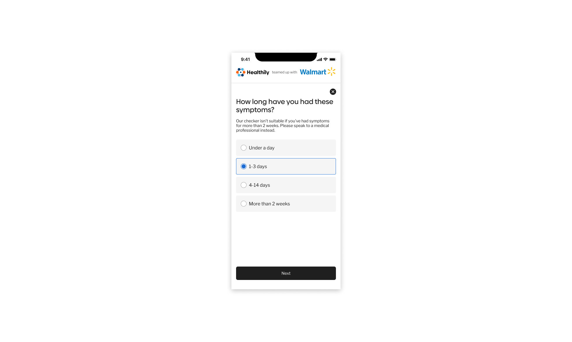
Duration of symptoms page to refine accuracy.
Legal & privacy screens for compliance.
‘You’re leaving Healthily’ alert modal for transparency.
🔄 Iterative Refinements & Collaboration
Throughout this phase, I worked closely with Developers, Product Owners, and UX Researchers to continuously refine the experience based on feasibility checks and feedback. Regular design reviews helped optimise usability before prototyping and user testing.
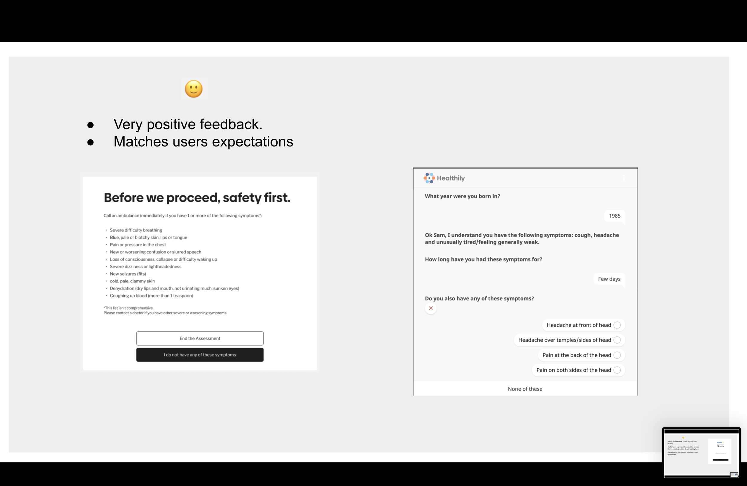
3. Prototyping & User Testing
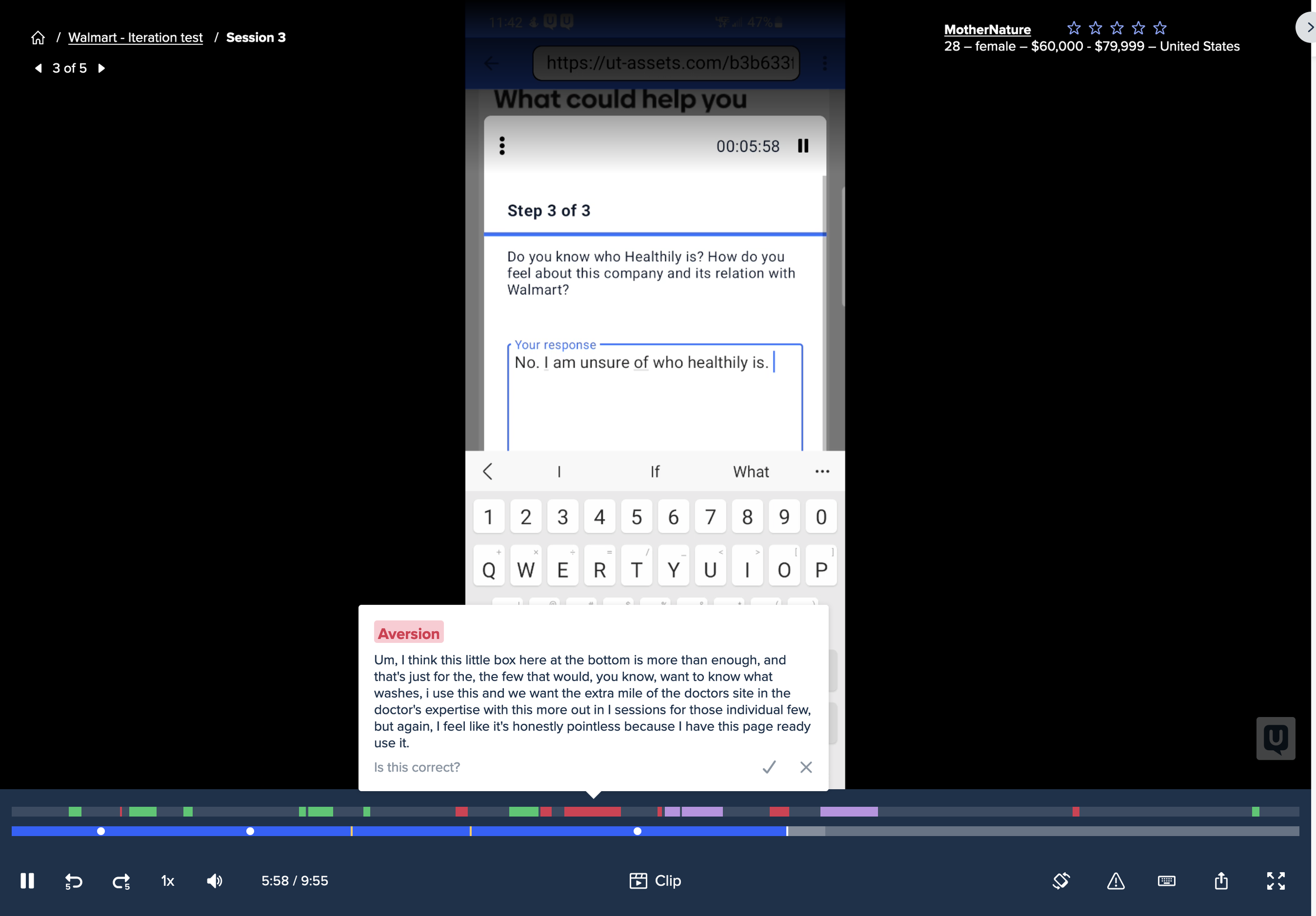
Usertesting.com - User feedback from US audience to gain qualitative feedback.
Throughout the project, we continuously reviewed the initial wireframes and prototypes.
Once prototypes were approved by stakeholders, we conducted unmoderated usability tests via Usertesting.com, targeting a US audience to gather qualitative feedback.
🔍 Key Focus Areas:
User feedback was collected to assess:
✔ Overall usability & clarity of the symptom checker flow.
✔ Ease of understanding of copy and content.
✔ Perceived helpfulness of the tool in symptom assessment.
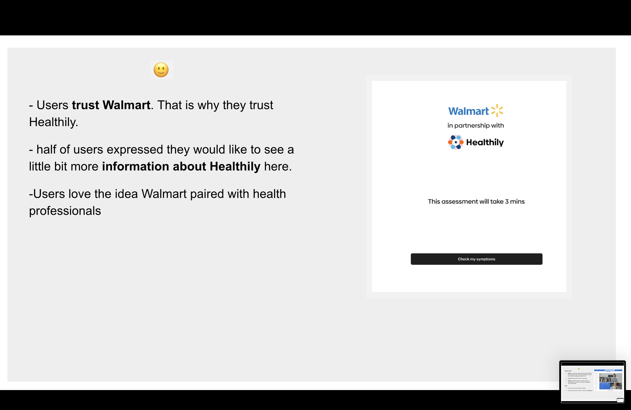
✔ User trust in Healthily’s partnership with Walmart.
A key insight from user testing showed 45% of users hesitated due to unclear symptom descriptions, leading to a revision of copy for better clarity.
📊 Insights & Refinements:
User feedback revealed key areas for improvement:
🚩 Information clarity – Some users struggled with medical terminology and symptom explanations.
🚩 Navigation efficiency – Certain steps felt longer than expected, leading to drop off risks.
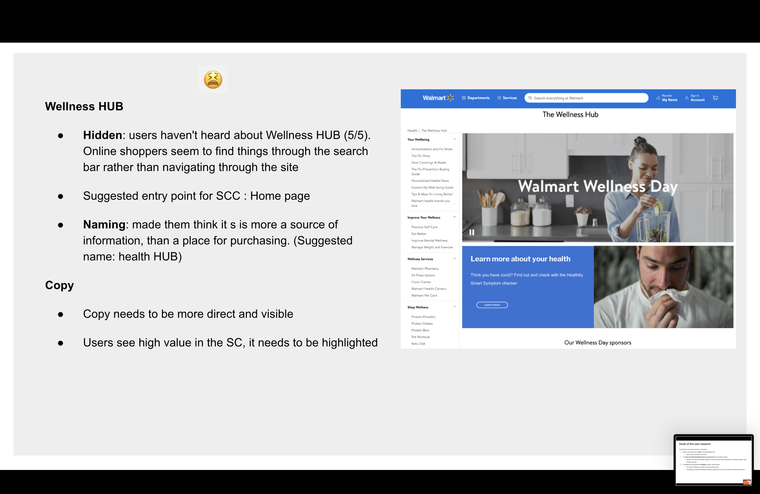
🚩 Trust in recommendations – Users were unsure about who was providing the medical guidance, impacting confidence in symptom outcomes.
To address these findings, I refined:
✔ Copy and content clarity to improve understanding.
✔ Navigation flow by reducing unnecessary steps and simplifying interactions.
✔ Trust signals by making Healthily’s medical verification more prominent.
🛠 Iterative Design Improvements
Using data from user testing, I implemented design updates to enhance usability, trust, and engagement before development. These refinements ensured that the final experience aligned with both user needs and business objectives.
Designing High-Fidelity Prototypes:
With the final designs in place, I created interactive prototypes in Figma and presented them to stakeholders for final review and approval.
By closely collaborating with the Product Manager, we maintained alignment on MVP designs post testing… refining the experience based on insights and ensuring a shared vision for the project’s direction.
4. Dev Handoff and Collaboration
With final designs in place, I created interactive prototypes in Figma and presented them to stakeholders for review and approval. By collaborating closely with the Product Manager, we ensured continuous alignment on the MVP post-testing, refining based on insights to maintain a shared vision.
🛠 Early Developer Involvement
✔ Shared mid-fidelity wireframes and prototypes early to assess feasibility and prevent design bottlenecks.
✔ Addressed potential technical constraints before finalising high-fidelity designs.
🔄🤝 Design Reviews & QA Testing - Transparency & Collaboration
✔ Conducted regular cross-functional reviews to ensure seamless API integration, UI responsiveness, and overall functionality.
✔ Maintained clear communication with engineers, resolving roadblocks efficiently and ensuring alignment between design and development.
✔ Collaborated closely with QA teams to validate accuracy, ensuring that the final implementation adhered to design specifications.
📜 Documentation & Specs
✔ Provided detailed Figma specs, including interaction behaviours and component guidelines, minimising ambiguity for developers.
✔ Iterated post-launch based on QA testing and usability feedback, refining UI details and optimising the user experience.
Outcomes and Impact
Impact & Key Results
🚀 Successfully launched within Walmart’s ‘Medicine Cabinet’, reaching thousands of American users nationwide.
📈 Landing page conversion increased from ~10% to ~55% after A/B testing copy, hierarchy and layout.
🔻 Drop offs reduced by ~45%, following changes informed by exit survey insights - including adding an upfront time estimate to set clearer expectations and increase journey completion.
🧭 33% of exiting users cited CTA confusion, which was addressed through clearer microcopy and intent messaging to reduce hesitation and misclicks.
🛒 Increased engagement with Walmart’s OTC product recommendations, contributing to basket size growth and supporting Walmart’s wider Health & Wellness strategy.
🔳 Supported in store promotion via QR codes, driving additional traffic and engagement with the checker experience.
🎯 Refined the post launch experience through ongoing A/B testing and exit-survey-led iteration.
⏳ Delivered the MVP in 3 months, aligning design, engineering, and data teams on a rapid delivery path.
The Walmart Cold, Flu and Covid Checker also provided:
✔ Medically verified self-care advice.
✔ Clear differentiation between cold, flu, and COVID-19 symptoms.
Live product on Walmarts Medicine Cabinet (US only*)
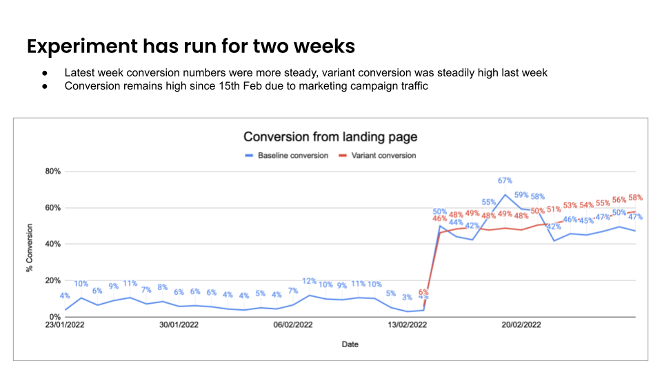
By December 2021, Walmart’s Cold, Flu, and COVID Checker launched successfully, increasing landing page conversion from ~10% to ~55% and contributing to higher basket sizes, aligning with Walmart’s health sales goals.
Post-launch, I worked with Research on data analysis and A/B testing, refining the landing page to boost engagement and reduce drop-offs.
To note: Although exact sales figures weren’t disclosed, Walmart confirmed the tool positively impacted basket sizes and enhanced purchase confidence.
Post-MVP Optimisations
After launch, the data team and I identified drop offs on the landing page, uncovering key pain points and opportunities for improvement.
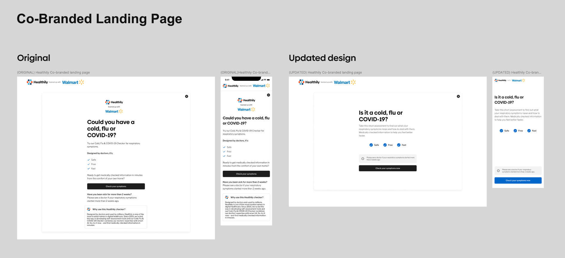
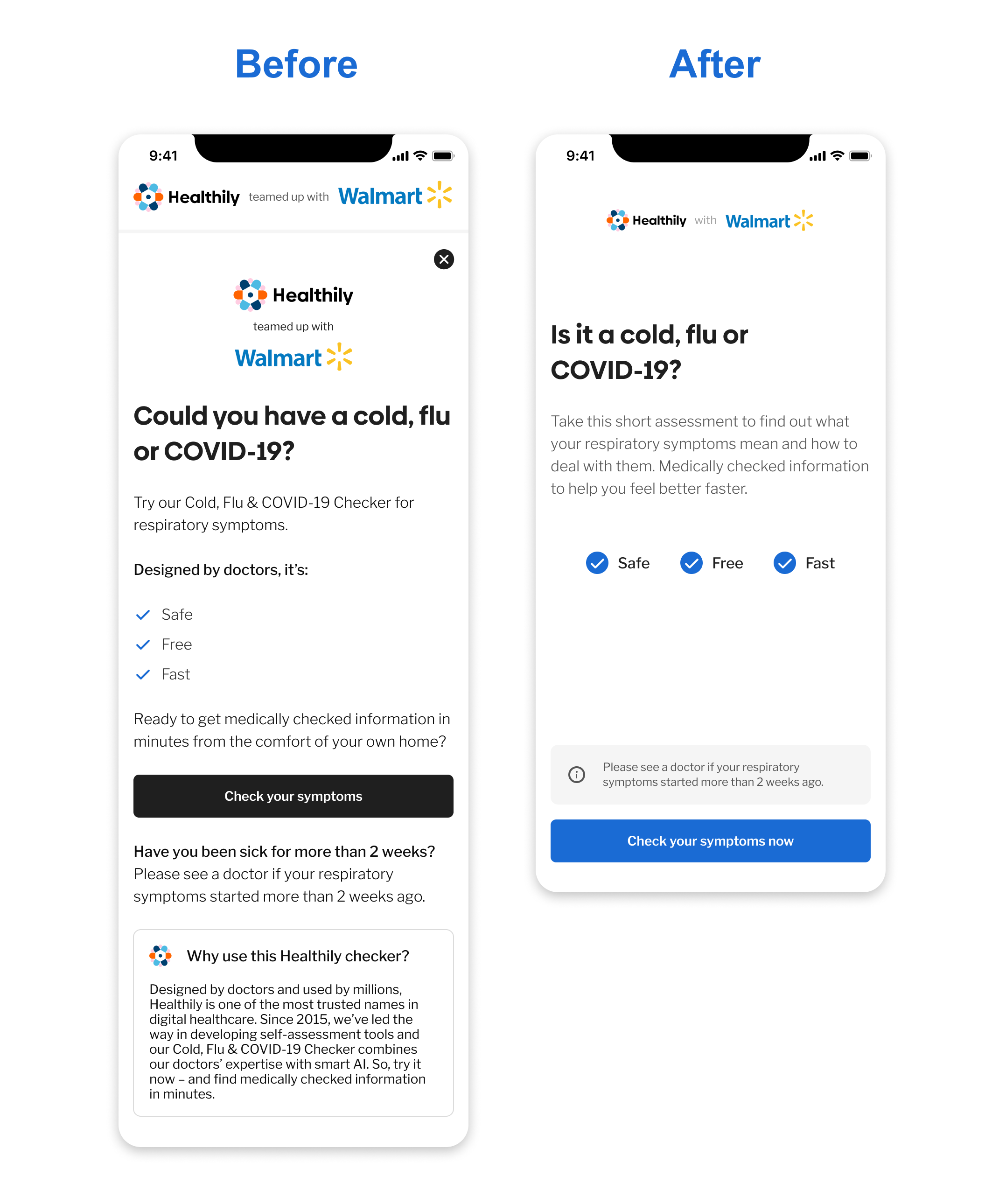
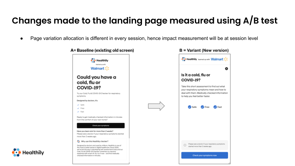
A/B Testing Insights (Landing Page Optimisation)
Tested a new landing page (Variant B) against the existing page (Baseline A).
Key changes:
✔ Simplified copy → Shorter, clearer messaging.
✔ CTA colour changed to blue → Increased visibility and engagement.
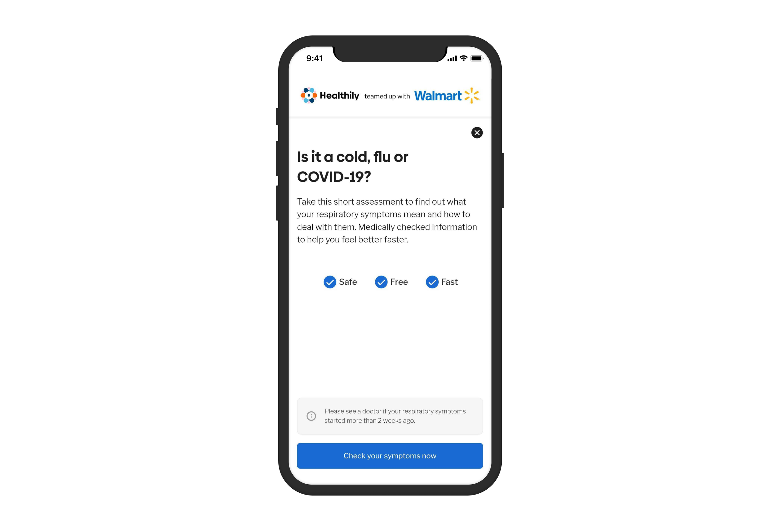
✔ Headline refined → Clearer framing: “Is it a cold, flu, or COVID-19?”
✔ Repositioned “Safe, Free, Fast” and enhanced icons → Improved visual clarity.
✔ Reduced cognitive load → Streamlined text and hierarchy.
A/B Test Results (Performance Data)
✔ Variant B significantly improved conversion rates compared to Baseline A.
✔ Conversion increased from ~10% to 55%.
✔ Sustained performance uplift post launch, likely due to the combination of marketing efforts and improved landing page clarity.
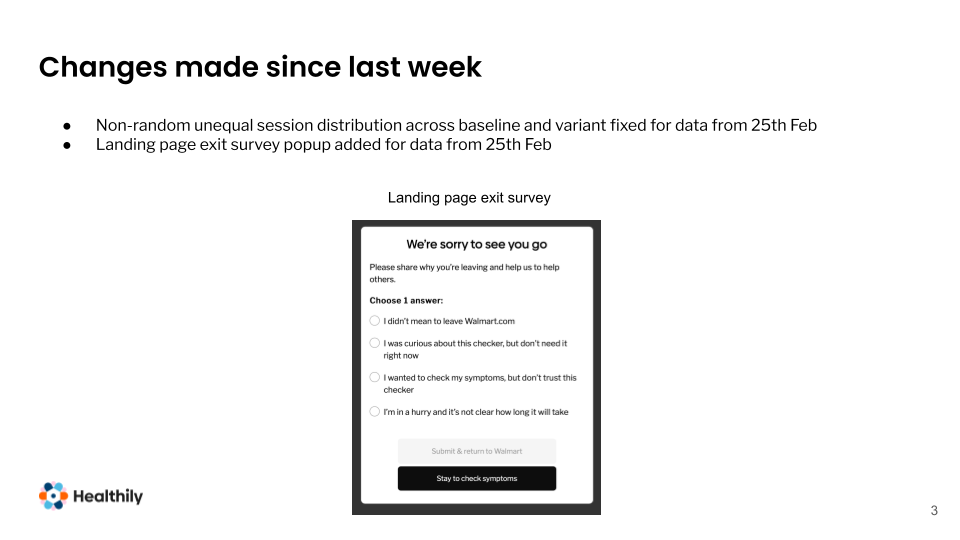
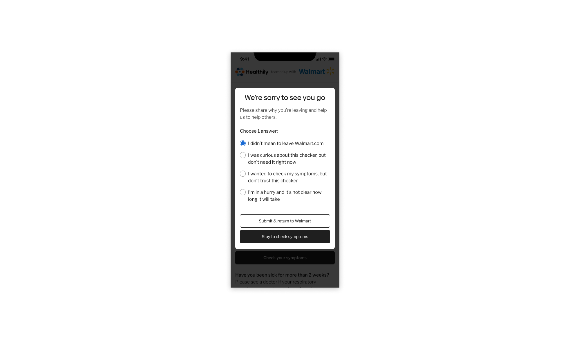
Implementing an Exit Modal to Gather User Feedback
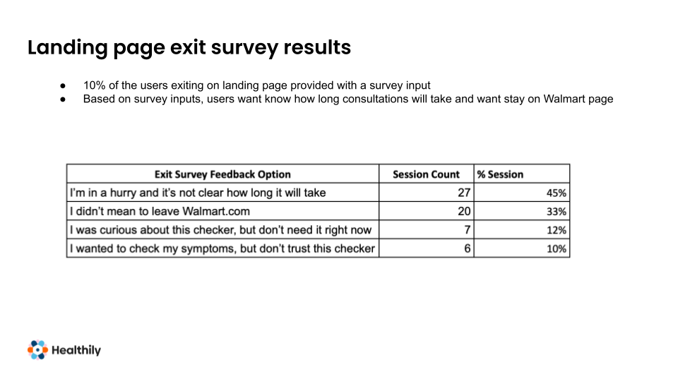
To understand why some users exited the symptom checker, we introduced an Exit Survey, targeting 10% of users who left the landing page.
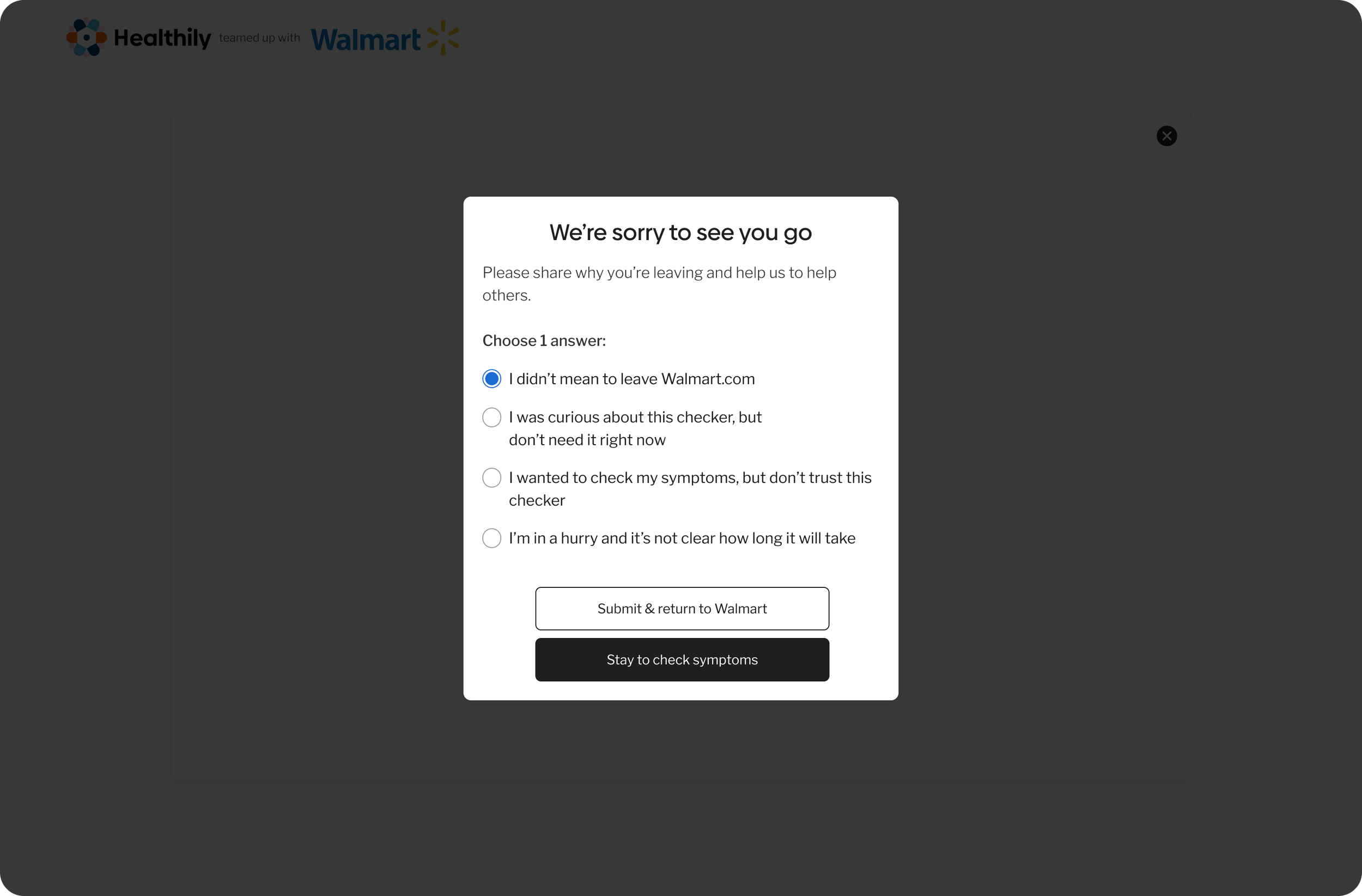
Exit Survey Insights - Key Findings:
🚩 Unclear time expectations → 45% of users selected:
💡 “I’m in a hurry and it’s not clear how long it will take.”
Design rationale: 45% of exiting users cited unclear time expectations, indicating uncertainty about journey length. To address this, we shortened steps where possible and added an upfront time estimate to set clearer expectations.
✔ Solution: Added an estimated completion time to reassure users upfront.
🚩 Confusion about leaving Walmart → 33% of users selected:
💡 “I didn’t mean to leave Walmart.com.”
Design rationale:A significant proportion of users misinterpreted the CTA, indicating unclear intent and concern about leaving the Walmart environment.
✔ Solution: Updated CTA messaging to clearly indicate that users were transitioning to an external tool.
🚩 Low engagement/lack of urgency → 12% of users selected:
💡 “I was curious about this checker but don’t need it right now.”
Design rationale: Some users lacked immediate intent, highlighting an opportunity beyond the core journey rather than a usability failure.
✔ Solution: No immediate fix, but this highlights a potential remarketing opportunity.
🚩 Lack of trust in the tool → 10% of users selected:
💡 “I wanted to check my symptoms but don’t trust this checker.”
Design rationale: Trust concerns indicated a need for stronger credibility cues and clearer reassurance around medical validation.
✔ Solution: Strengthened trust signals by making the Walmart partnership and medical verification more prominent.
Impact of These Changes
✅ Following these updates, analytics showed a significant increase in users continuing beyond the landing page and completing the Symptom Checker.
✅ Clearer time expectations helped reduce hesitation and improve engagement, addressing the most common exit reason identified.
✅ Improved trust signals helped reinforce user confidence, particularly for users concerned about credibility and medical verification.
Launch and Follow-Up
After a great deal of effort, collaboration, and multiple design iterations, the product was successfully launched in Walmart’s ‘Medicine Cabinet’ section.
Additionally, the product was promoted in Walmart stores with an advertisement card that included a QR code, allowing customers to scan and use the online Walmart Symptom Checker to check their symptoms.
Once the product was live, I continued to collaborate with Walmart to monitor the data and developments post-launch. This allowed us to analyse the results over time and identify any areas for potential improvement.

Key Contributions and Learnings
💡 User Centred Design
Advocating for usability and accessibility helped balance user needs with business goals, resulting in a more intuitive experience.
🤝 Cross Team Collaboration
Coordinating across Product, Medical, UX, and Development teams streamlined execution and ensured a smooth approval process.
📊 Data Driven Decision Making
A/B testing and exit surveys provided valuable user behavior insights, leading to iterative design improvements.
🗣 Clear Communication & Alignment
Maintaining open communication at critical points was essential to meet tight project timelines and align stakeholders.
🔄 Process Flexibility & Adaptability
A structured yet adaptable approach helped navigate unexpected challenges and ensure successful product iterations.
Final Reflection…
This project reinforced the importance of a seamless balance between user experience and business objectives. Given more time, I would have explored additional usability refinements and deeper postlaunch analytics to further optimise conversions. Ultimately, this project demonstrated how a user centred, research-backed design approach can drive both engagement and business growth.