Project Summary
As a Senior UX/UI Designer at OrthoLogIQ, I redesigned the ‘Add Patient’ and ‘Edit Patient’ screens to reduce cognitive load, streamline workflows and improve accessibility for clinicians under time pressure.
The previous layout was cluttered, with long forms and excessive scrolling, leading to errors and inefficiencies.
I introduced a step by step wizard and tabbed layout to make patient data entry clearer, faster and easier to manage - including a key structural decision to reframe the final success modal into a dedicated summary and confirmation step, reducing errors at the highest risk point in the flow.
My Role: Senior Staff UX/UI Designer
Team: Remote developers, Product Managers, Marketing, QA/Test Engineers
Timeline: August to October 2023, 2 months, 4 sprints
Impact & Key Results
🕒 43% Time Reduction – Reduced clinician patient data entry time from 3 minutes to 1.7 minutes, helping clinicians complete entries more quickly, especially under time pressure.
🔄 Structural Reframe - Identified that the existing success modal created visual noise and dismissal risk at the most critical moment in the workflow. Repurposed it as a dedicated confirmation step, giving clinicians a clear opportunity to review before submission.
✅ Fewer Data Entry Errors – Clearer UI and a structured step by step flow reduced common input mistakes and rework
👍 Higher Clinician Satisfaction – Clinicians found the platform easier to navigate and the summary confirmation step improved confidence before submission
♿ Improved Accessibility - WCAG compliant colour contrast, keyboard navigation, cognitive load reduction by design, and accessibility carried through to build via full component documentation.
Challenges
Healthcare professionals (HCPs), including surgeons and clinicians, face busy schedules, limited resources and staff, and high pressure environments. Within OrthoLogIQ, I identified several areas where information overload led to confusion and inefficiency.
The existing Add Patient screen crammed all fields into a three-column single-page layout, requiring excessive scrolling and making it easy to miss or mis-enter data under pressure. Clinicians reported cognitive overload and frustration. The Edit Patient screen replicated the same layout despite being a fundamentally different task: targeted correction, not guided data entry.
Key pain points identified (all contributing to cognitive overload and user errors):
Excessive scrolling and difficulty locating key details
A high risk of entry errors under time pressure
Poor accessibility across devices
A frustrating and inefficient workflow
Original ‘Add Patient’ Design - All input fields were arranged in three columns on a single page, creating an overwhelming amount of information for users to process at once.
“With our packed schedules and limited staff, we need tools that help us work faster, not slow us down. Right now, there’s just too much information and clutter, which creates confusion and wastes valuable time. We need a simpler, more efficient system that fits our workflow.”
- Dr. Miller, Clinician

Project Objectives
🎯 Simplify data entry
Replace the overwhelming single screen form with a cleaner, more guided experience.
🎯 Reduce cognitive load
Organise content into clear, digestible sections that align with how clinicians work.
🎯 Improve task efficiency
Decrease time spent creating or editing a patient by reducing scrolling and clicks.
🎯 Enhance accuracy
Reduce user errors by clarifying labels, grouping related fields, and introducing validation.
🎯 Support accessibility
Ensure the interface meets accessibility standards for a wide range of users.
🎯 Lay scalable foundations
Introduce reusable components and patterns that can evolve with the platform.

The Project Experience…
Throughout this project, I:
✔ Redesigned both the Add and Edit Patient flows, introducing a clear, structured layout to reduce cognitive overload.
✔ Created multiple layout concepts (2 step, 3 step, and tabbed flows) and shared them with stakeholders for feedback.
✔ Contributed and maintained consistency across the OrthoLogIQ Design System, introducing new reusable components - championing accessibility as I went.
✔ Ran informal feedback sessions with clinicians, gathering insights that helped shape the final user flows.
✔ Worked cross functionally with developers and QA, aligning early to ensure feasibility and a smooth handover.
✔ Wrote detailed interaction documentation to ensure the design intent carried through to development.
✔ Defined custom analytics events to support Azure dashboard tracking and future data informed improvements.
✔ Managed design reviews and sign off, ensuring alignment across product, marketing, and engineering.
Design Process and Strategy
Research and Insights
I reviewed and analysed the existing ‘Add Patient’ and ‘Edit Patient’ screens to understand the current layout and content. Putting myself in the shoes of a busy clinician, I quickly identified issues like content overload in the original single page layout and the need to scroll across three dense columns to access all fields.
Without a dedicated research team, I conducted informal interviews and observed clinicians interacting with the interface via video calls. These real time observations gave me valuable insight into their workflows, mental models, and where the current design created friction.
While a few users preferred having all the data visible on one page, most found the layout overcrowded and hard to navigate under pressure. These insights highlighted the need for a more structured and clearer layout to reduce cognitive load and improve task efficiency.
After gathering feedback, I validated these needs through stakeholder discussions and lightweight internal testing.
Key Findings:
🕒 5 minutes or more spent scrolling and locating fields in the current Add Patient process
📄 Overcrowded layout made it hard to find key information quickly
🧠 Cognitive overload increased the chance of input errors
📉 Excessive scrolling slowed workflows and frustrated users
📋 Preference for a structured flow - clinicians responded better to segmented input screens
“The current process feels overwhelming. There are too many fields crammed into one page, and it’s easy to lose track of where I’m at. It slows me down and increases the chance of making mistakes, especially when I’m in a rush.”
– Dr. Patel, Clinician
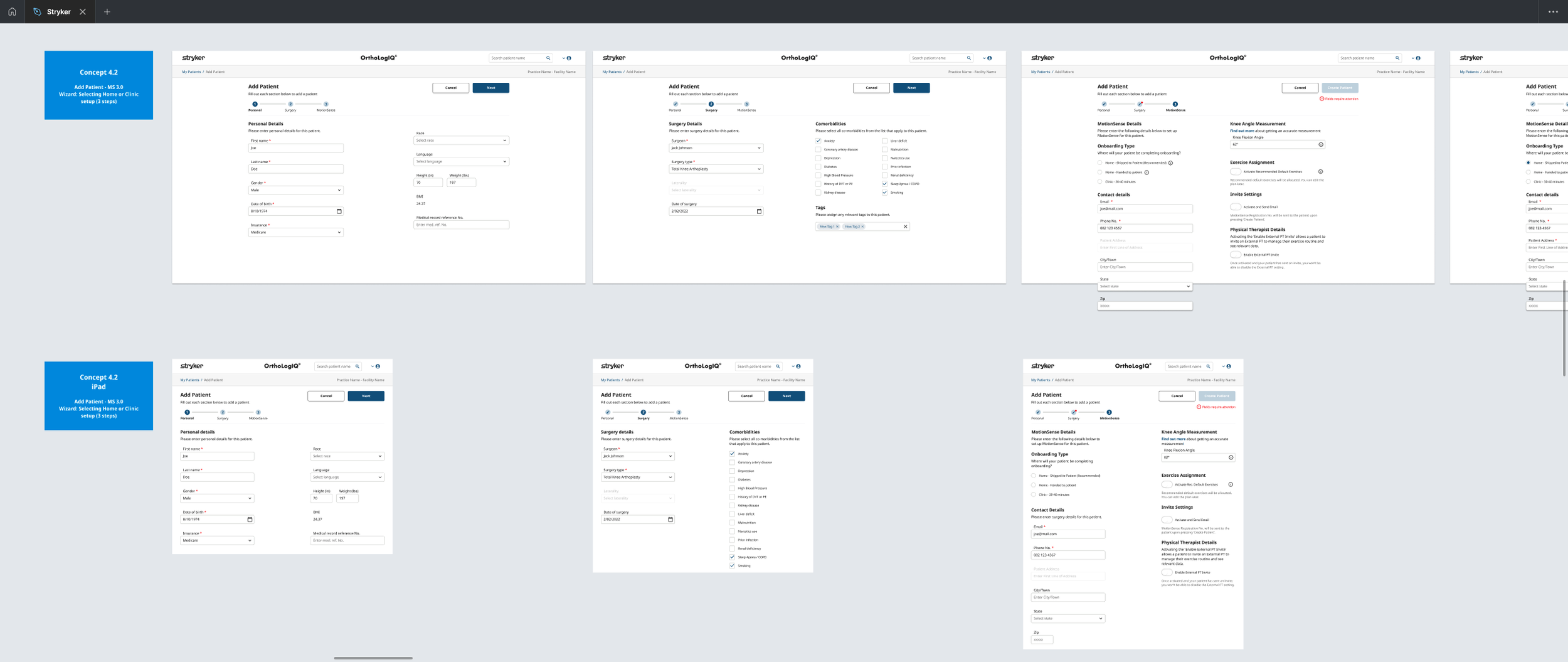
2. Wireframing & Prototyping
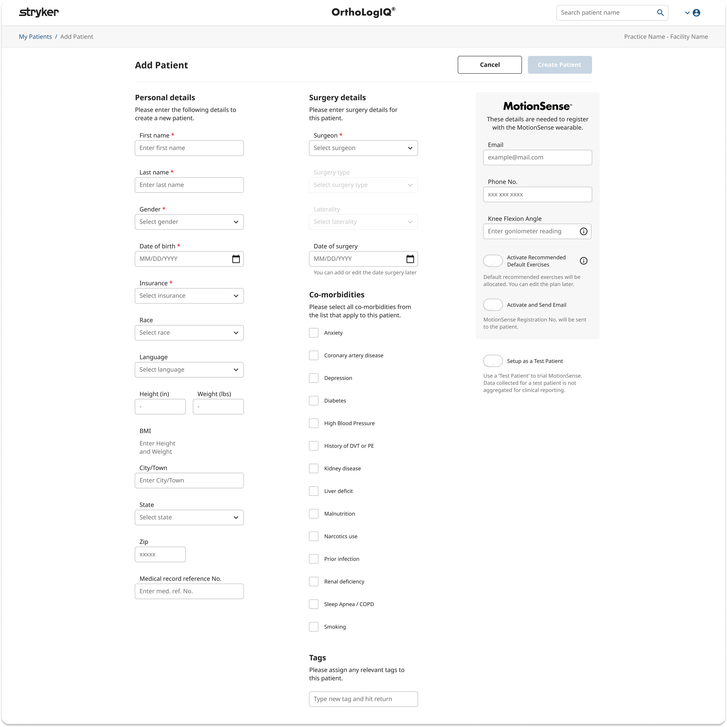
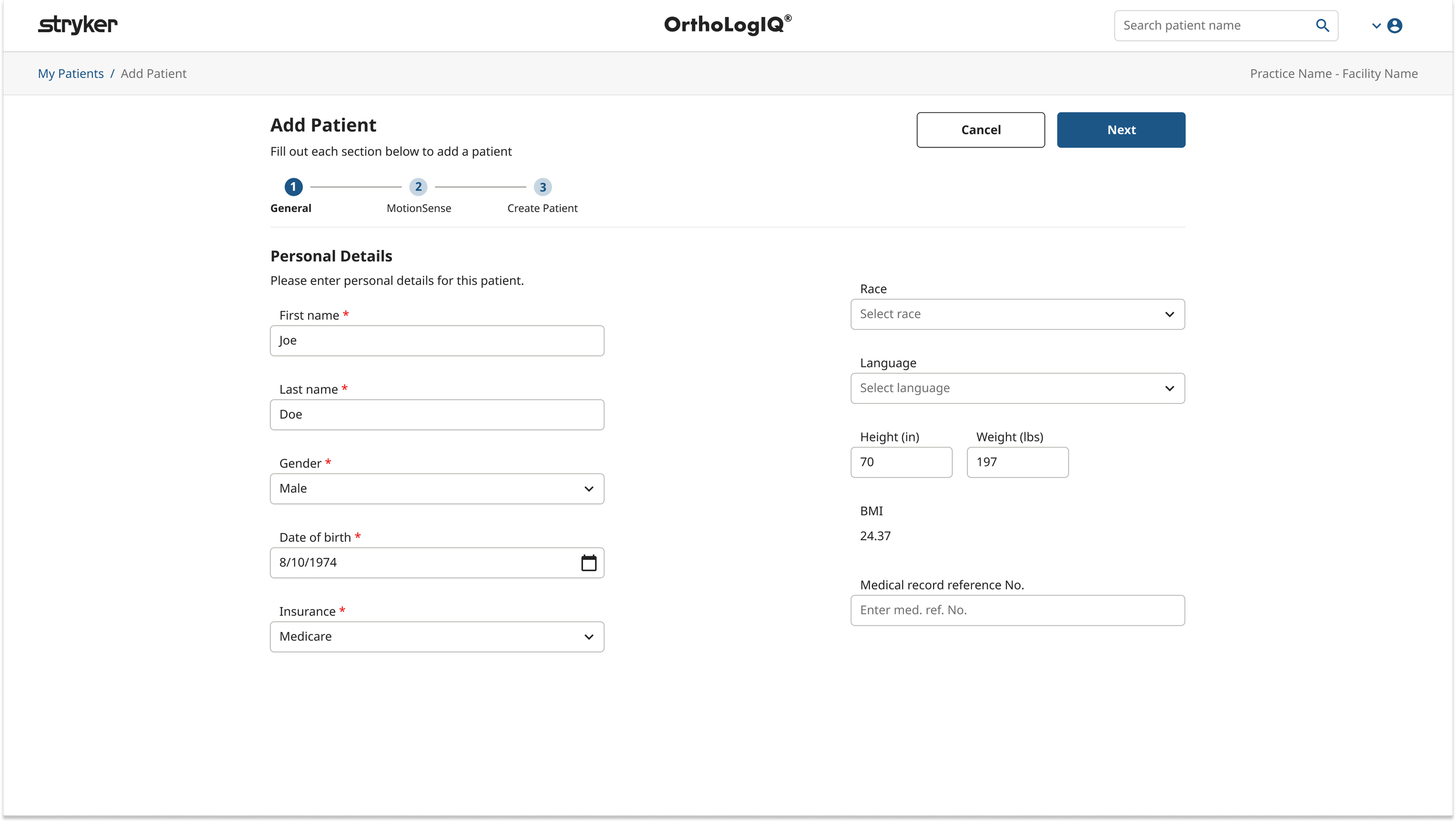
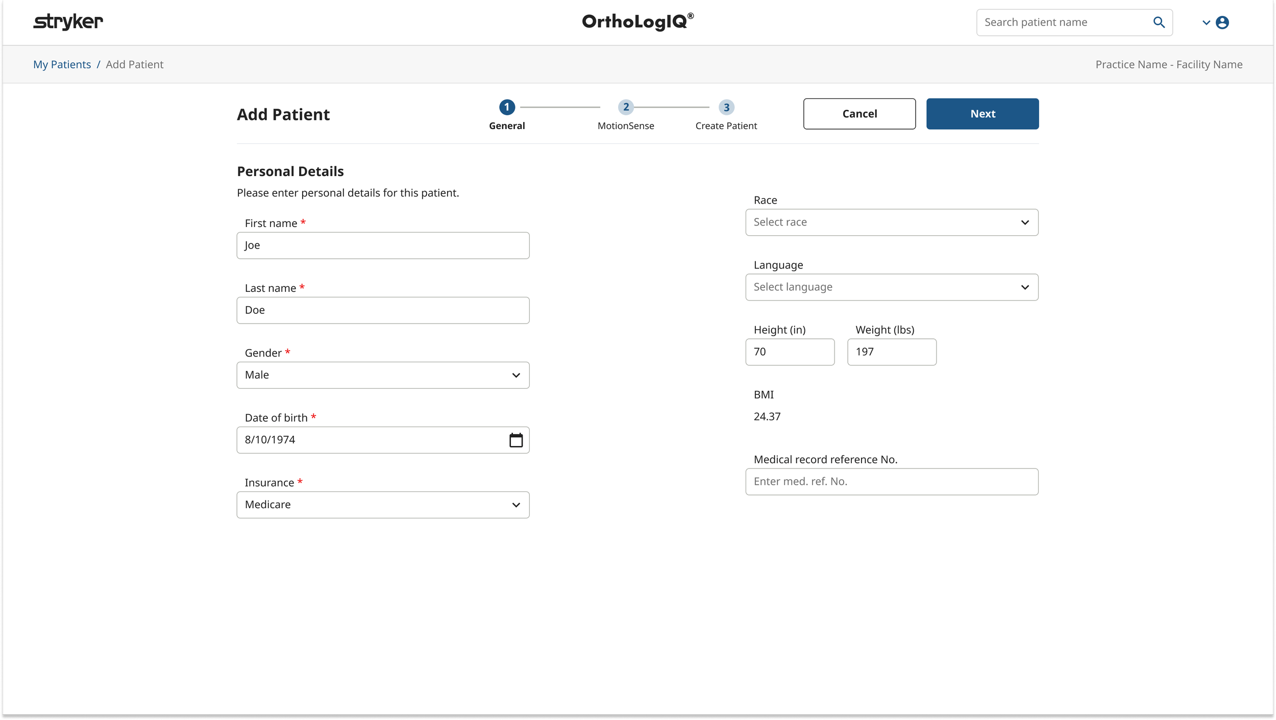
Add Patient
Wireframing, Early Concepts & Feedback
Building on earlier insights, I explored multiple layout options for the ‘Add Patient’ flow, aiming to reduce overwhelm and improve clarity.
I created a range of mid fidelity wireframes, comparing two step and three step structures:
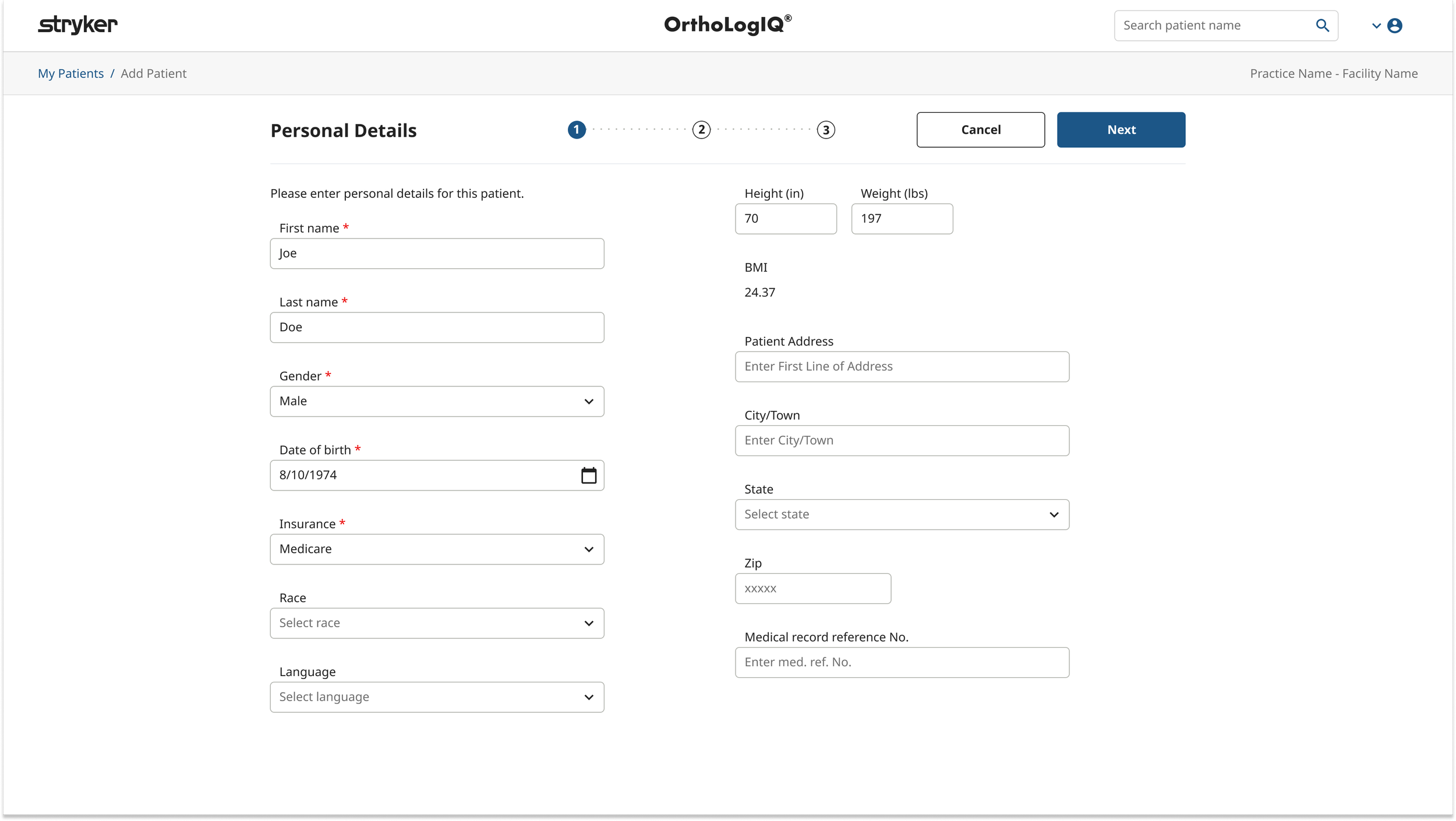
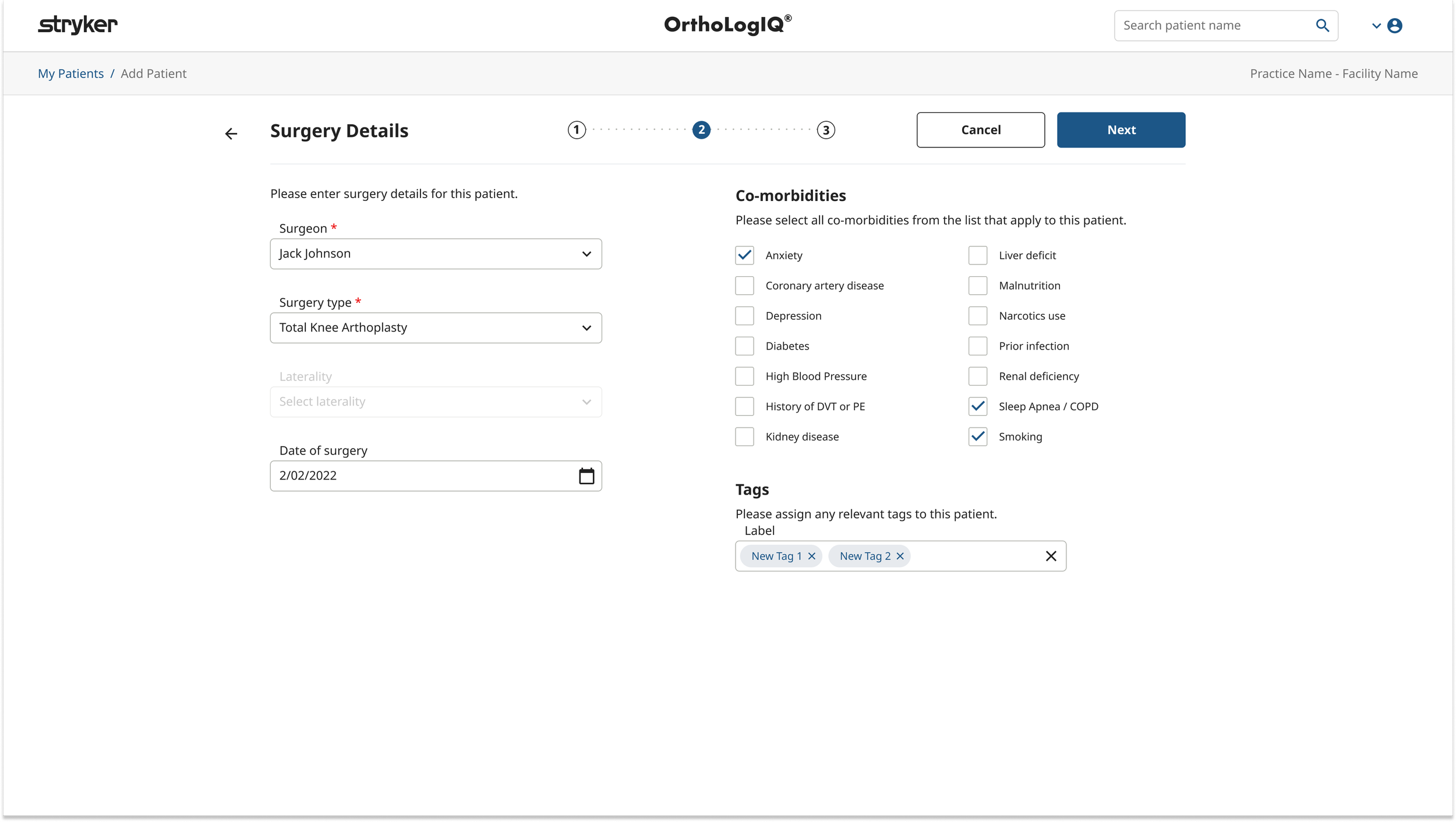
Two Step Layout: Combined ‘Personal Details’ and ‘Surgery Info’ into one step, followed by ‘MotionSense’.
Three Step Layout: Split into ‘Personal Details’, ‘Surgery Info’, and ‘MotionSense’ for more granularity.
Each version was supported with interactive prototypes and detailed user flows, including ‘unhappy paths’, to identify possible points of failure. These were shared with internal teams and select clinicians for feedback.
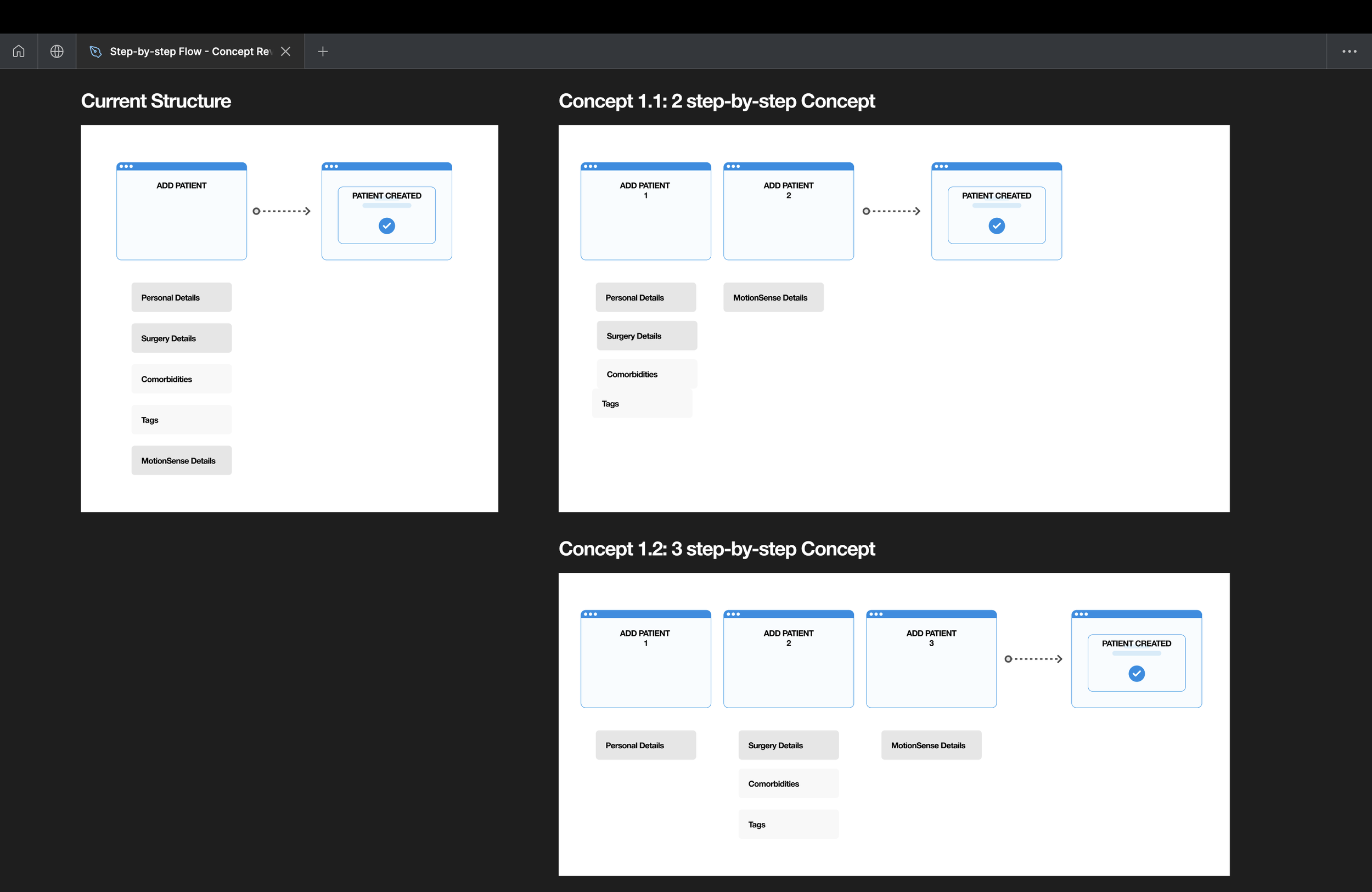
Flows Showing Current and Proposed Add Patient Page Structures

Early Figma wireframes exploring layout directions - reviewed with stakeholders to pressure test before further design
Add Patient - 2 Vs 3 step content structure design
Add Patient – Refining the Step Structure
Early wireframes explored a three step structure: Personal Details, Surgery Details and MotionSense.
Feedback from clinicians highlighted that separating Personal and Surgery information created unnecessary fragmentation during data entry, and they were comfortable scrolling as long as content was clearly structured. Stakeholders favoured a simplified flow, while Engineering flagged opportunities to reduce build time by aligning with existing UI libraries.
In response, I merged Personal and Surgery into a single General step to reduce cognitive load, while retaining MotionSense as a distinct second step due to its unique wearable setup and technical constraints.
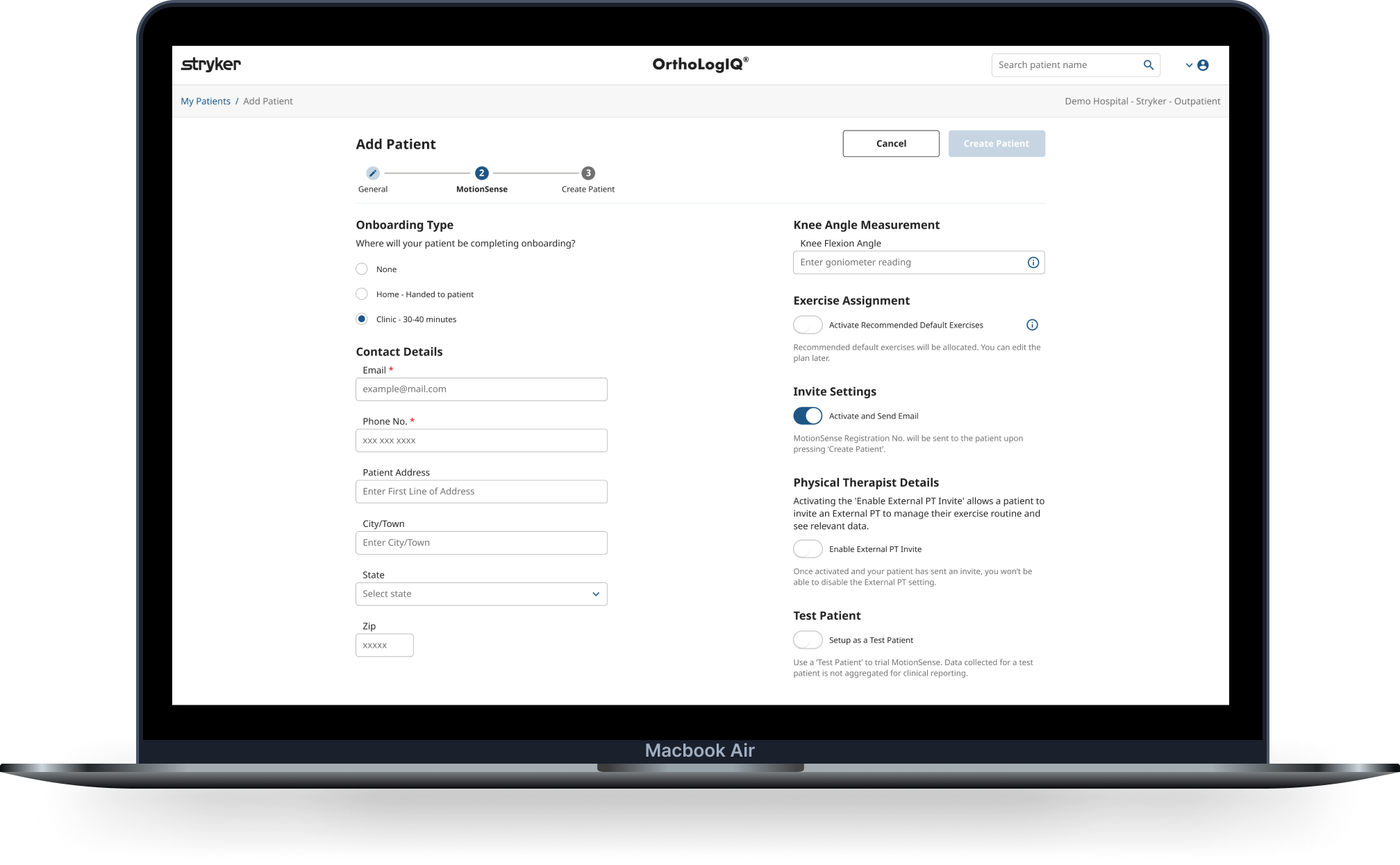
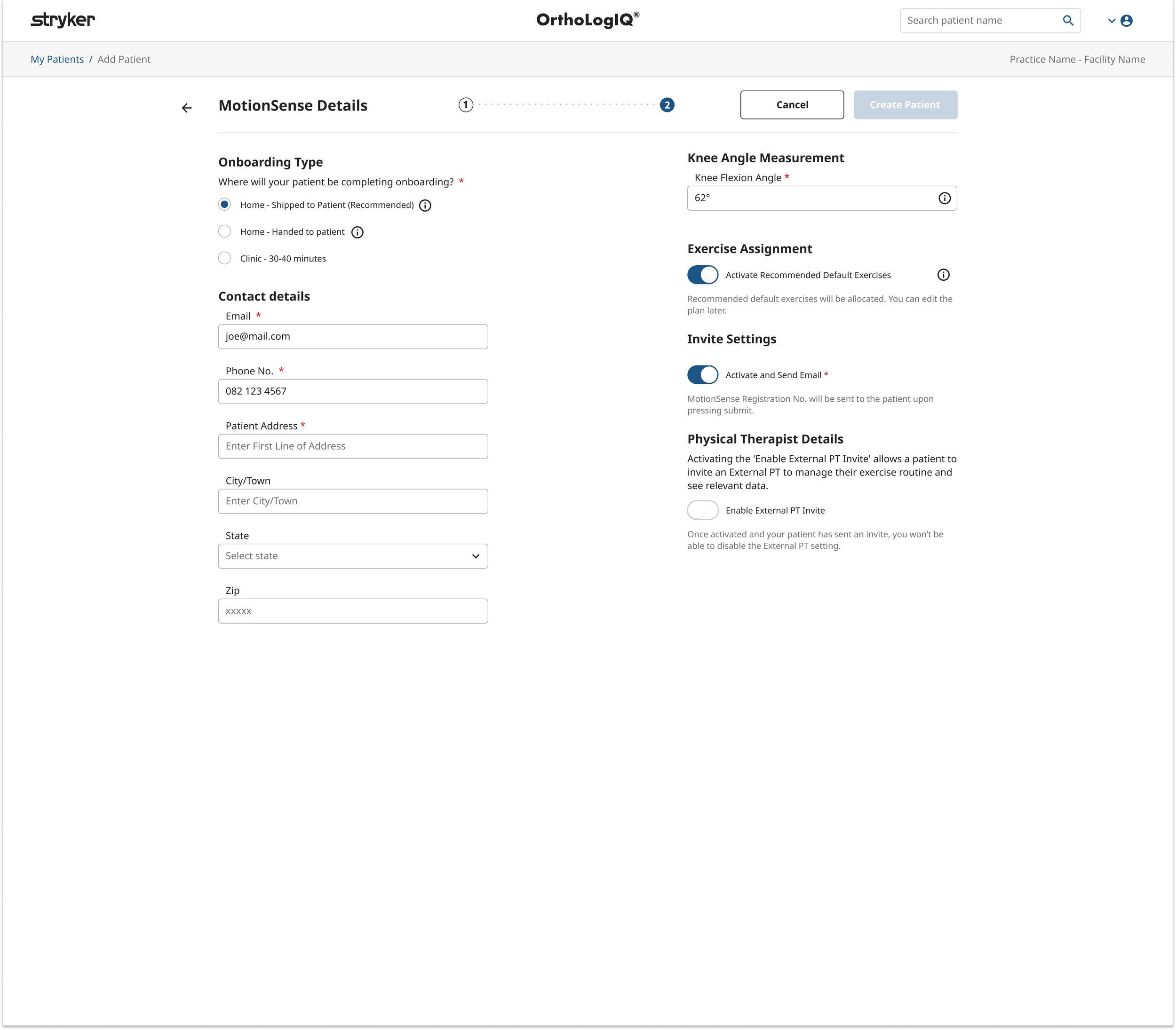
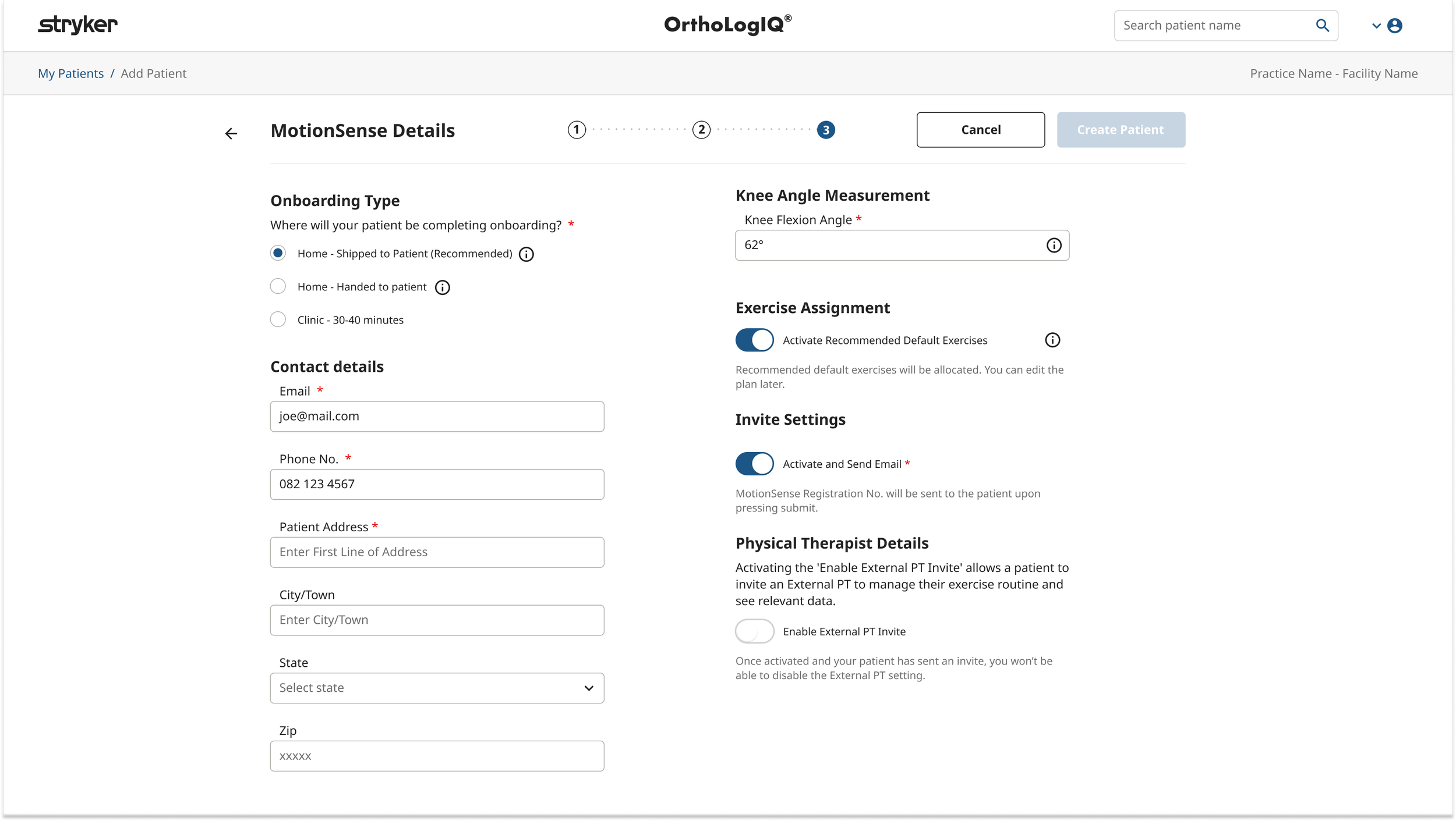
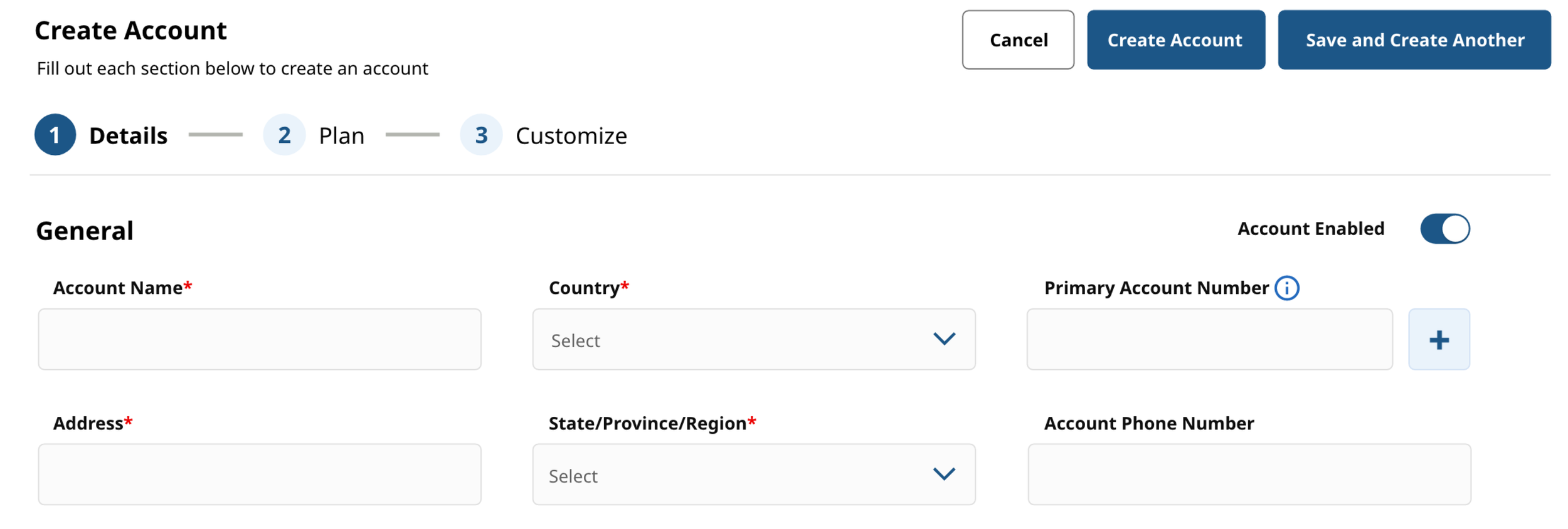
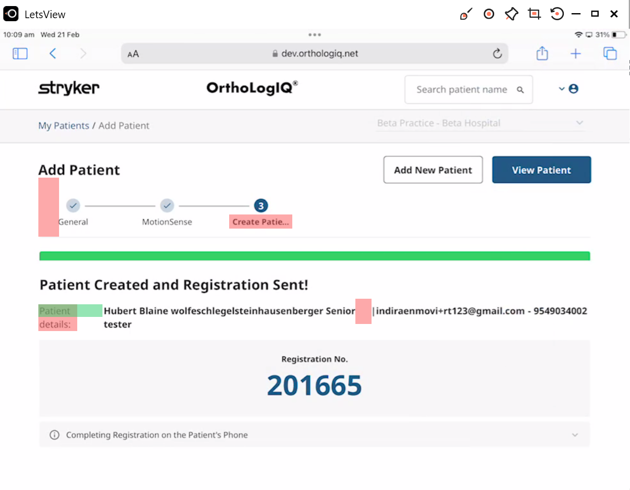
Add Patient – The Key Design Decision: Reframing the Success Modal
The original flow ended with a success modal prompting clinicians to choose between "Add New Patient" or "View Patient". While the intent was sound, the modal felt visually cluttered, inconsistent with OrthoLogIQ patterns, and easy to dismiss before clinicians had properly registered the confirmation details - a real risk in a high pressure clinical workflow.
Rather than removing this moment, I repurposed it into a dedicated third step within the wizard. The new confirmation screen gave clinicians a clear, unhurried view of what had been created - including the registration number, onboarding type and step by step phone setup instructions - reducing the chance of missed information and improving confidence at the point of completion.
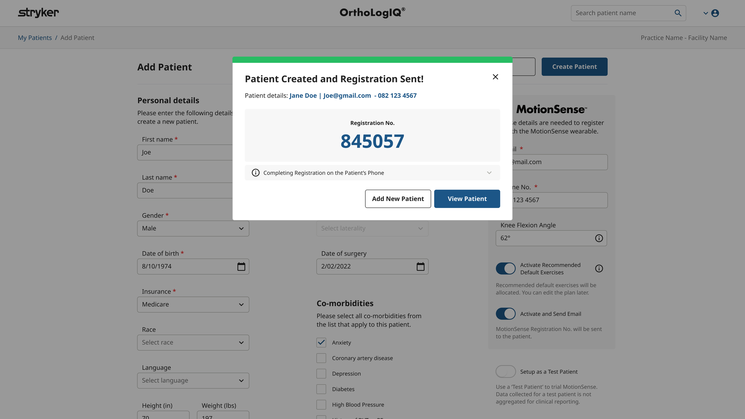
Original ‘Success modal’ design for when a patient was created
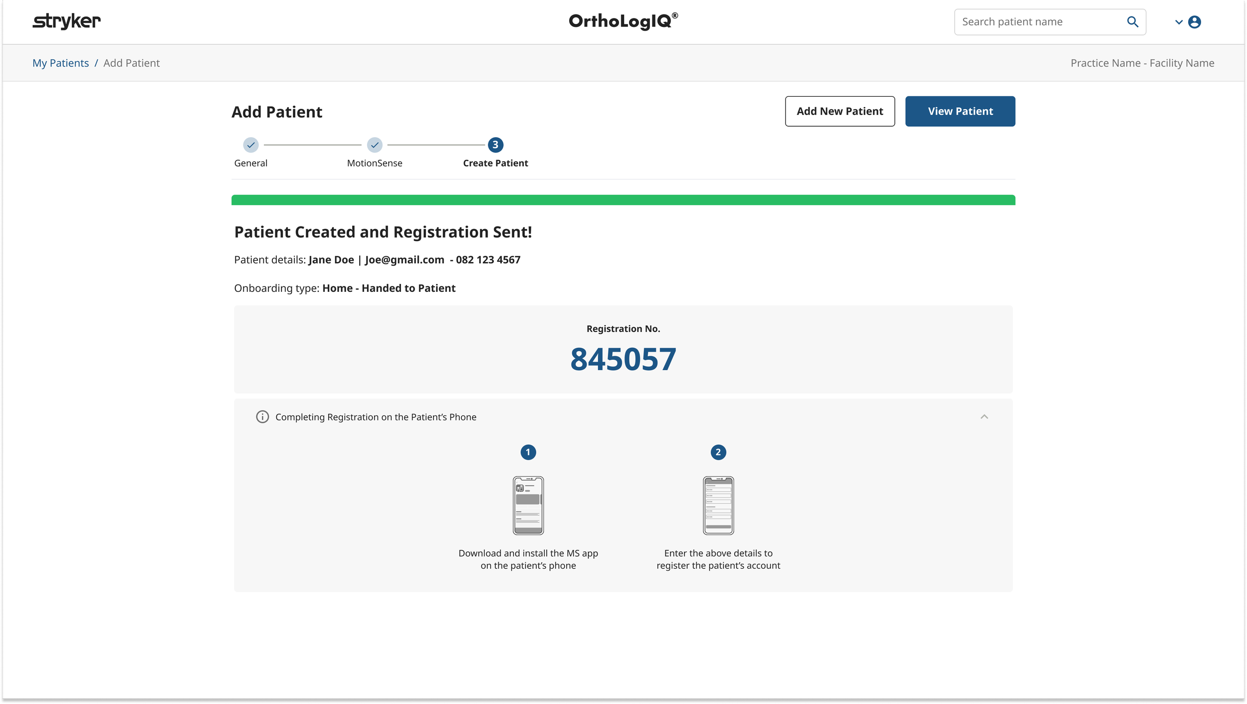
Add Patient – Final Structure & Rationale
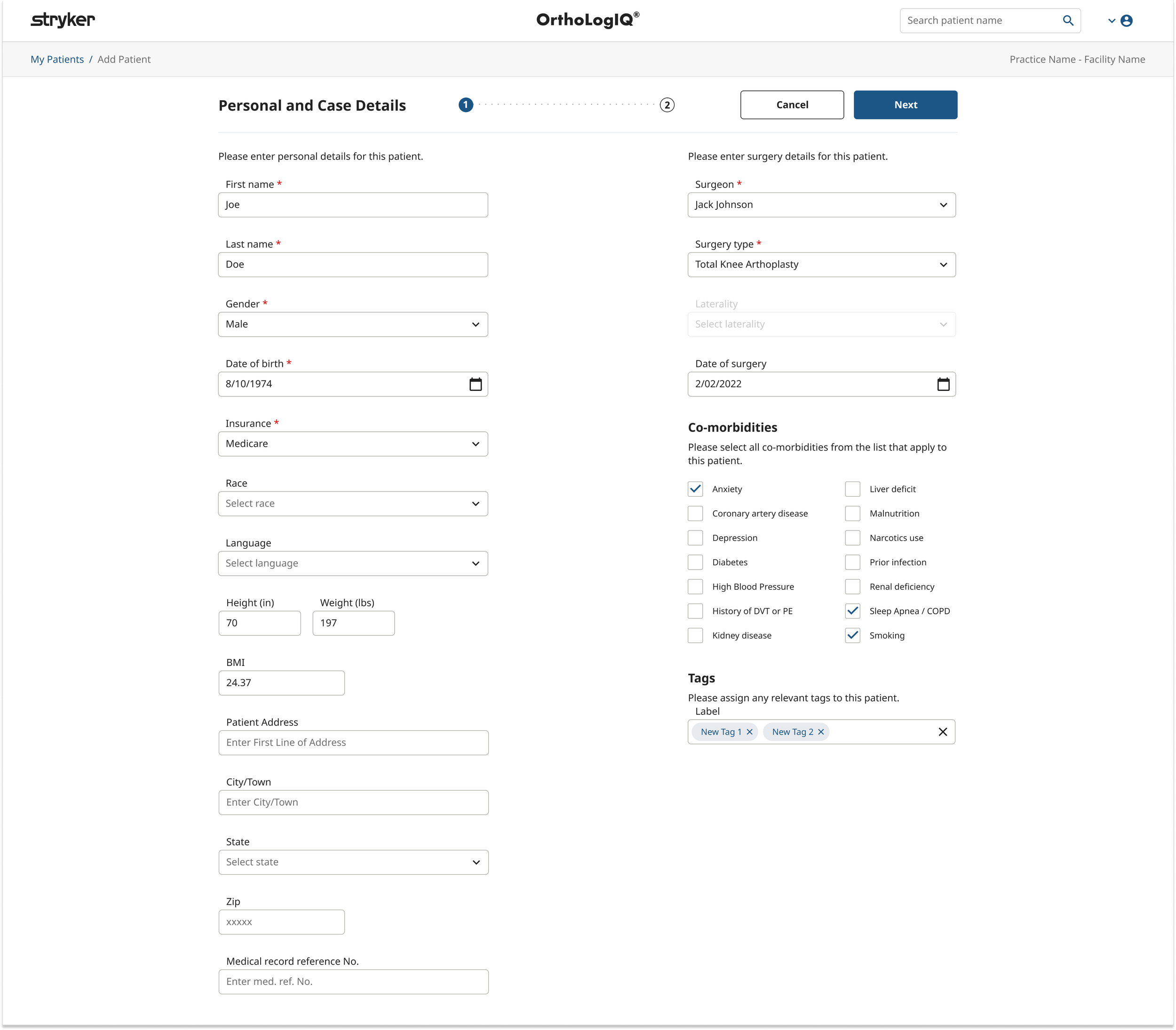
Based on usability feedback and cross functional review, the final three step structure balanced clarity, clinical logic, and development feasibility:
General – Patient and surgery/case details
MotionSense – Wearable device setup
Create Patient – Summary and confirmation before submission
This structure preserved familiar content, reduced fragmentation, and created a clear, reassuring endpoint for a high risk clinical workflow.
Edit Patient
Wireframing, Early Concepts & Feedback
Designing for Speed, Not Guidance
The original Edit Patient screen mirrored the Add Patient flow, reusing a multi step wizard and introducing unnecessary visual clutter.
Editing is a targeted, corrective task and benefits from speed and direct access, rather than a guided, step by step flow. As a result, a full wizard was inappropriate in this context and was replaced with a simpler, more immediate editing experience.
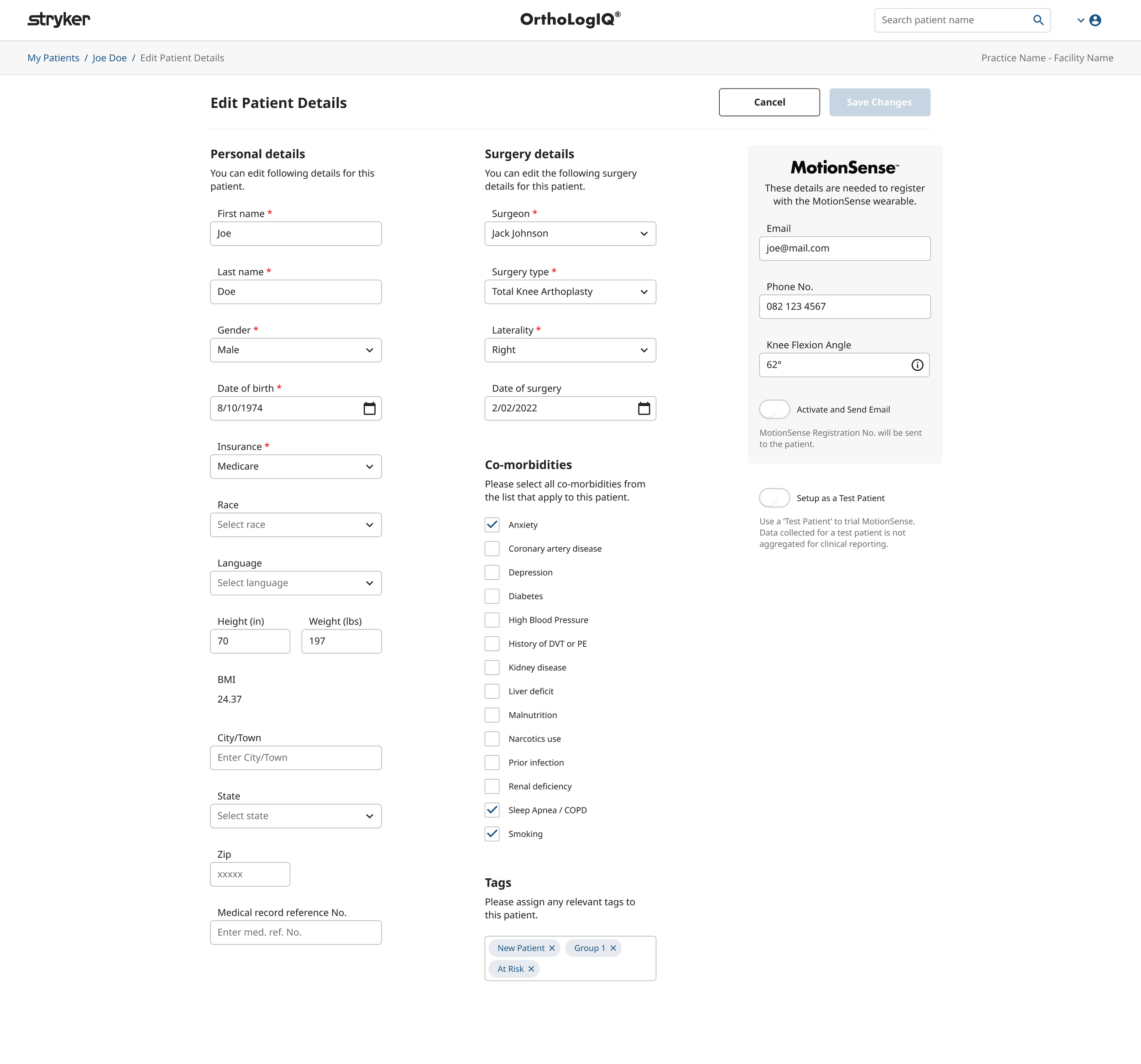
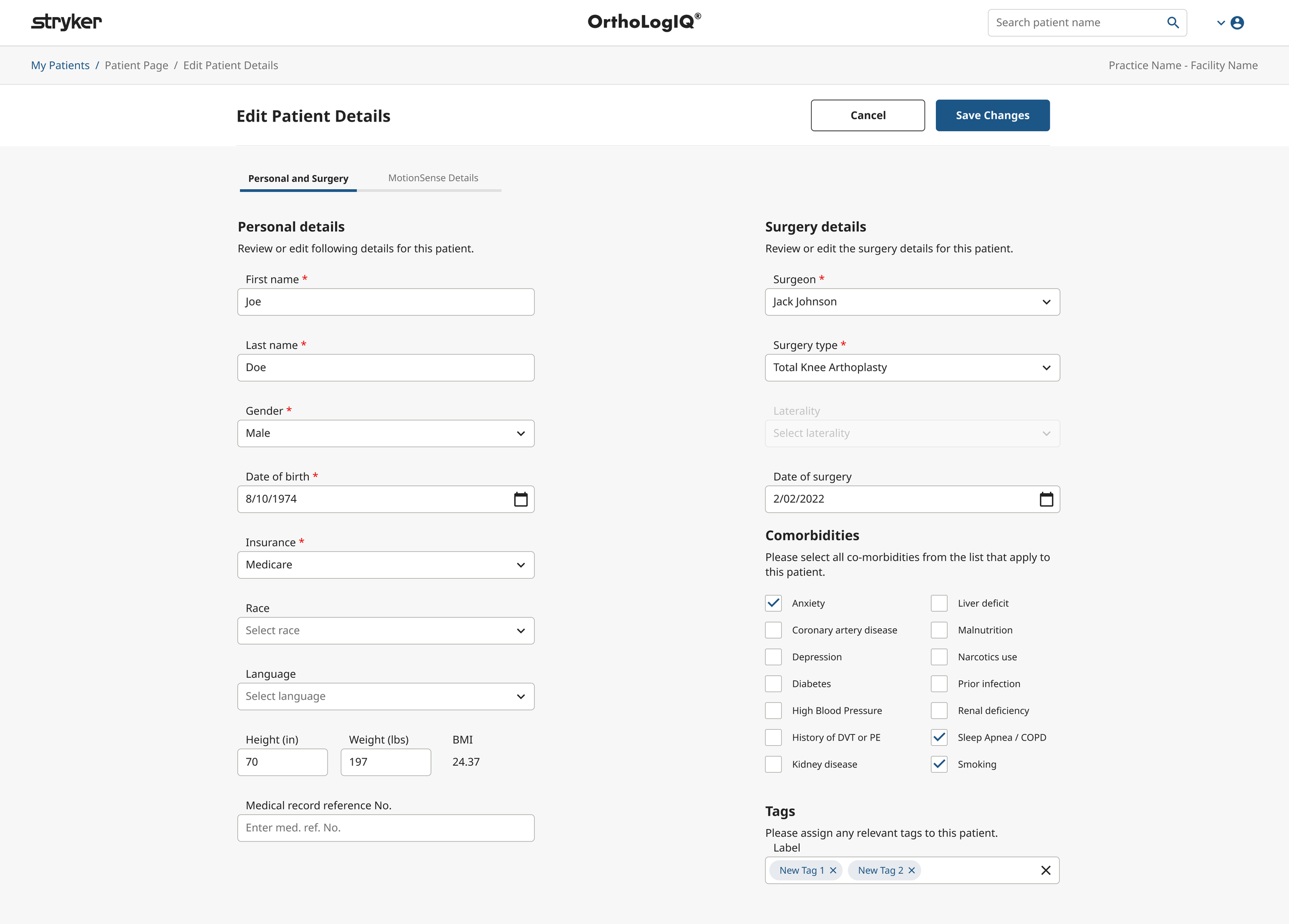
Original Edit Patient page - Identical layout to Add Patient Page
Edit Patient - Layout Options Explored
I developed multiple wireframes to explore structure, grouping, and layout strategies - ensuring the same clarity and consistency we established in the Add Patient flow.
Key goal: maintain logical grouping and clear labelling across both screens.
Concept 1.1 and 1.2 (see images below): Explored three column layouts to reduce scrolling, but this made the UI feel cramped and caused overflow issues with certain content types.
Concept 2 (see images below): Took inspiration from a Stryker design pattern, testing a more visual and descriptive tab component UI with integrated field groupings.
Edit Patient - Validation & Interaction Mapping
To test usability, I created interactive prototypes of the proposed tabbed layout, mirroring the structure and visual language of the updated Add Patient flow.
I also mapped out detailed interaction diagrams for both Add and Edit Patient experiences (including ‘unhappy paths’) to proactively identify and mitigate areas of friction before development.
Edit Patient - Feedback Loops
Design Team Feedback
The design team appreciated the clarity of the tabbed layout and recommended refining tab labels.
Stakeholders emphasised consistency with Add Patient and avoiding design over complication.
*Key decision making point: Developers expressed their preference for Concepts 1.1 and 1.2 as they aligned with existing component libraries, reducing build complexity within the project’s timeline.
(Concept 2 with the stacked components would be more complex to build within the time frame and other projects happening at the time)
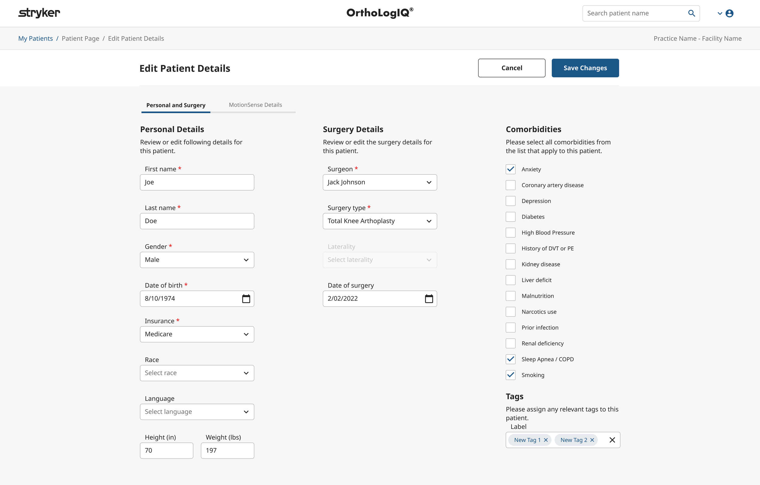
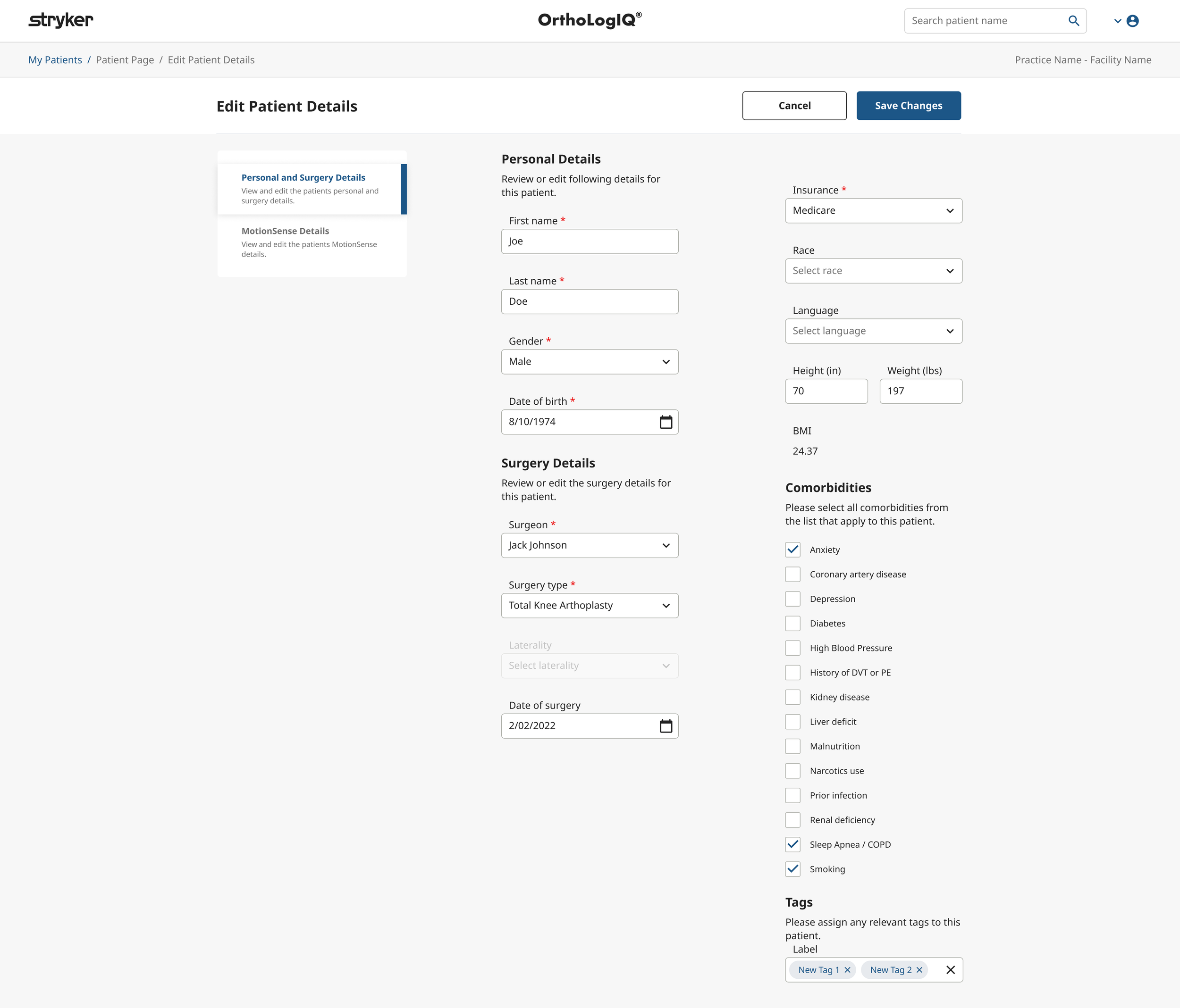
Edit Patient - Final Design Decision
After multiple rounds of collaborative feedback, we aligned on a clean, tabbed layout for Edit Patient with two key sections:
General (Personal and Surgery Details)
MotionSense
This approach delivered clarity, consistency, and simplicity - without requiring a step based experience.
Various Design Concepts in Figma – Desktop and iPad Responsive Designs:
Developed and reviewed design concepts with stakeholders, optimising the layout and structure to ensure a seamless experience across both desktop and iPad screen sizes.
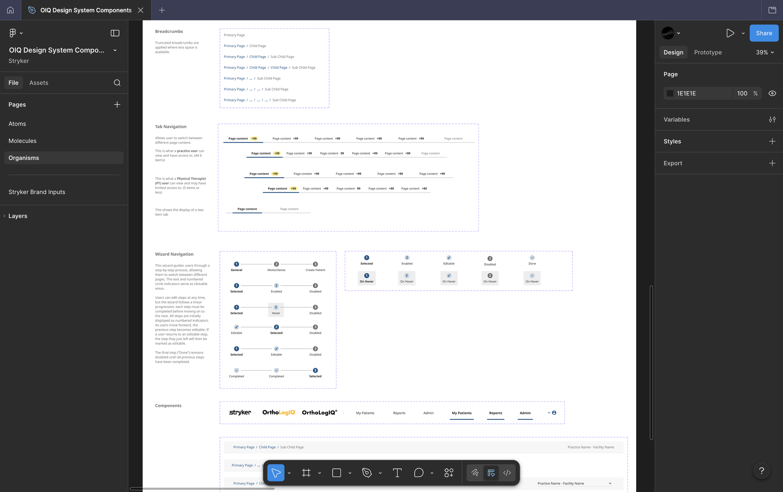
3. Component Decisions & Design System
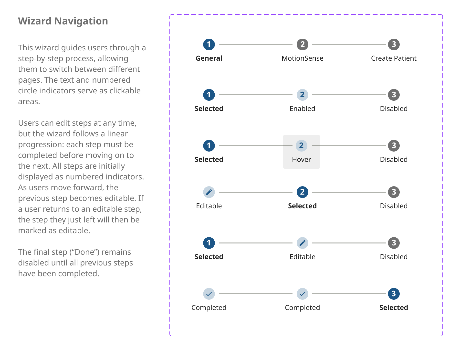
Documented component rules, states and interaction specs directly in Figma, ensuring the design system stayed consistent and the handoff was self explaining for developers and QA
Explored placement of progress indicator (top vs below title)
Matched colours and component rules to brand guidelines
Used Angular Material's stepper component to save dev time and align with existing engineering patterns
The wizard was designed and built within the OIQ Design System, below is the Figma system file showing the atomic structure it was built from, including the Wizard Navigation component with all states and variants documented.
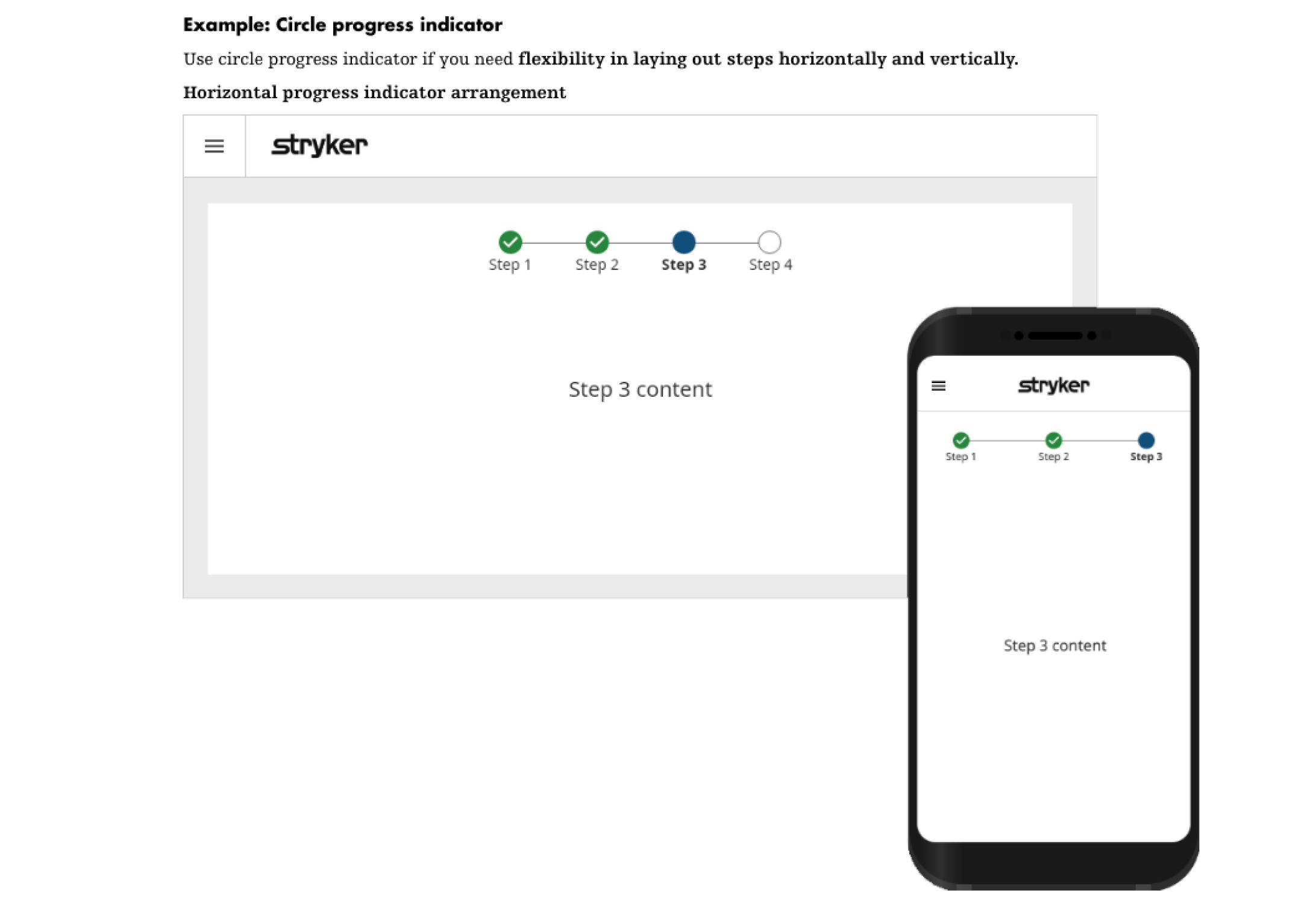
Stryker Brand Guidelines - Progress Indicator / Step Recommendations
A different project/team within Stryker - Alternative Component Design Example
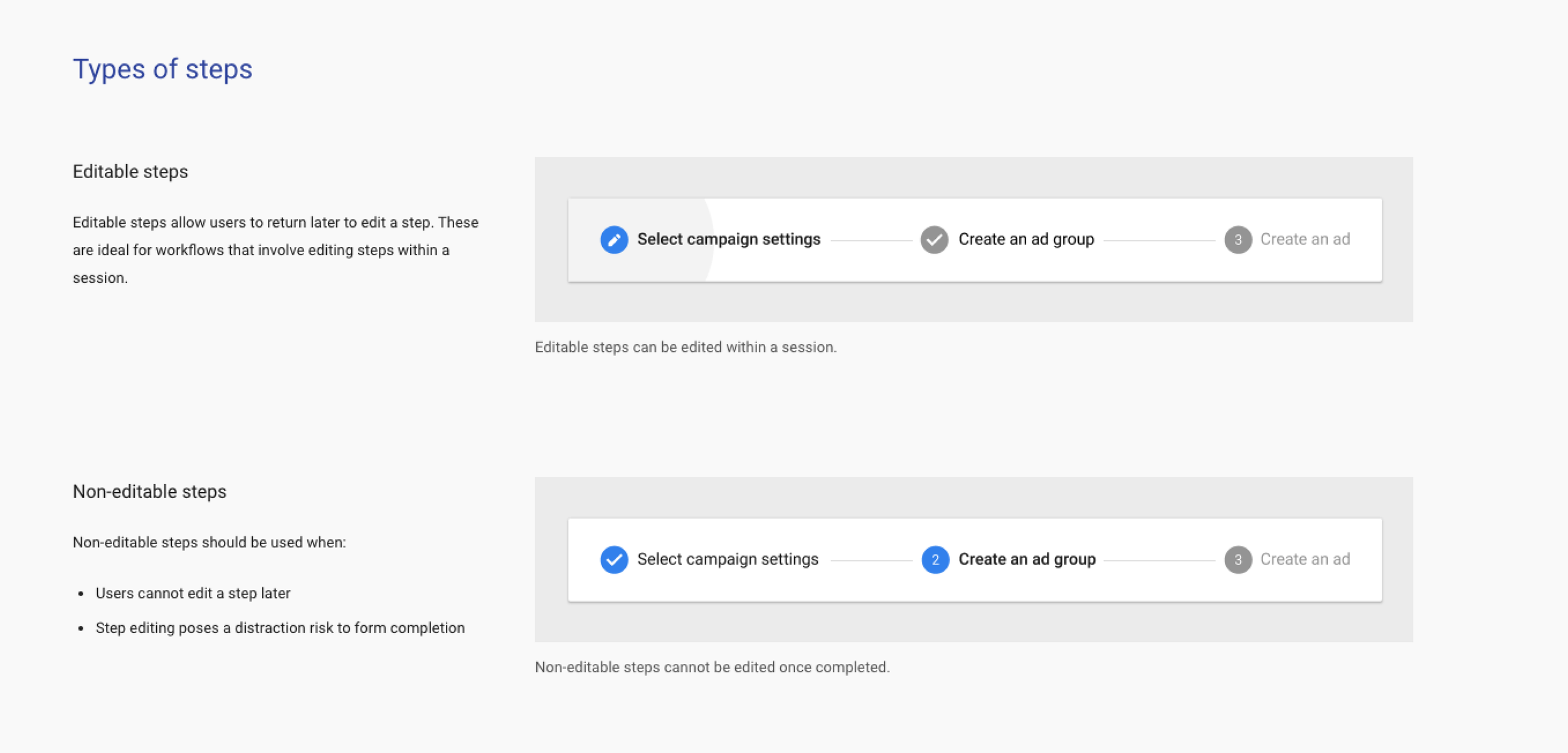
Developers suggested using the step by step component from ‘Angular Material’ guidelines, saving development time and aligning closely with my design
4. Challenges Faced and Solutions Implemented
🧠 Challenge 1: Cognitive overload and clutter
The original screens were dense and overwhelming, slowing clinicians down and increasing the chance of errors.
✅ Solution
I introduced a clearer layout (a step based flow for Add Patient and a tabbed layout for Edit Patient) to break down information and improve navigation.
🔍 Result
Reduced cognitive load, clearer hierarchy, and a more intuitive experience for users under time pressure.
🔍 Challenge 2: Limited user research resources
We lacked a dedicated research team, so access to users was limited.
✅ Solution
I conducted informal interviews and live observations with clinicians over video calls.
🔍 Result
Even with limited access, real time insights shaped key design decisions and aligned the experience with clinical workflows.
🤝 Challenge 3: Stakeholder alignment
Stakeholders had differing views on structure, particularly around two step vs. three step flows.
✅ Solution
I facilitated iterative reviews, presented multiple versions, and mapped the pros and cons of each approach.
🔍 Result
We reached consensus through open discussion and aligned on a structure that balanced user needs and business goals.
🛠️ Challenge 4: Balancing design and dev constraints
Some design concepts conflicted with existing UI components and sprint timelines, particularly around the progress indicator and confirmation screen patterns.
✅ Solution
I aligned with engineering early to understand what was feasible within the existing Angular Material library. Rather than pushing for custom components that would delay delivery, I made a deliberate call to adopt the Angular Material stepper component and adapt it to meet the design intent. Where the system couldn't support what I wanted right now, I documented it for the backlog rather than compromising the core experience.
🔍 Result
Faster build time, cleaner handover, and no rework mid sprint. The decision to work with existing libraries rather than against them meant the team could focus on getting the detail right rather than rebuilding foundations.
5. Anticipating ‘Unhappy Paths’ in the Add Patient Flow
To create a more resilient and user friendly experience, I proactively mapped potential “unhappy paths” which are scenarios where users might encounter friction, confusion or errors.
Some of these emerged from more complex workflows linked to a separate project: the introduction of new Onboarding Options for the MotionSense knee wearable.
Clinicians could now choose how the device would be delivered and set up:
Home Shipped – mailed to the patient for at home setup
Home Handed – given in person, setup still completed at home
In Clinic – setup done during an in-person appointment
These new options introduced the risk of misconfiguration. Below are some of the key scenarios I identified:
Unhappy Path 1
The clinician intends to set up the patient as Home Shipped, but mistakenly selects In Clinic.
→ The patient realises the error before the clinician.
Unhappy Path 2
The clinician selects In Clinic, but the patient was supposed to receive the device as Home Handed.
→ Again, the patient notices the mistake first.
Unhappy Path 3
The clinician intends to choose In Clinic, but mistakenly selects Home Shipped.
→ This creates confusion at the point of care.
These insights directly shaped the final designs, helping us anticipate user needs and reduce potential drop-offs or frustration.
In addition to the onboarding specific issues, I also addressed broader interaction challenges that could disrupt the Add Patient flow:
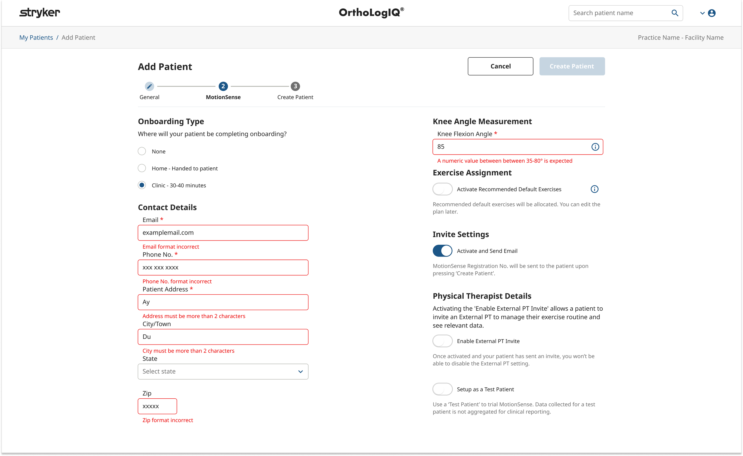
1. Incomplete or Incorrect Data Entry
Users might miss required fields or enter incorrect information.
→ I introduced inline validation and clear error states (e.g red borders, inline messages) to help users catch and correct issues in real time.
2. Onboarding Type Selection Errors
Users sometimes selected the wrong onboarding type or changed their mind midflow.
→ I made the selected type visible in the summary step and added a friendly information message:
“You can complete the MotionSense setup for this patient later by visiting the Patient Page and selecting Edit Patient.”
3. Confusion Around Step Requirements
Some users weren’t sure what was expected at each stage.
→ I added contextual help, including brief descriptions and tooltips, to guide the experience more clearly.
4. Accessibility Barriers
Users relying on screen readers or keyboard only navigation faced potential challenges.
→ I followed accessibility best practices, ensuring high contrast ratios, semantic labels, and full keyboard navigability for inclusive access.
By identifying and addressing these pain points early, I helped ensure that the Add Patient experience was smoother, more forgiving, and supportive… even when things didn’t go exactly to plan!
6. Testing and Validation:
Once the new prototype was finalised (including the third step, ‘Create Patient’, which served as a summary and confirmation screen) we ran informal review sessions with clinicians to gather feedback and validate the experience.
Key Insights and Their Influence
🟢 Clinicians valued the summary step
Clinicians confirmed that the new summary step improved confidence and reduced second guessing.
→ This feature was kept in the final design and contributed to improved user satisfaction and trust in the flow.
🟡 Confusion around checkmark icons
Some users assumed the ✅ ‘completed’ icons in the summary step were editable buttons, leading to momentary confusion.
→ Due to backend limitations, inline editing wasn’t feasible… but the feedback was noted and added to the backlog for future consideration.
7. Final Designs
Add Patient:
Introduced a three step wizard:
1. General (Personal + Surgery Info)
2. MotionSense (Wearable Setup)
3. Create Patient (Summary + Confirmation)
Each step was designed with clear guidance and inline validation to reduce error and improve task flow.
Edit Patient:
Used a simpler tabbed interface to separate key areas (‘Personal & Surgery’ and ‘MotionSense’), reducing clutter without the need for a step based flow.
8. Final Implementation & QA Support
To support a smooth build and QA process, I delivered detailed flow diagrams outlining every screen, CTA, and interaction. These diagrams became a shared reference across design, dev, and QA teams.
Key Outcomes:
• Clear handover with precise flow documentation and component specs
• Fewer dev questions due to early alignment and reuse of system components
• QA efficiency with defined paths and edge cases mapped in advance
Figma Detailed User Flow: Overview of the Add and Edit Patient layout and navigation for desktop and iPad.
Design System Component: Component rules and instructions to communicate to Developers and QA Testers on the components functionality.
Development & QA Challenges
1. Parallel Workstreams
Challenge: Overlapping development of the onboarding feature and the new wizard.
✔ Solution: Set up timelines and checkpoints to align cross feature dependencies.
2. Communicating Design Intentions
Challenge: Keeping everyone aligned as flows evolved.
✔ Solution: Regular walkthroughs, updated Figma links, and clear specs ensured everyone stayed on the same page.
3. UI Consistency Across Devices
Challenge: Spotted developer inconsistencies in margin and spacing during build.
✔Solution: Introduced stricter UI documentation and regular reviews with QA to catch visual bugs early.
I flagged specific spacing and alignment issues early, helping QA and developers maintain high visual consistency across devices
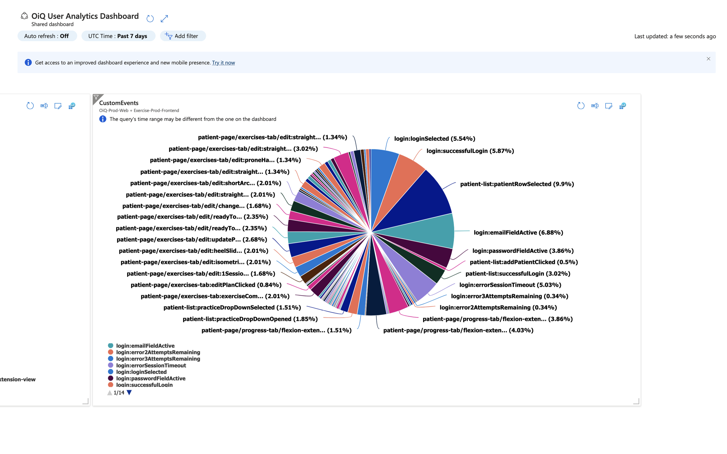
9. Analytics & Data Tracking
To support ongoing optimisation, I defined Custom Dimensions and Page View naming conventions for tracking user behaviour in Azure dashboards.
This enabled:
📉 Visibility into drop off points
📈 Insights on task completion rates
🔍 Early identification of areas needing iteration
Example insight:
Data showed higher exit rates on Step 2 (MotionSense), prompting a review of content clarity for a future sprint.
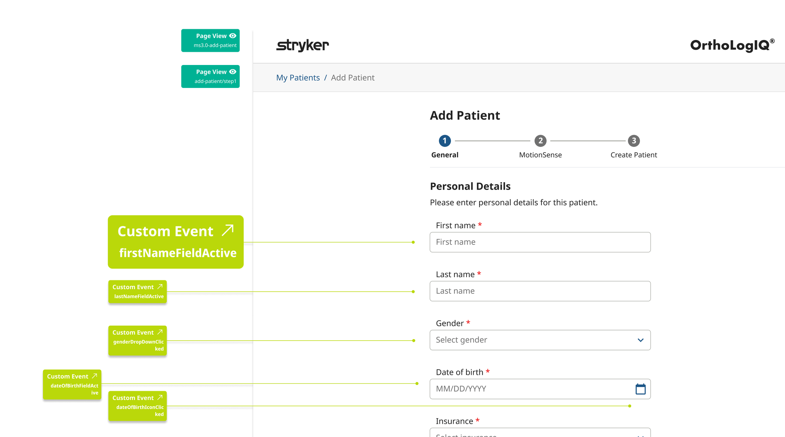
Key Actions:
📁 Documentation
Mapped naming conventions directly in Figma, making them easily accessible for the full design team.
📊 Central Data Source
Compiled all events and page views into a shared spreadsheet to support dashboard reporting and ongoing analysis.
📈 Azure Dashboard Integration
Tracked real time feature usage and engagement
Informed design improvements through user flow analysis
Enabled continuous monitoring of product performance post launch
Results & Impact:
🕒 43% Time Reduction – Reduced clinician patient data entry time from 3 minutes to 1.7 minutes, helping clinicians complete entries more quickly, especially under time pressure.
🔄 Structural Reframe - Identified that the existing success modal created visual noise and dismissal risk at the most critical moment in the workflow. Repurposed it as a dedicated confirmation step, giving clinicians a clear opportunity to review before submission.
✅ Fewer Data Entry Errors – Clearer UI and a structured step by step flow reduced common input mistakes and rework
👍 Higher Clinician Satisfaction – Clinicians found the platform easier to navigate and the summary confirmation step improved confidence before submission
♿ Improved Accessibility - WCAG compliant colour contrast, keyboard navigation, cognitive load reduction by design, and accessibility carried through to build via full component documentation.
Conclusion:
This project improved the usability of the OrthoLogIQ platform by introducing a more intuitive, step by step experience for adding and editing patient information.
Through iterative design and close collaboration across teams, I delivered a solution that reduced cognitive load, streamlined workflows, and improved clinician satisfaction.
This project deepened my ability to balance real world constraints with user centred thinking… reinforcing a design approach that’s accessible, scalable and impact driven!
Before…
After…
add and Edit patient run through
My Top 10 Lessons and Highlights
Iterative Design Is Everything
Multiple rounds of design, feedback, and testing helped shape the final solution. Staying open to change was key to creating a user friendly experience.Balancing Stakeholder + User Needs
I learned how to navigate competing priorities and find the middle ground between business goals and what clinicians actually needed.Clear Communication Builds Trust
Frequent collaboration with the Product Owner, Marketing, and Design helped align expectations and make sure everyone understood the “why” behind each decision.Stay Flexible, Stay Curious
Early concepts leaned toward a one screen layout, but user feedback steered us toward a two step flow. This reminded me to stay open and responsive to real world insights.Designing Within Constraints
Working closely with developers helped me understand what was technically feasible. It also taught me when to push for improvements and when to plan for future iterations.Accessibility Is Non Negotiable
Adjusting colours and contrast early improved readability and inclusiveness. It reinforced my belief that good design works for everyone.Even Light Research Adds Value
With no formal research team, we relied on feedback from two clinicians—and it was more than enough to validate key flows and reveal blind spots.Anticipate the “Unhappy Paths”
I looked ahead to potential errors and confusion, designing tooltips and inline validations to support users before they hit friction.Design for Now, Think Ahead
Not everything could be built right away, so I flagged several features for future sprints—keeping the roadmap flexible and growth friendly.Document Everything
Clear documentation kept everyone aligned and became a useful reference point for later iterations and cross team knowledge sharing.