Goal & Objectives:
Improve user confidence in symptom assessment.
Simplify the process of inputting symptoms and understanding results.
Ensure the AI-generated recommendations are clear, actionable, and medically reliable.
User Research & Key Insights
Research Methods: Competitive Analysis, User Testing (via usertesting.com, Data Dashboard Analysis
Participants: 30 users across different demographics
Key Findings:
Confusion: Users were often uncertain about medical terminology and needed simplified language.
Trust & Accuracy: Users worried about the reliability of AI-generated diagnoses, requiring clear disclaimers and confidence scores.
Mobile Usability: 70%+ of users accessed the tool on mobile devices, meaning a mobile first design was crucial.
Design Process & Iterations
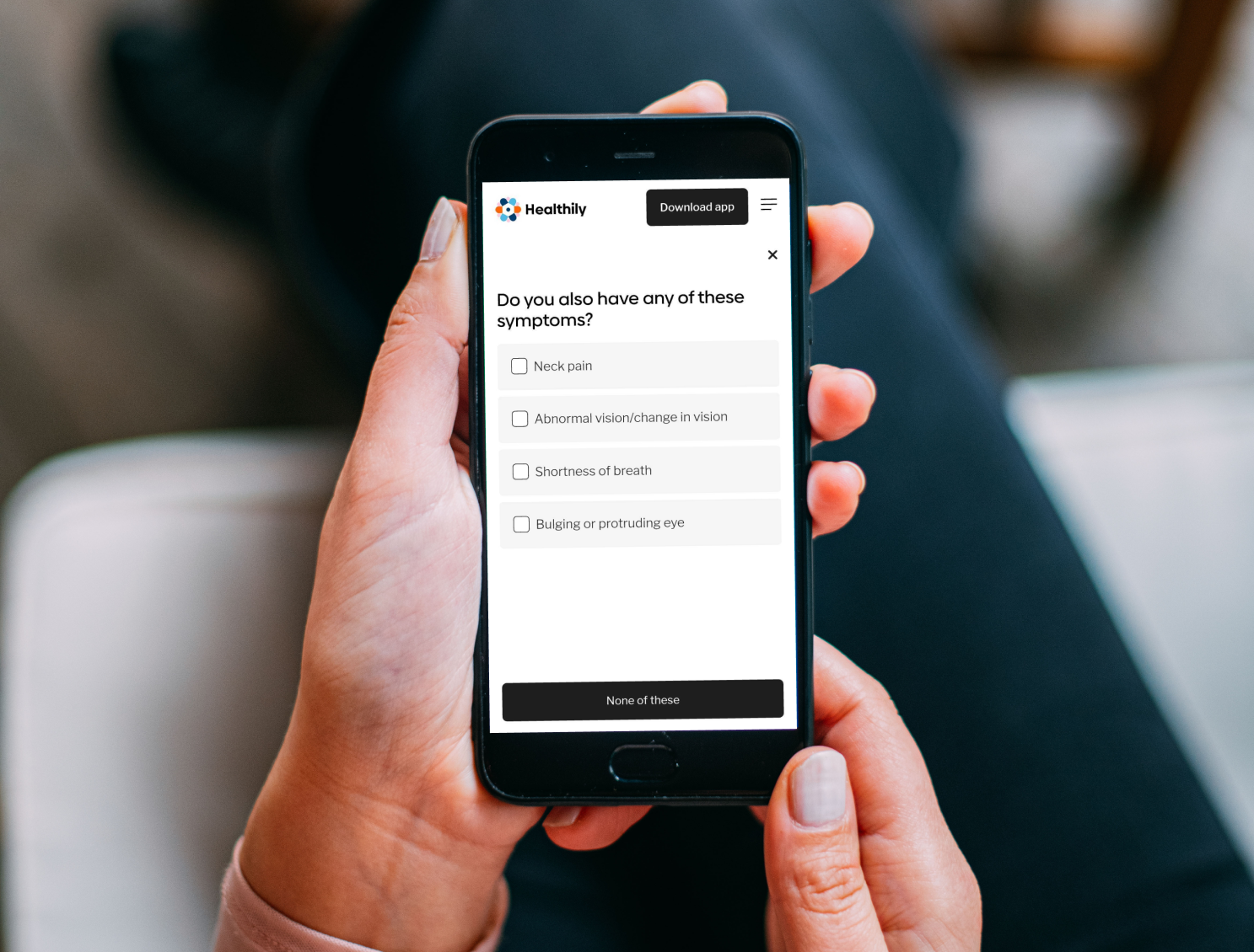
1. Wireframing & User Flows: Mapped out simplified symptom input flows to reduce confusion.
2. Prototype Testing & Feedback: Ran usability tests using Usertesting.com → Users found the AI recommendations too technical, so we revised copy for clarity.
3. Iterating & A/B Testing:
Variant A: Used medical jargon
Variant B: Used simplified symptom descriptions
Result: Variant B led to 30% higher comprehension among users.
4. Final UI Enhancements: Optimised for mobile-first, improved navigation, and added a PDF Report Feature for better information sharing with users GP / Doctors.
Results & Impact
Engagement Up: 20% increase in users completing the symptom check process.
Improved Accuracy Perception: 85% of users trusted AI-generated recommendations after UI and copy improvements.
High Adoption of PDF Report Feature: 60% of users downloaded or shared their PDF reports.
Reduced Drop-off: 15% fewer users abandoned the process after improving symptom entry UX.
Challenges & Lessons Learned
Trust in AI: Users initially doubted AI-driven results, so we introduced confidence levels and disclaimers.
Medical Accuracy vs. Simplicity: Balancing doctor-approved terminology with user-friendly language was tricky.
Data-Driven Decisions: A/B testing and analytics helped shape design choices rather than just assumptions.
My Roles and Responsibilities
Competitor Research and Analysis:
Conducted research and analysis of competitors to inform design decisions and strategy.Workshops and Collaboration:
Organised and participated in workshops, collaborating with cross-functional teams to drive alignment and innovation.User Testing:
Utilised the Usertesting.com platform to gather user feedback on design prototypes, ensuring user-centric improvements.A/B Testing: Collaborated with the research team to drive design inputs for A/B testing, validating decisions and informing data-driven improvements.
Improving User Journeys and Flows:
Revisited and refined user journeys and flows to enhance the overall user experience.Designing and Maintaining SSC Screens:
Designed and maintained the SSC screens in Figma, with a mobile-first approach.Design Review and QA Support:
Reviewed designs during development stages and provided support for quality assurance (QA) through design reviews.Creating Prototypes:
Developed working prototypes for new features to validate and refine design concepts.Content and Feature Updates:
Reviewed and designed updates to improve copy, content, features, and functionality.Monitoring Data Insights:
Monitored the Symptom Checker ‘Data Dashboard’ for insights to guide further enhancements.Data Analysis for Improvement:
Collaborated with data analysts to identify areas for improvement based on user data.Creating a PDF Report Feature:
Designed a ‘PDF Report’ feature that allows users to view their consultation outcomes, send them to their email, and download them for sharing with their GP or Doctor.