Project Summary
As a Senior Product Designer at Elvie, I led the UX/UI redesign of the Pump Controls and Home screens, solving key usability challenges that impacted new and experienced pump users.
This project was about supporting users across two critical moments:
Getting started confidently
Staying in control once they’d begun
I improved clarity in pump modes, streamlined navigation, and enhanced onboarding, delivering a smoother, more accessible experience - especially for first time mothers.
Impact & Key Results
📈 30% Faster Setup – Users completed setup more quickly, with fewer errors.
💪 Confidence increased from 51% to 94% – Users reported feeling significantly more confident adjusting pump settings.
🚀 25% Fewer Steps – The new tabbed layout on the controls screen UI streamlined navigation, making interactions smoother and more intuitive.
📉 62% Reduction in Support Enquiries – Customer support received significantly fewer enquiries related to pump mode confusion, demonstrating improved design clarity.
One of my final projects at Elvie was a redesign of the app’s Controls screen, with additional enhancements to the Home screen experience.
Although I worked on the Home and Controls screens separately, they were designed as one continuous experience across different moments of use.
The Home screen was about reducing anxiety and uncertainty at entry - helping users understand what’s happening and what to do next.
The Controls screen was about maintaining confidence during use - making sure users could adjust settings without cognitive overload.
Both screens were solving the same underlying problem: supporting decision making when users are tired, distracted or emotionally loaded…
The goal was to modernise the interface, improve usability, and ensure the app aligned with Elvie’s hightech, user centred brand - especially as it expanded to support new products like ‘Elvie Stride’, ‘Curve’, and ‘Catch’.
The existing app design was functional but outdated, and many users (particularly new mothers) struggled with pump setup and navigation. This redesign offered the opportunity to improve clarity, reduce cognitive load, and guide users more effectively.
The original Pump App
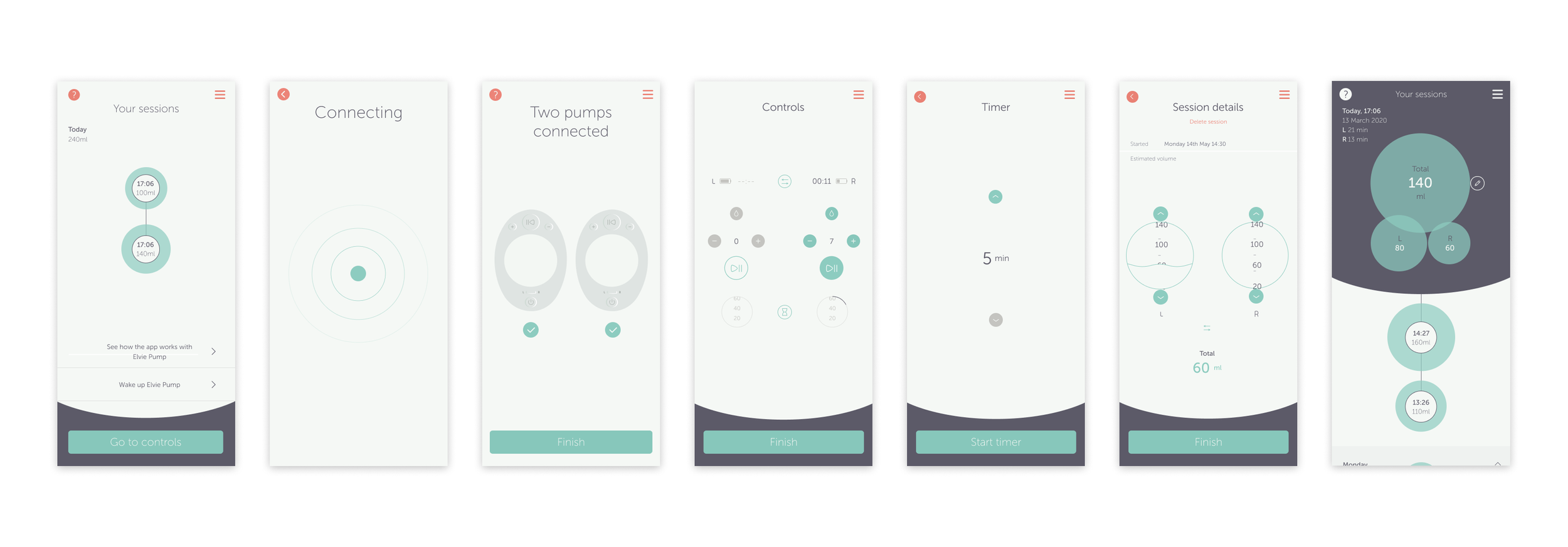
Original Elvie app ‘Home’ and ‘Control’ screens
Challenges and Pain Points
These challenges were identified through qualitative user research, usability testing, interface analysis and were reinforced by a high volume of related support enquiries (from the Customer Support/Care team).
Controls screen
Cognitive overload
Displaying both pumps’ controls on a single screen created a cluttered experience, with users frequently hesitating before making adjustments or adjusting the wrong side during testing.
Unclear mode indicators
Users struggled to differentiate between ‘Stimulation’ and ‘Expression’ modes, often relying on trial and error rather than understanding the UI cues.
Unclear interactivity and navigation
Key controls relied on unlabeled iconography. For example, arrow icons used to switch between pump sides were commonly misinterpreted as intensity or adjustment controls, contributing to repeated user confusion and related support enquiries.
Home screen
Confusing setup experience
New users struggled with initial setup of their Elvie Pump, particularly understanding what to do first and where to find guidance.
Outdated UI
The interface felt inconsistent with Elvie’s expanding product ecosystem, reducing trust and perceived clarity for first time users.
Lack of relevant content
The home screen did not surface educational articles or step by step guides at moments when users actively needed reassurance or instruction.
Project Objectives
🎯 Enhance usability – Improve the experience on the Controls screen along with the Home screen.
🎯 Clarify pump modes – Ensure users can easily distinguish ‘Expression’ vs. ‘Stimulation’ modes.
🎯 Improve onboarding – Help new users set up pumps confidently.
🎯 Refine information architecture – Adapt the app structure for new products.
🎯 Update UI – Modernise visuals to align with Elvie’s brand.
🎯 Gather user feedback – Validate design changes through user testing.
The Project Experience
Throughout this project, I:
✔ Collaborated cross-functionally with Product Owners, Developers, Researchers, and Data Scientists to refine the Home and Controls screens.
✔ Contributed to the wireframing process, ensuring designs were optimised for multiple device sizes, including tablets, while working alongside the Service Designer.
✔ Onboarded new designers to Elvie’s workflow, ensuring they adapted quickly.
✔ Maintained consistency across the design system while integrating new product additions.
✔ Developed animations in Principle for Mac to improve clarity in the pump modes.
✔ Worked closely with engineers to ensure designs were accurately translated into the final app.
✔ Designed for multiple device sizes, ensuring responsiveness across mobile and tablet screens.
✔ Operated within an agile environment, adapting to changing requirements and priorities to keep the project on track.
Design Process and Strategy
1. Research & Alignment
I collaborated with Product Owners and User Researchers to analyse previous usability studies and clearly define our key objectives.
The initial research revealed four primary user pain points, which guided our redesign efforts:
🚩 Complex and lengthy setup process – Users reported the initial setup was slow and error prone.
🚩 Low confidence in adjusting pump settings – Users frequently expressed uncertainty around whether they were using the correct pump modes.
🚩 Excessive interaction steps – Users found navigating the controls screen overly complicated and cluttered.
🚩 High number of support enquiries – Customer support was regularly contacted due to confusion about pump modes.

Real user feedback reinforced these insights…
“When I set up a new pump, I’d like clear guidance and instructions to help me do it confidently.”
- Mother of 2
“I don’t understand what mode my pump is in… I’m not sure what the droplet icon means.”
- Mother of 3
“The controls screen feels busy… I have to check multiple times if my pump is actually working.”
- New mum (Mother of 1)

Home - IA and UX Wireframe proposals
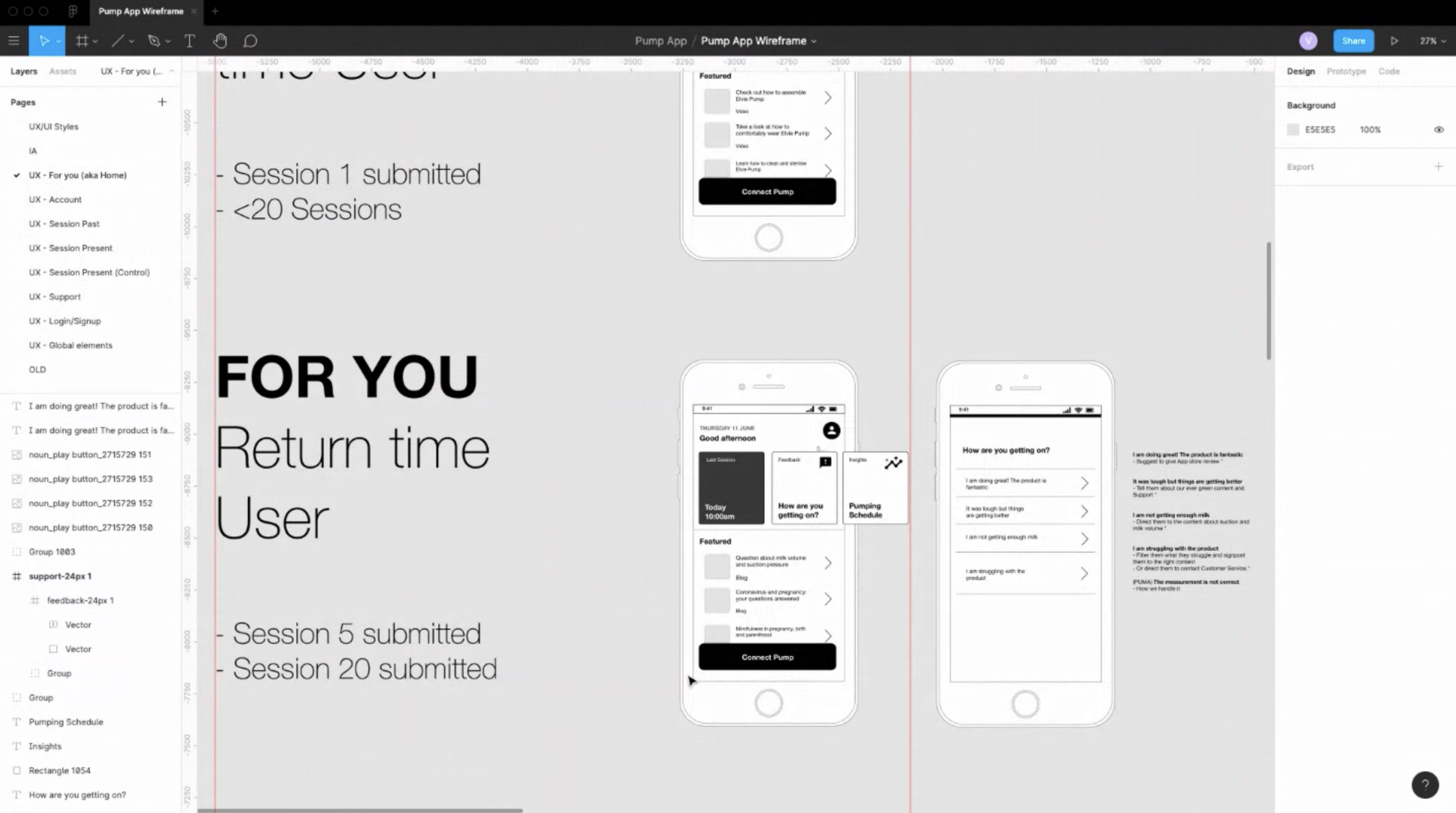
Home - IA and UX Wireframe proposals
2. Concept Development & Wireframing
I held regular review sessions with the Product Owners and broader team to refine the app’s information architecture, ensuring the Home and Controls screens addressed key usability challenges.
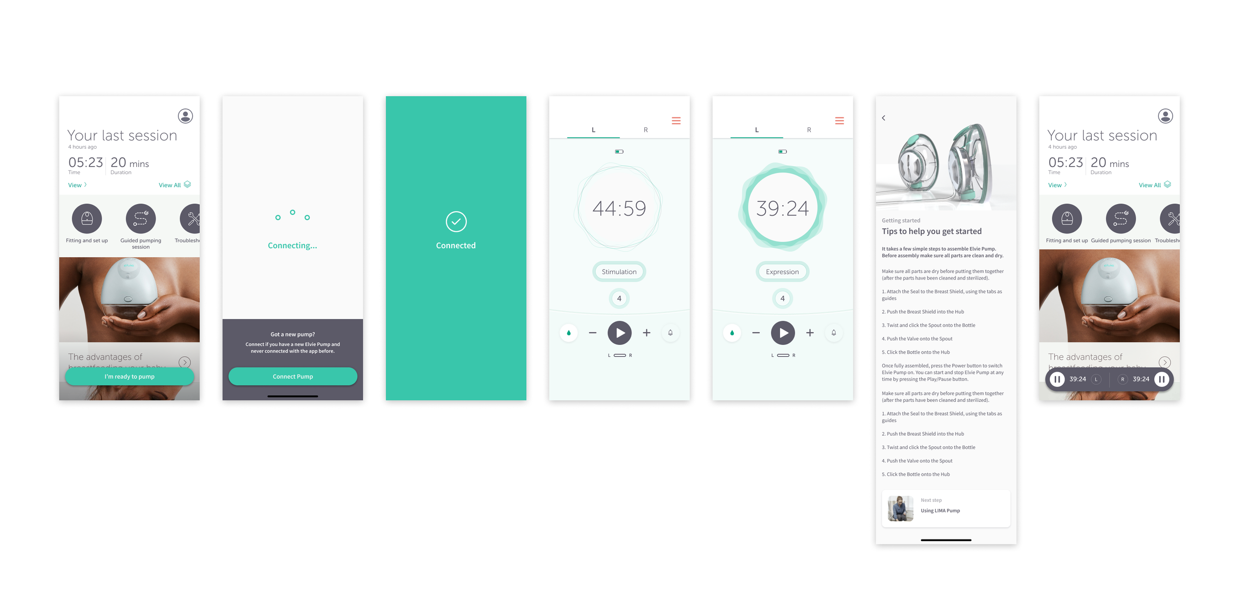
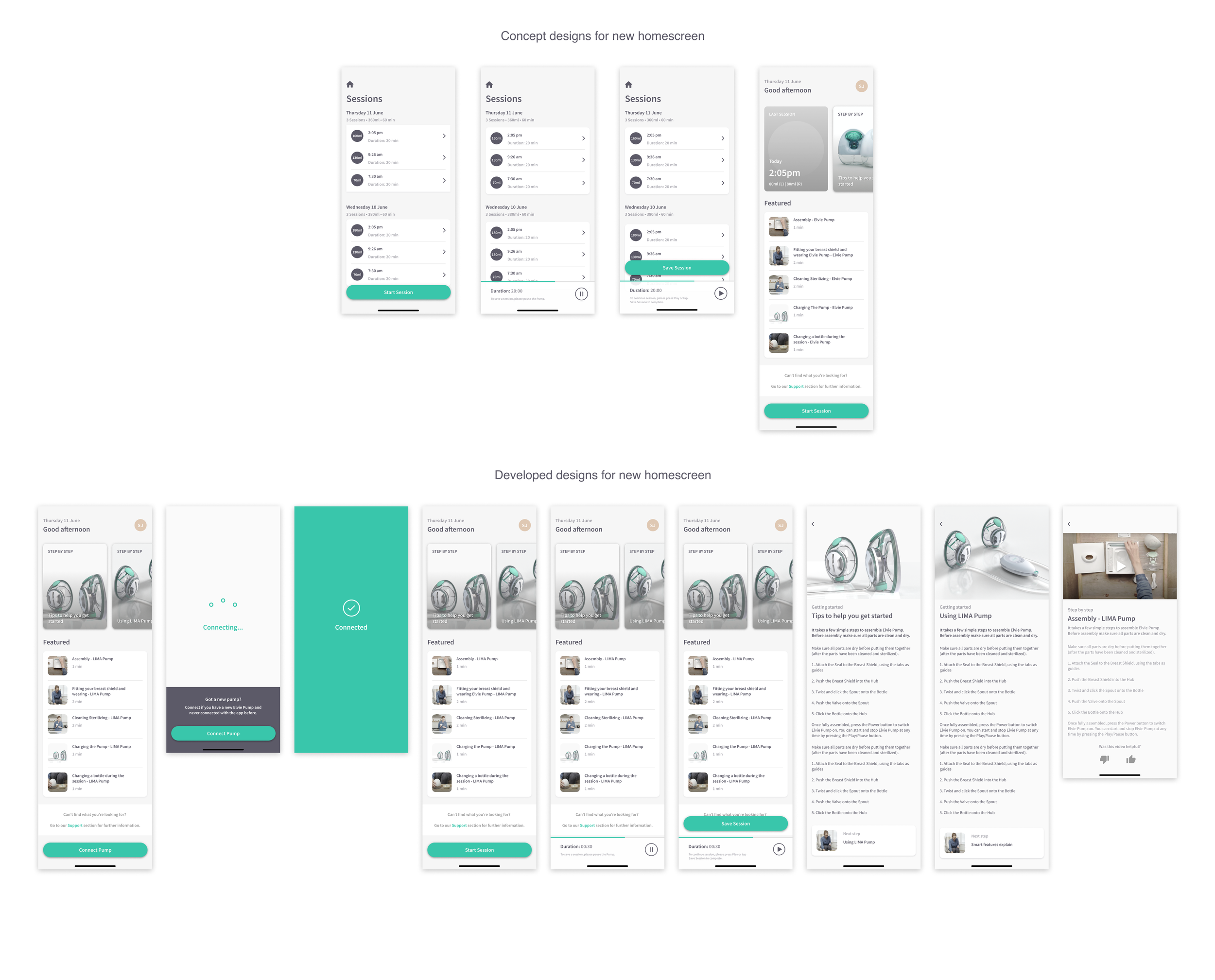
🏠 Home Screen Enhancements
• Improved onboarding flow to guide new users through pump setup more seamlessly.
• Refreshed UI design to align better with Elvie’s evolving product ecosystem.
• Surfaced educational content and step-by-step guides at relevant moments.
• Provided direct access to pump controls from the Home screen, allowing users to easily pause or switch modes while exploring other app content (e.g., reading articles).
🕹 Controls Screen Enhancements
• Simplified navigation to reduce cognitive overload.
• Redesigned mode indicators for clearer distinction between Stimulation & Expression.
Mockups:
I regularly reviewed wireframes with Product Owners and internal stakeholders to maintain alignment. Once well-defined, I developed mid- and high-fidelity mockups, integrating feedback to ensure the final designs were clear, structured, and ready for prototyping and user testing.
3. Prototyping & User Testing
The controls screen was more complex due to its extensive functionality. While the functionality itself worked well, the interface appeared busy and cluttered, and users were often unclear about the meaning of the droplet icons for ‘Expression’ and ‘Stimulation’ modes.
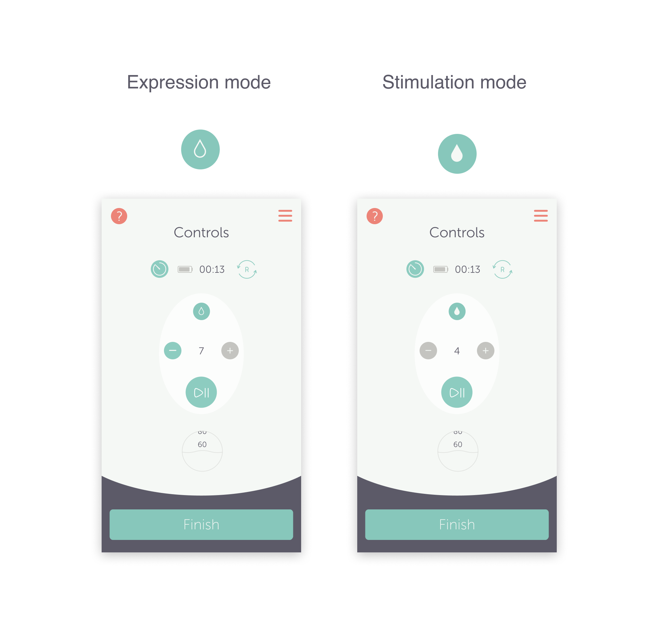
User feedback indicated that many users were unsure which mode they were in and did not understand the difference between these modes.
I recognised that clarifying this was a crucial aspect of the redesign, and it became a key focus when gathering further user feedback on the new designs.
I developed concepts aimed at making the session start more obvious to the user, clearly indicating which mode the pump was in, and enhancing the overall user experience to make it more enjoyable.
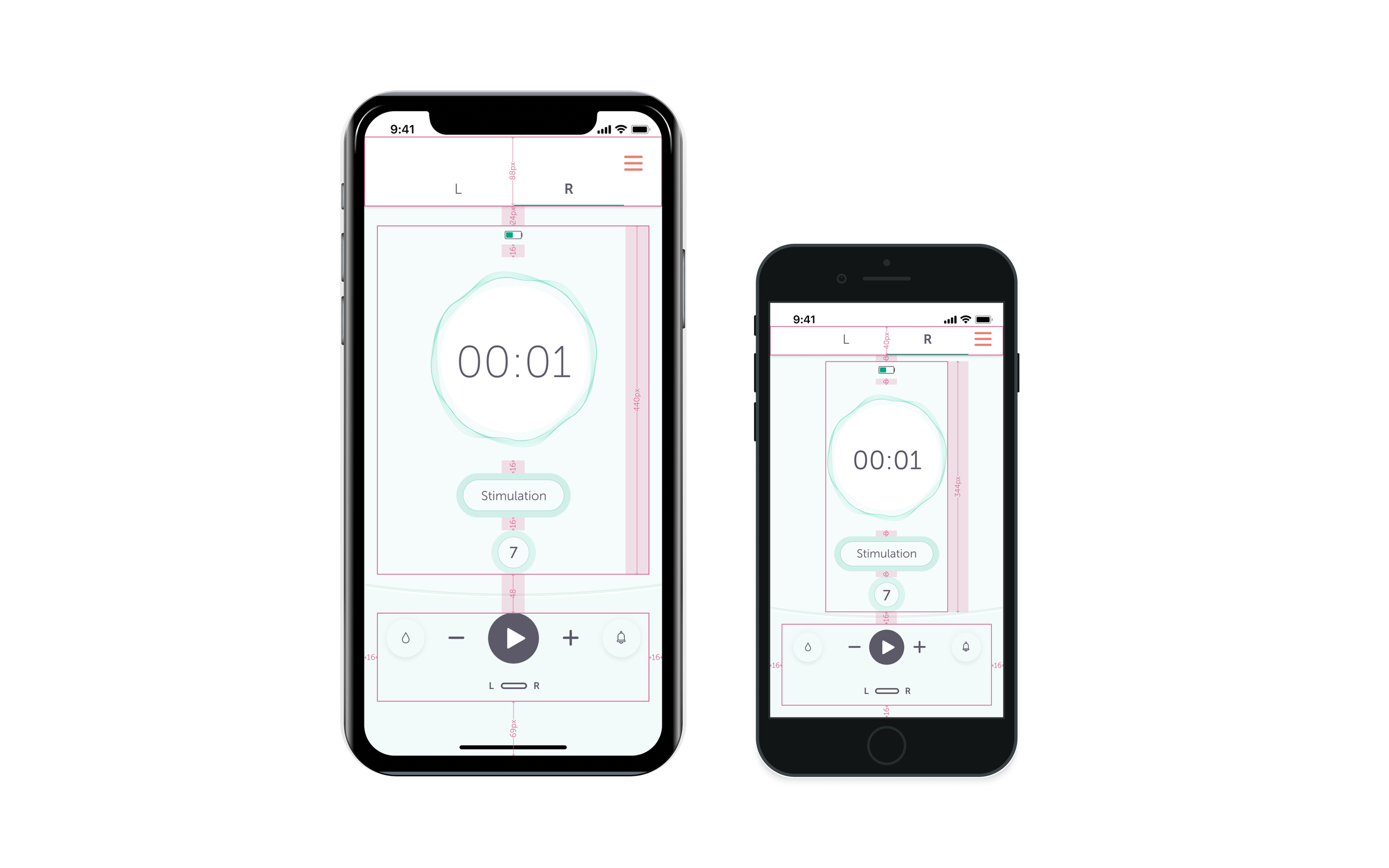
Placement & Layout Refinements
To establish a clearer visual hierarchy, I redesigned the layout for key elements, including:
The mode button
Intensity controls (+ and - icons)
Side switch
Play/Pause button
Timer (not featured on the Pump hardware)
Milk volume display (ml or oz)
Battery level indicator
Close modal
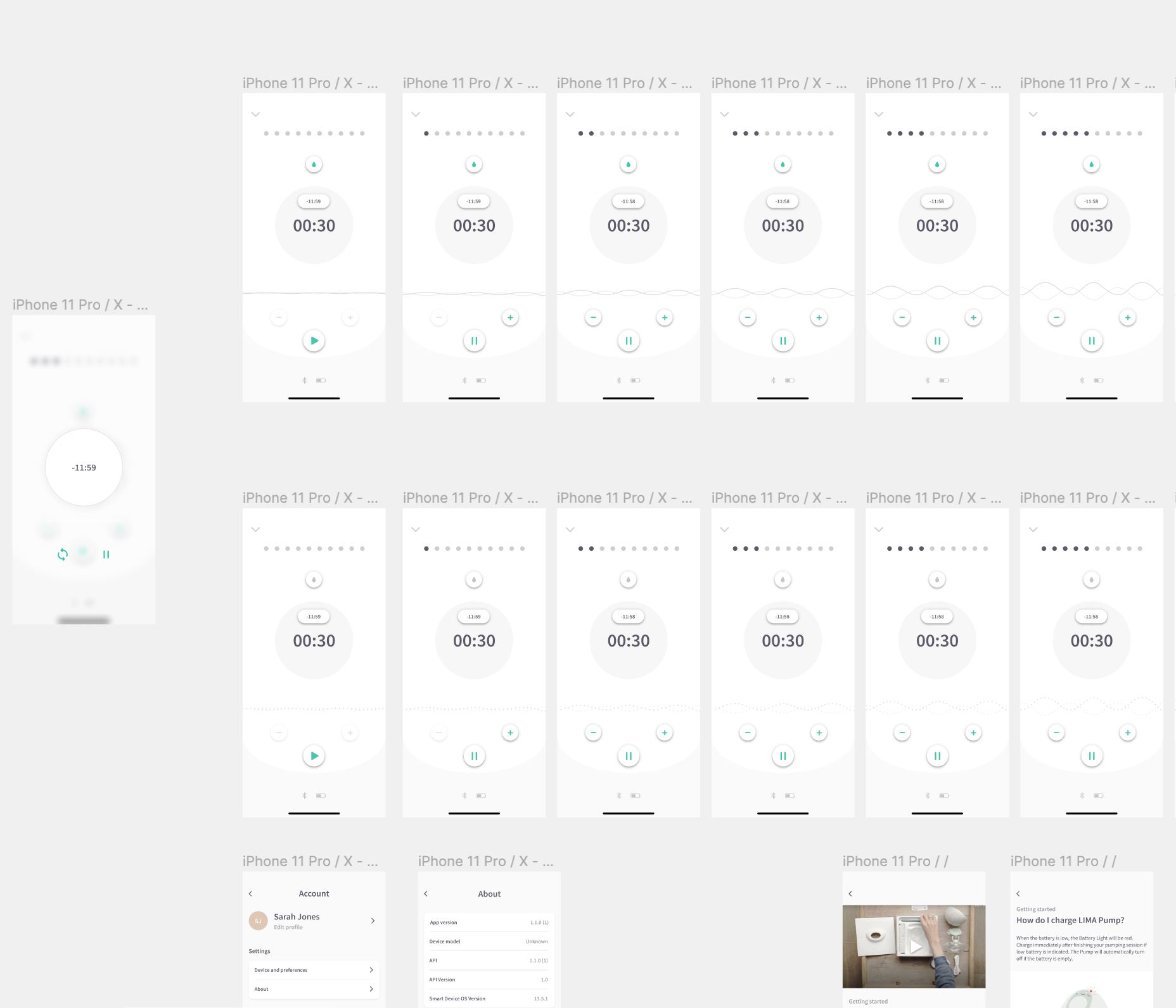
I also introduced a tabbed display to separate left and right pump controls instead of displaying both on a single screen. This significantly reduced cognitive load and made navigation more intuitive.
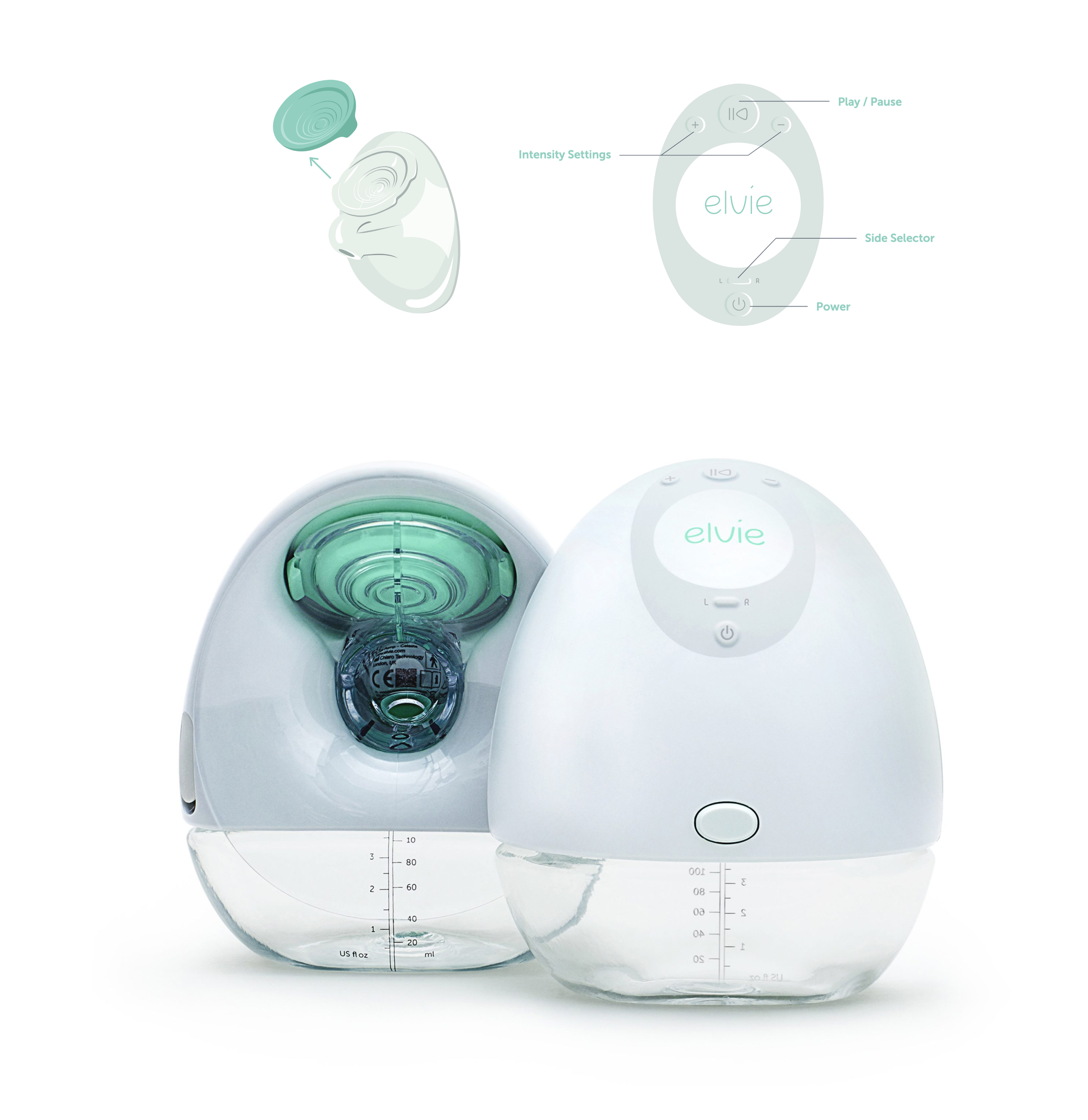
Product-Hardware Alignment:
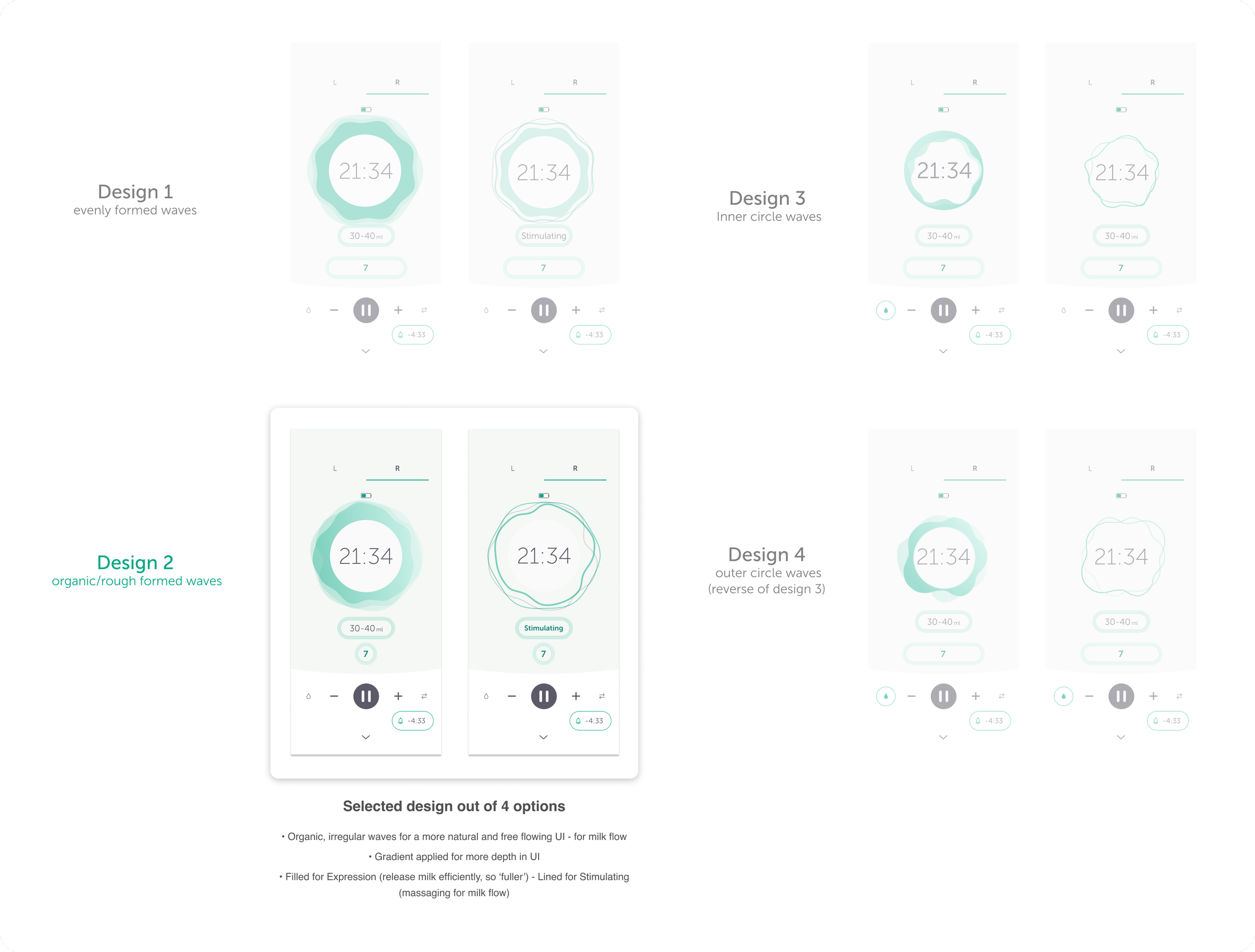
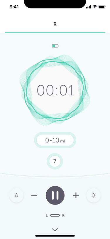
To align the app interface closely with the product hardware (Elvie Pump), I maintained and designed familiar controls, such as play, pause, intensity settings (+ and -), and the left and right pump switch. Inspired by the ‘breast seal’ (teal-colored cap), I translated the pump’s intensity levels into a visual representation within the UI, incorporating the concept of sound/suction waves.
Prototyping the animation
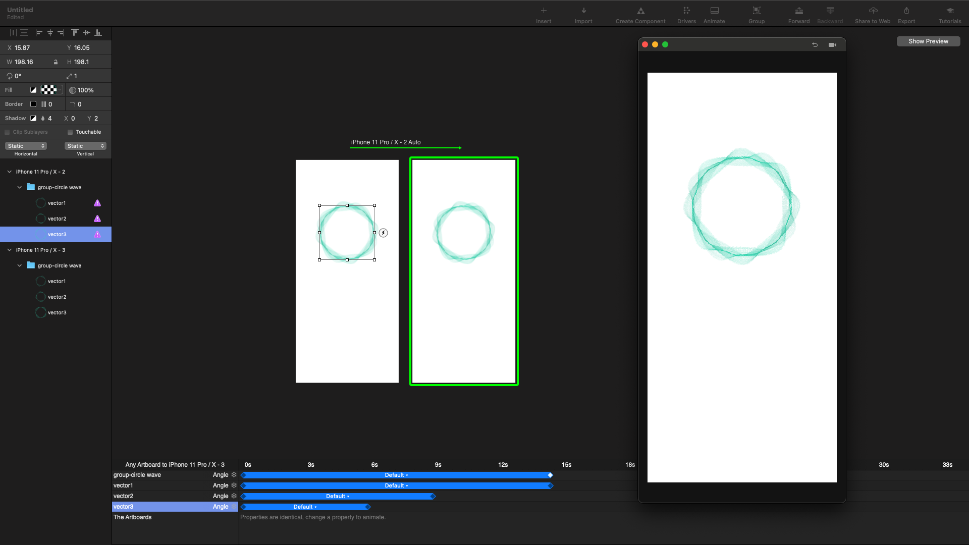
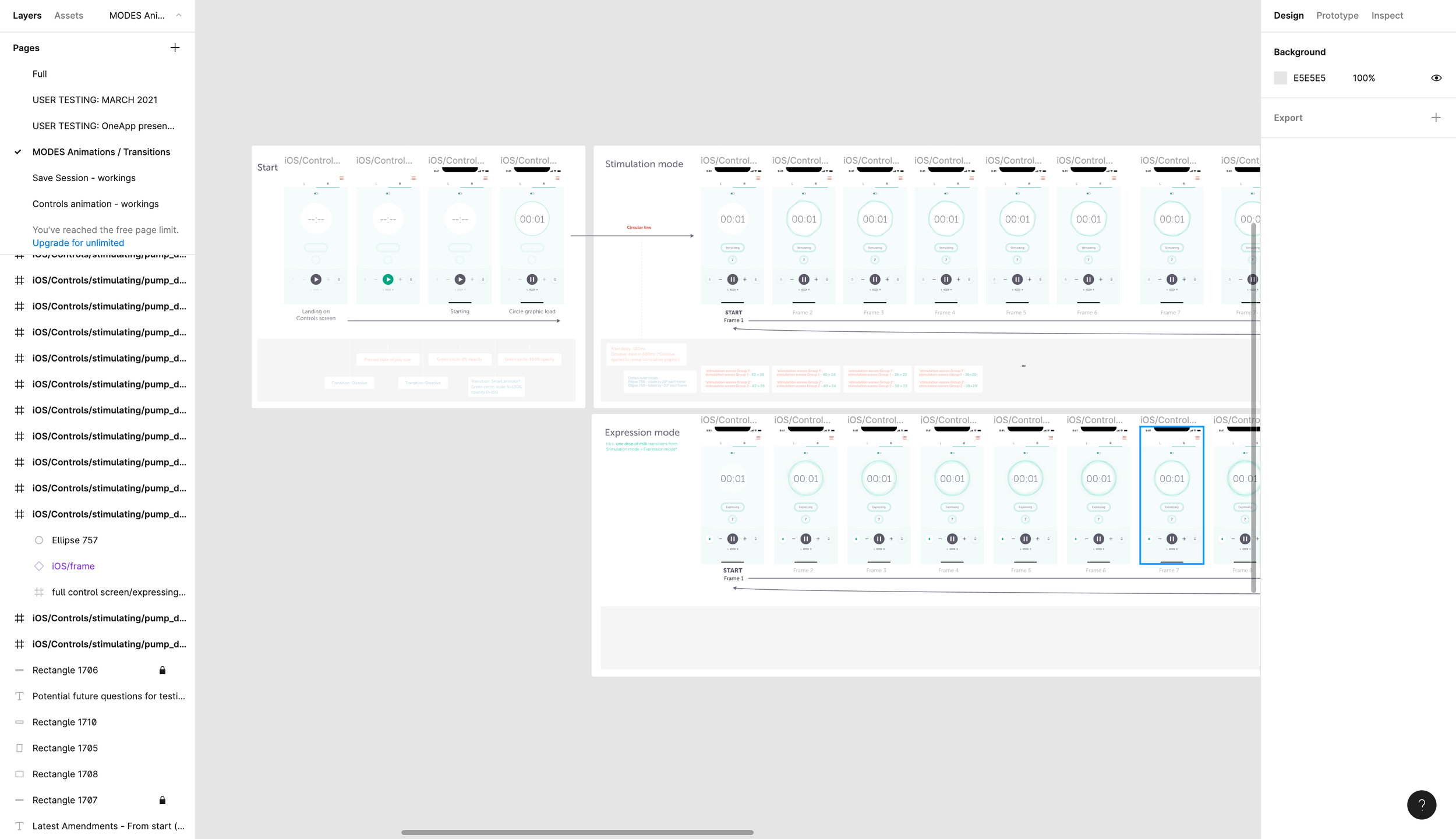
To improve clarity, I explored three animation concepts that visually reinforced pump mode changes.
These concepts aimed to:
✔ Clearly indicate transitions between modes to reduce confusion.
✔ Enhance intuitiveness by visually representing suction and flow states.
✔ Align animations with real-world pump behavior to create a more natural experience.
First Animation Concept (Initial Attempt)
• Used subtle rotary movement to indicate suction strength.
• Feedback: Users liked the subtlety and effect but wasn’t sure on the movement/animation style.
Second Animation Concept (Refined Approach)
• Introduced a zoom in/out pulsating effect to better convey suction changes.
• Feedback: Some users found this effect too intense and preferred a softer, more gradual animation.
Third Animation Concept
• Introduced a gentler, slower zoom effect, reducing animation intensity.
• Feedback: Users found this approach calmer and more natural, though some still preferred an even more ‘subtle’ animation.
Final Animation Concept
Based on user feedback preferring calming and natural transitions, I refined the animation by slowing down the speed and softening the wave movement.
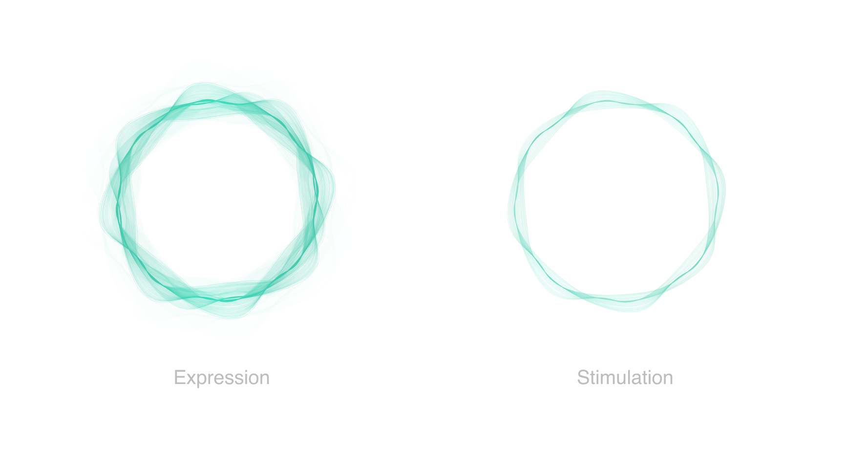
Mode differentiation: Stimulation mode featured a smaller, more subtle wave spread, while Expression mode had a bolder, more pronounced wave spread.
Additional clarity: When switching modes using the button, text labels “Stimulating” or “Expressing” were displayed to reinforce the visual change.
4. Iteration & Development Support
After implementing feedback, I worked closely with developers to ensure the designs were accurately translated into the final app. This included:
Creating animations for stimulation/expression modes using Principle for Mac.
Managing design systems for consistency.
Refining small UI elements based on final user testing insights.
Ensuring the components on the controls screen adapted responsively across different device sizes.
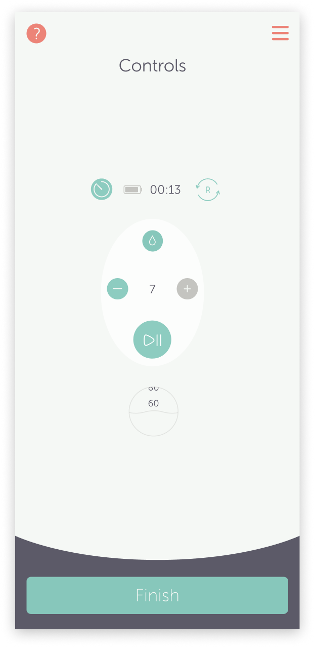
Before…
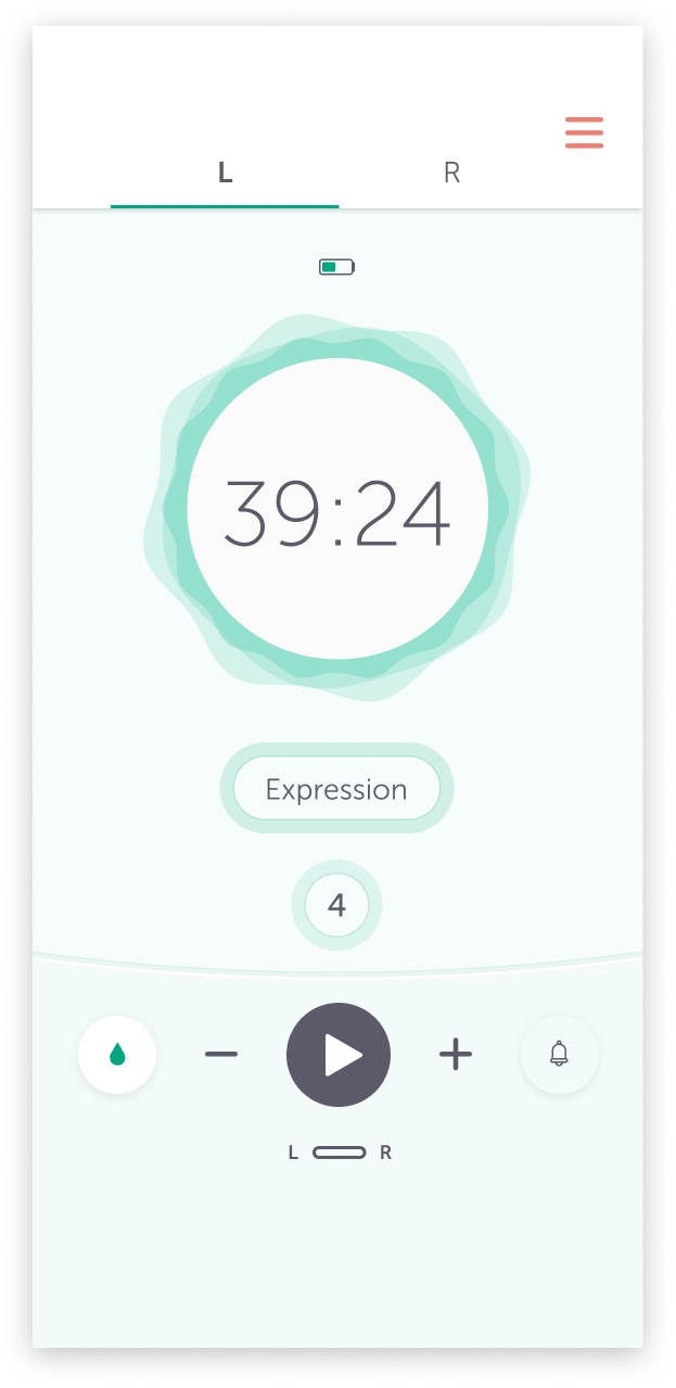
After!
User Testing & Design Validation
After refining the initial designs, I joined the User Researchers to conduct in person, moderated user feedback sessions. I observed how users interacted with the prototype and took notes, while the User Researcher facilitated the sessions, asked questions and led the testing in person.
Overall, the feedback was positive! There were several useful and constructive insights regarding the UI and features on the controls screen. Most of the questions revolved around the iconography, specifically the droplet icons for stimulation and expression modes.
Once we gathered the feedback, the User Researcher compiled the findings and provided a detailed list to me and the Product Owner. Following a brief break from designing to participate in the user research, I revisited the home screen designs with a fresh perspective and collaborated with other designers to gather additional feedback and input.
Key Improvements & Outcomes
Home Screen Enhancements:
✔ More intuitive onboarding: Users completed setup more smoothly, with fewer errors in usability tests.
✔ Relevant content surfaced at the right time: Users accessed setup guides and FAQs more frequently, reducing frustration.
✔ Updated UI for clarity & engagement: The modernised interface provided a fresher, more consistent experience.
Controls Screen Enhancements:
✔ Reduced cognitive load: The tabbed layout for left/right pumps made navigation significantly easier.
✔ Clearer pump modes: Usability tests showed that users could identify stimulation vs. expression mode more quickly.
✔ More intuitive adjustments: Users required fewer steps to modify suction levels, improving efficiency.
Final Impact
Results from user testing and analytics showed:
📈 30% Faster Setup – Users completed setup more quickly, with fewer errors.
💪 Confidence increased from 51% to 94% – Users reported feeling significantly more confident adjusting pump settings.
🚀 25% Fewer Steps – The new tabbed layout on the controls screen UI streamlined navigation, making interactions smoother and more intuitive.
📉 62% Reduction in Support Enquiries – Customer support received significantly fewer enquiries related to pump mode confusion, demonstrating improved design clarity.
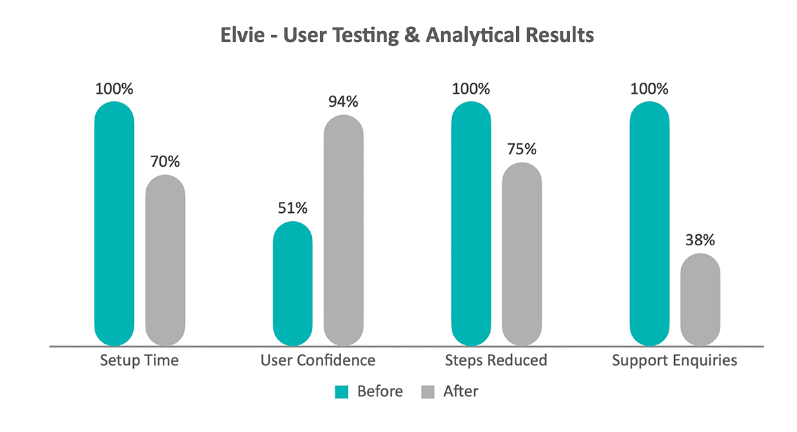
All ‘before’ values are normalised to 100 as the baseline for percentage reduction comparisons.
Evidence & validation
Metrics are based on in person, moderated usability testing conducted in collaboration with User Researchers, alongside post task confidence scoring and customer support trend analysis during the Elvie pump controls redesign. Results reflect comparative before/after insights gathered across iterative design releases.
Key Contributions and Learnings
During this project, I:
Advocated for user needs by ensuring research findings informed design decisions, leading to a more intuitive experience.
Simplified complex interactions by reducing cognitive load and clarifying visual hierarchy in the Controls screen.
Enhanced accessibility by refining contrast, iconography, and mode indicators to create a more inclusive experience.
Designed responsive UI components to ensure seamless functionality across multiple device sizes, including smaller devices.
Developed high-fidelity wireframes at speed to support agile iteration cycles and testing.
Created animations in Principle for Mac to visually communicate pump mode transitions more effectively.
Worked closely with developers to ensure pixel-perfect implementation of designs.
Fostered collaboration by aligning stakeholders across research, engineering, and product teams to deliver a user-centered outcome.