In the first few months of joining Touch Surgery, I was presented with an incredible opportunity: to help redesign and rebuild the app from the ground up. This was a major project and an exciting challenge.
The existing app was somewhat outdated and had originally been developed to showcase the surgical animation content available at the time. It had been designed by just one or two designers and built by a small team of animators during the company’s early start-up phase.
As the app’s user base grew, it became clear that a refresh was needed to accommodate the increasing demand and to unlock its full potential.
What Were the Problems?
High Drop-Off Rate
It was observed that many users were abandoning the app at various stages, particularly when starting or loading a ‘simulation’.
Misalignment with Native Guidelines
The app did not conform to the Material Design guidelines for Android or the Apple Human Interface Guidelines for iOS, resulting in two inconsistent and unclear user experiences.
Frequent Bugs and Crashes
At the time, the app was plagued by numerous bugs and frequent crashes, frustrating our users.
Lack of Consistency and Usability
The app lacked consistency, visual appeal, and functional usability.
Low Engagement
It wasn’t as engaging or enjoyable as it could have been as a learning tool.
Poor Multi-Device Functionality
The app did not perform well across different devices.
It was evident that the app’s performance and maintainability had reached a critical point, and significant improvements were necessary.
Our ultimate goal was to deliver an enhanced, engaging, and enjoyable app experience for our users, supported by a modern codebase with far fewer crashes and bug reports.
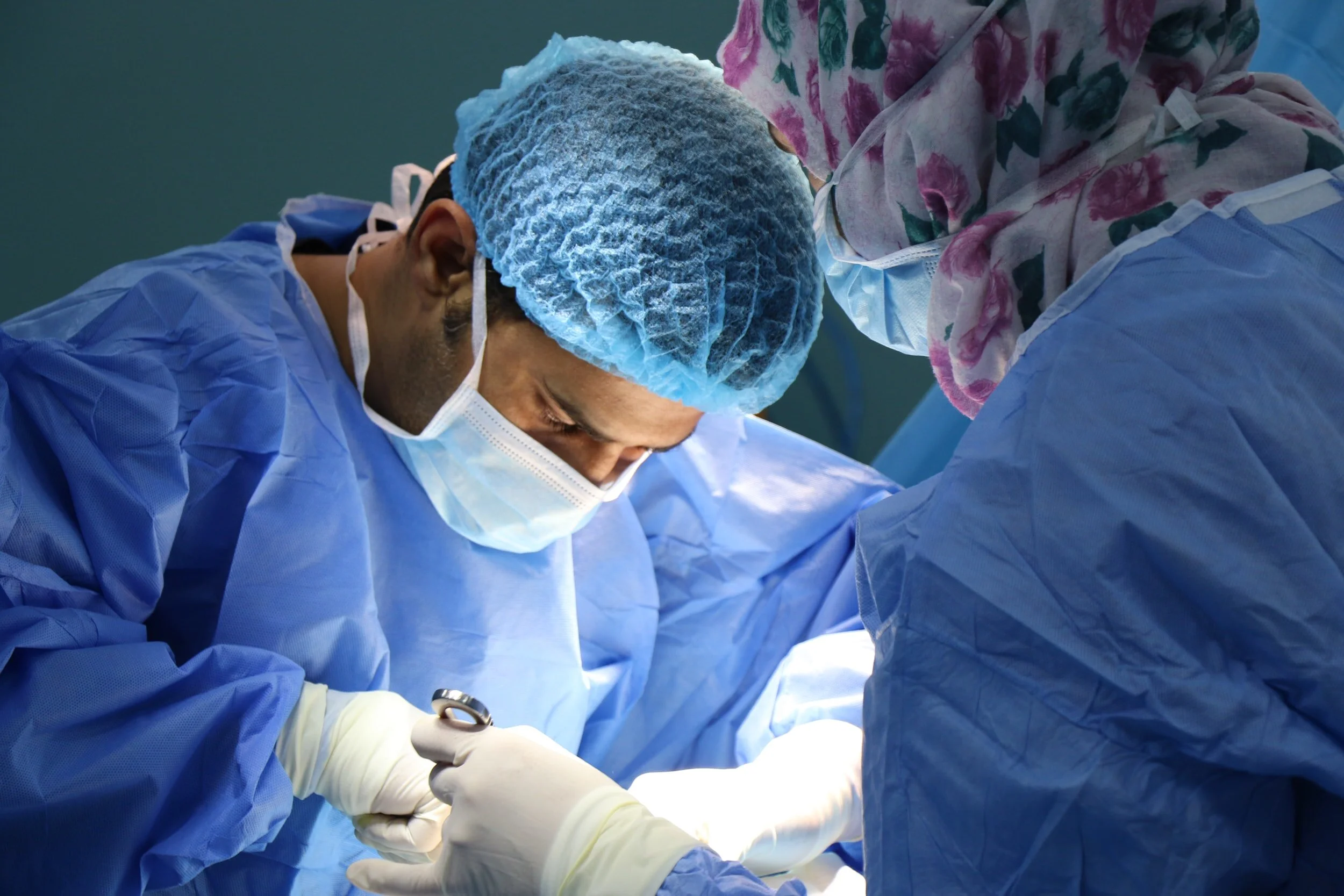
Resident surgeons are hard at work to learn surgical procedures whenever possible, inside and outside the OR.
Project Objectives
I wanted to ensure that the Touch Surgery app experience would be as helpful and convenient to use for surgeons, anytime and anywhere they needed.
Enhancing the App Experience for Surgeons
My primary goal was to ensure that the Touch Surgery app would be as helpful and convenient as possible for surgeons, accessible anytime and anywhere they needed it.
Refreshing and Updating the App
The app had significant room for improvement, and new features were needed to create a more engaging and enjoyable learning experience.
Enabling Offline Content Access
Recognising the challenges of loading surgical simulation (video animation) content within hospital environments, we knew it was essential to allow content to be downloaded for offline use.
Establishing a Consistent UI and Tone of Voice
I proposed enhancing the UI to address inconsistencies across different pages. The tone of voice also needed updating to better reflect the brand, ensuring clear and confident communication with users.
Creating an Enjoyable Learning Experience
The goal was to make the app a cleaner, simpler, and more enjoyable tool for learning.
Minimising Cognitive Load
This involved removing any unnecessary features, rethinking the potential of required features, and focusing on what the user base truly needed from the app.
Improving the Codebase
The code needed to be rewritten by developers to resolve existing issues, such as crashes, language inconsistencies, and various bugs.
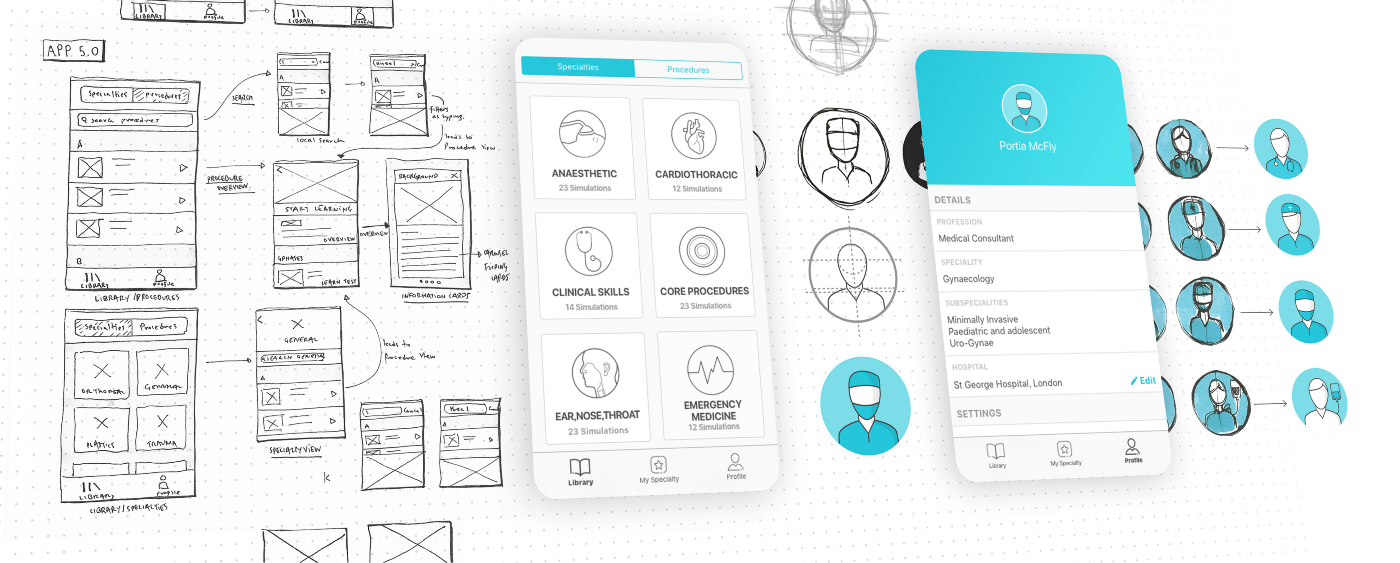
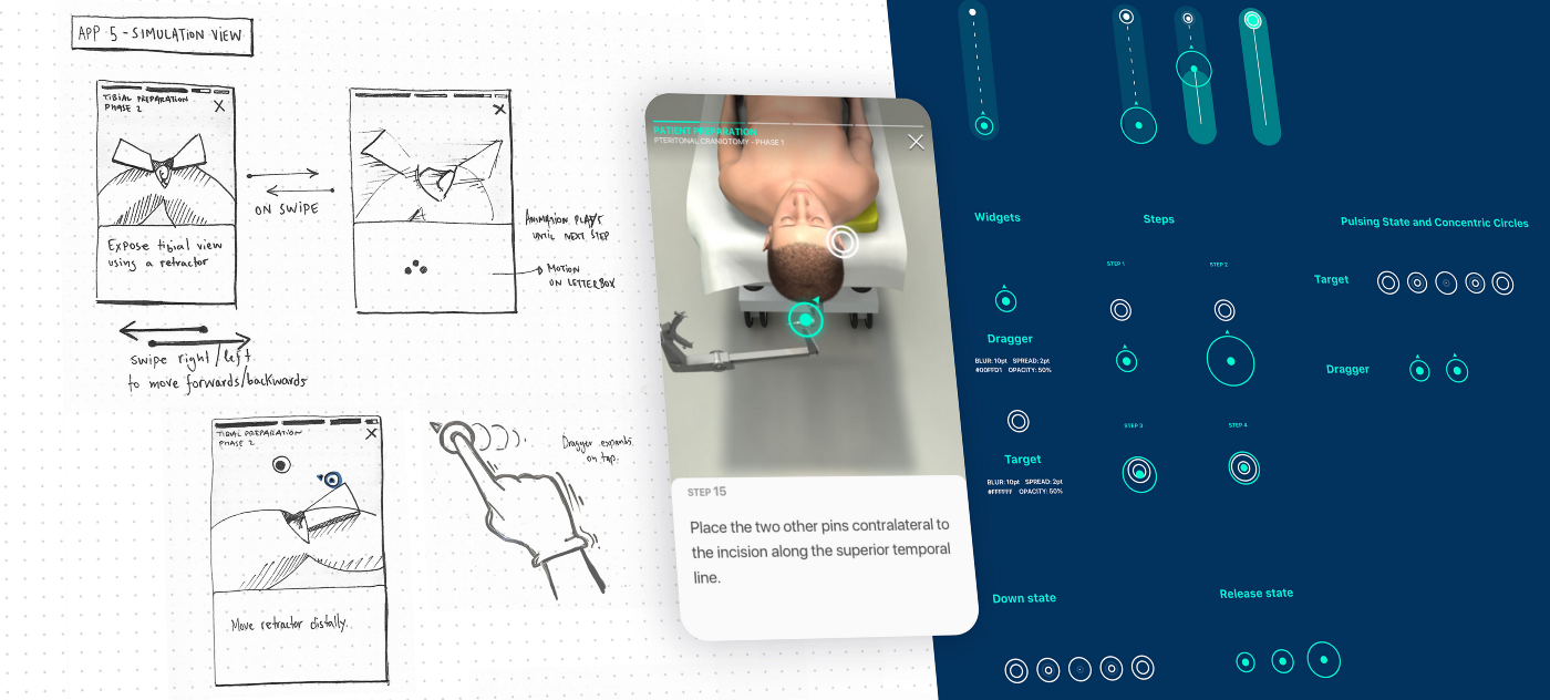
Design process: from sketches, to wireframes, to mockups…
The Project Experience
Throughout this project, my responsibilities included:
Collaborating with the User Researcher to conduct user testing on various features.
Developing, refining, and testing wireframes and user journeys as needed, while adhering to the set timelines.
Creating both low and high-fidelity prototypes.
Testing low-fidelity prototypes and gathering feedback as frequently as necessary, with high-fidelity designs being developed in later stages.
Staying updated with Product Owners on data, metric analysis, and Monthly Active Users (MAUs).
Keeping engineers informed and presenting them with upcoming features and designs.
Delivering fast and efficient designs that were ready for development and implementation.
Assisting other team members (designers) with the UI elements in their proposed wireframes.
Creating and maintaining style guides for UI across different devices.
Providing engineers with necessary icons, assets, and design direction (such as icons, PNGs, SVGs, spacing, and alignment queries) whenever required.
Based on the Product Owner’s insights and direction, along with a thorough understanding of existing app feedback, I focused on identifying the key problem areas and potential opportunities for improvement.
The project involved an iterative design process, encompassing user journeys, research, user flows, feedback and testing, wireframes, and the development of future style guides for Designers and Developers across both Android and iOS platforms.
In an Agile environment, I worked closely with the team to prioritise the features for development during the design sprints.
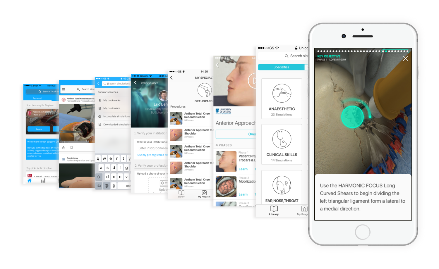
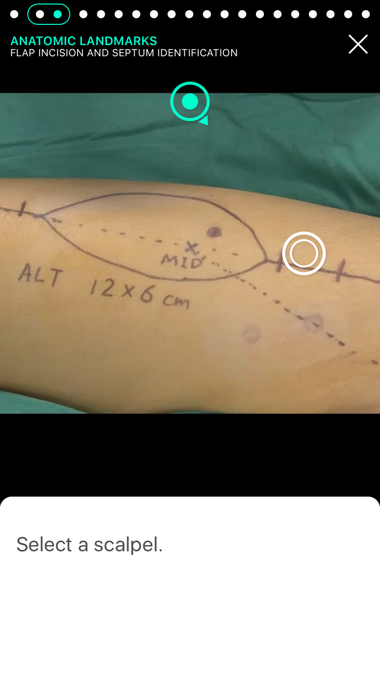
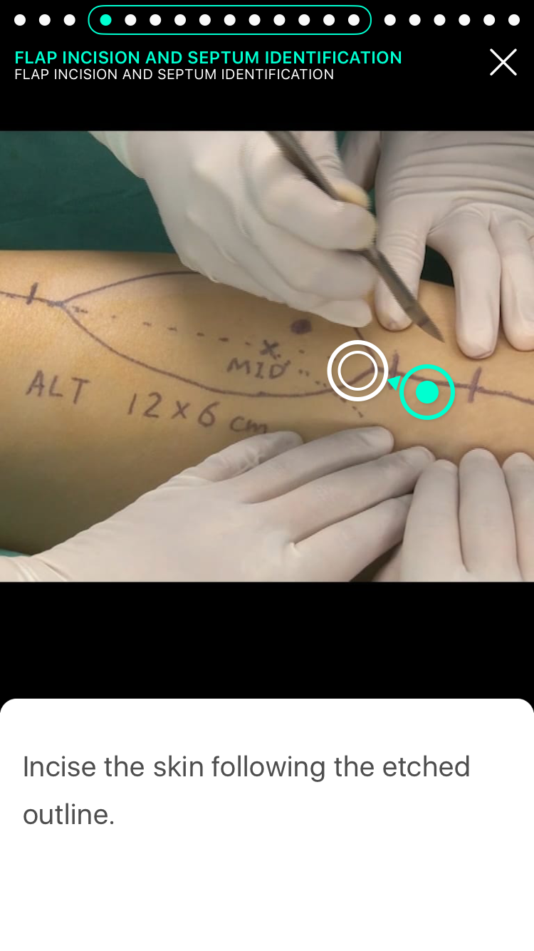
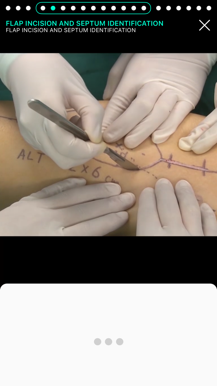
The Touch Surgery App Evolution - from old to new
Testing and Action Points
During the app redesign, it was essential to gather feedback and conduct testing whenever possible, especially in a fast-paced development environment.
Proposed features were explored, reviewed, and incorporated into prototypes, which were then tested with users as soon as they became available. In some cases, we had the opportunity to visit resident students and surgeons in hospitals around London to gather direct, face-to-face feedback from our target audience. This allowed me to test and analyse users’ experiences with the new designs and identify areas for improvement.
The main objective was to determine whether the designs were helpful, intuitive, and easy to understand, and to identify any points where users felt uncertain or confused. Some of the most valuable feedback came from observing where users hesitated, listening to their comments during testing sessions, and assessing whether they found the app quick and straightforward to use.
Outcome
Since the launch of the new app, the user base had expanded from 100,000 to 2 million, and monthly engagement had increased by 500%.
The app’s curriculums have been adopted by 160 surgical residency programs worldwide, including those at Harvard, Stanford Medicine, Johns Hopkins, and Mt Sinai Health System.
As a UI/UX Designer on this project, I contributed to the evolution of the new Touch Surgery app by:
Enhancing the UX and UI throughout the app, ensuring it was intuitive, engaging, and enjoyable to use.
Managing the development of new features, actively listening to suggestions and feedback from developers before each release.
Advocating for user needs, ensuring that all teams understood the importance of user requirements and the reasoning behind design decisions.
Prioritising accessibility, making sure it remained a high priority in the app’s development.
Producing high-fidelity wireframes quickly, crucial for testing and delivering feature releases within short timeframes.
Designing and optimising the app for multiple device sizes, including tablets.
Regularly attending user testing sessions to ensure that designed features were driven primarily by user feedback, creating fundamental and intuitive user experiences.
By actively engaging with the surgical community and collaborating closely with various teams across the company, the design team and I significantly increased user engagement compared to the previous version of the app, and vastly improved the overall learning experience for users.
Old version of the Touch Surgery app
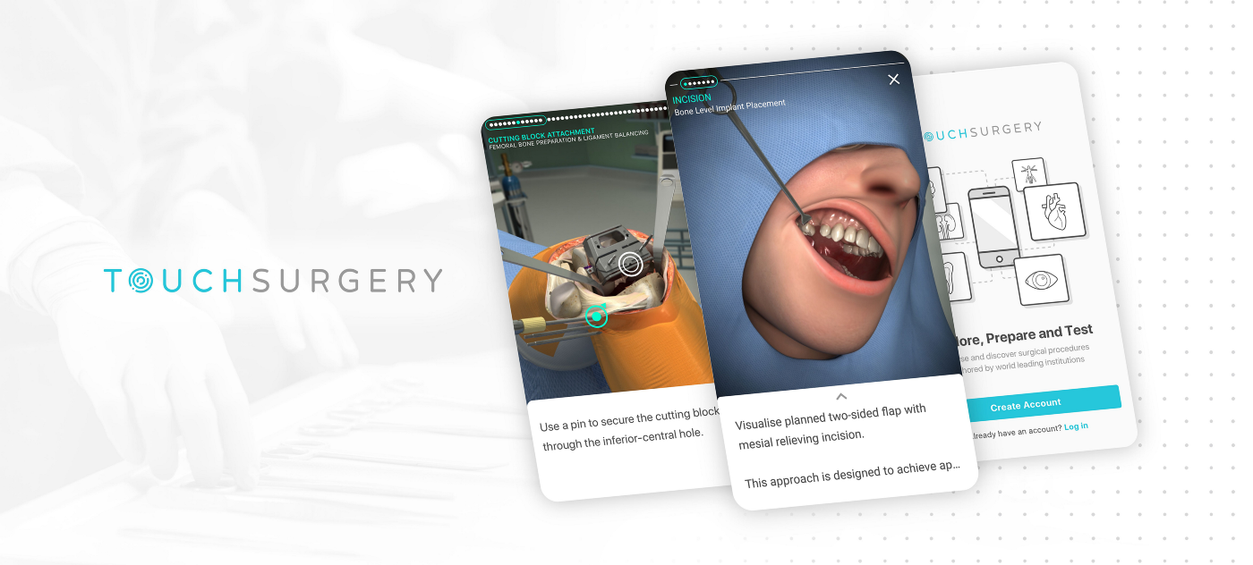
Latest version of the Touch Surgery app