Overview
As a Product Designer at Elvie, I was tasked with optimising the website’s navigation to enhance user engagement, streamline the e-commerce experience, and make the site mobile-first.
With new product lines launching, ensuring that our information architecture stayed up to date while meeting user needs became crucial. I led the redesign of the website navigation to address these challenges, aiming to improve both usability and accessibility.
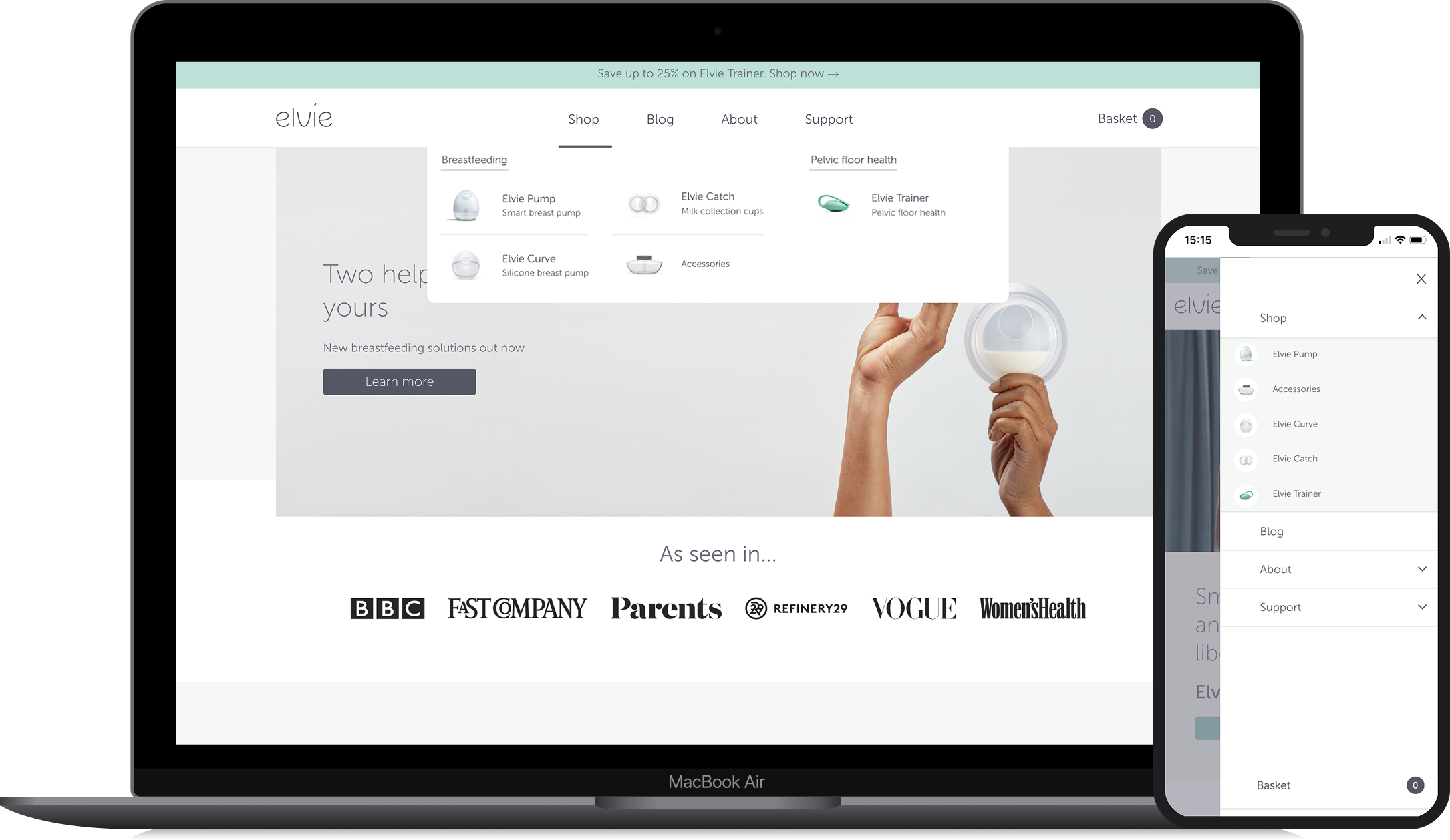
Original Website Navigation
User Research & Insights
Before making design changes, I conducted usability testing to observe how users interacted with the website. Key activities included:
Tracking user interactions (e.g., mouse movements, clicks, hesitation points) to identify usability issues.
Analysing user behaviour patterns to understand how customers browsed and purchased Elvie products.
Gaining insights into navigation pain points that contributed to drop-offs or friction in the user journey.
Conducted competitor research on e-commerce sites offering similar hardware/wearable products with Bluetooth connectivity to identify best practices, information architecture strategies, and usability trends.
User testing and gaining valuable insights into how users interact with the website - Seeing users’ behaviour for shopping Elvie products online.
Tracking user interactions (e.g. mouse movements, clicks, and hesitation points) to identify usability issues.
Challenges
Complex Navigation
The existing site structure needed improvement to accommodate new products (Elvie Catch, Curve, Stride, and accessories) while maintaining ease of use.
Mobile Usability
With 82% of users accessing the site via mobile, the shopping experience required significant refinement to ensure seamless navigation and usability on smaller screens.
Accessibility Issues
The mobile navigation design featured fine white text on a dark grey background, which (while visually unique) failed WCAG accessibility standards. I highlighted this issue to the team, emphasising the need for an immediate fix to improve readability and compliance.
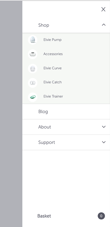
Lack of Imagery and Product Familiarity
The navigation featured unique product names like “Catch,” “Curve,” and “Stride,” which could lead to confusion for users unfamiliar with Elvie’s product range. I identified this gap and suggested incorporating product imagery within the navigation to:
1. Enhance Visual Appeal: Make navigation items more engaging and encourage clicks.
2. Improve Product Recognition: Help users quickly understand each product’s purpose, reducing uncertainty and improving the browsing experience.
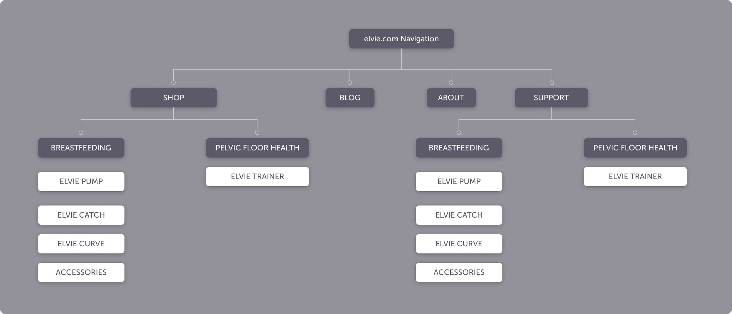
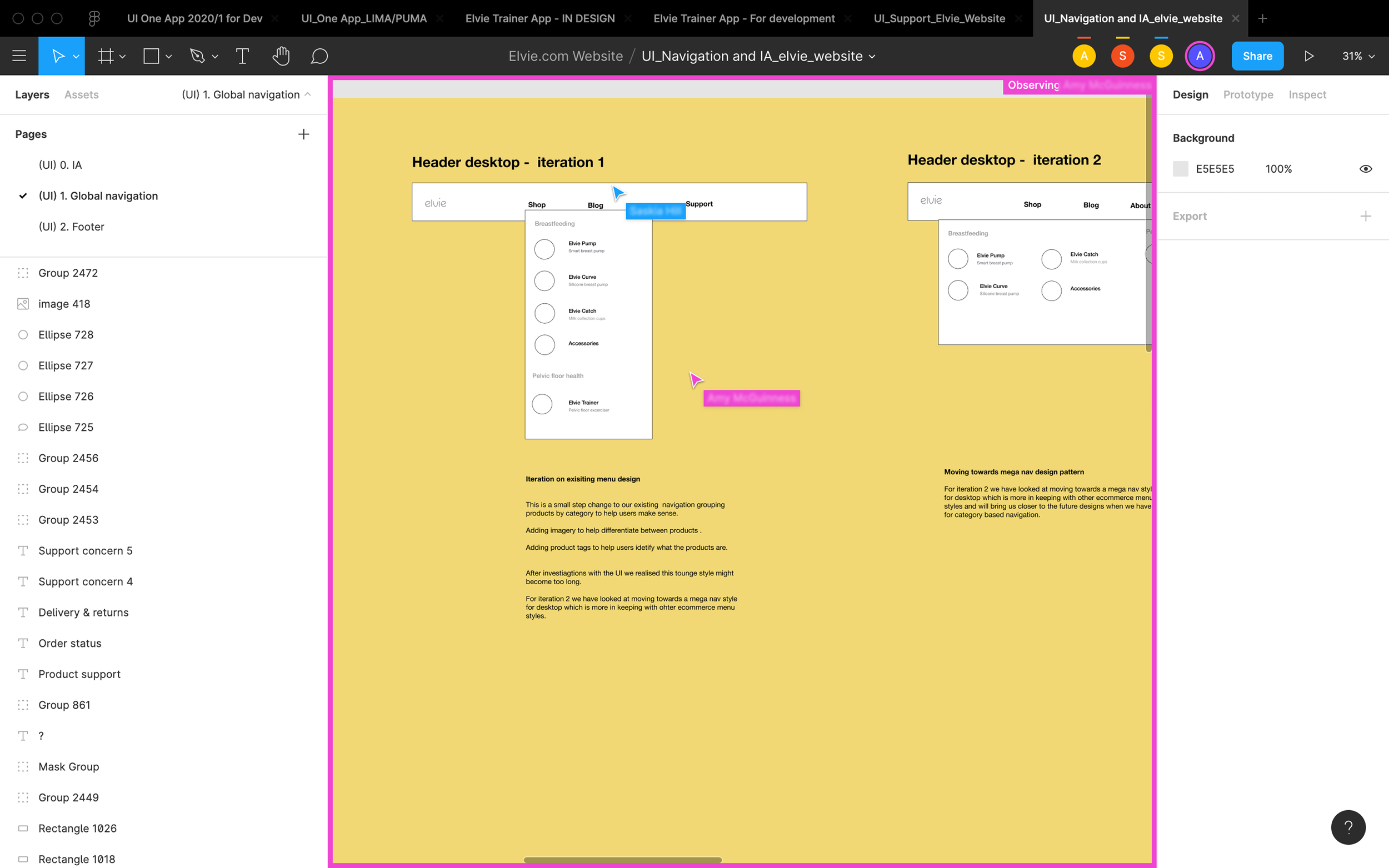
Redesigned Website Navigation Sitemap
Collaboration & Review of Design Concepts
Collaborated with cross-functional teams (including another fellow designer and product owner) in Figma to review navigation concepts and gather feedback.
Iterated on designs based on usability test findings to ensure the navigation was intuitive and scalable.
Validated navigation improvements through user testing before launch.
Collaborating with the team in Figma to review, gather feedback, and refine navigation designs through iterative improvements.
Higher fidelity concepts

Approach
1. Restructured Information Architecture:
I revamped the site’s information architecture to integrate new product categories seamlessly while ensuring an intuitive and scalable navigation structure.
2. Mobile First Design:
Focused on accessibility and usability across devices, optimising for mobile with high contrast elements, touch-friendly UI, and improved performance.
3. Data-Driven Decisions:
Used Google Analytics and insights from user testing to identify pain points and refine navigation flows based on real user behaviour.
4. Cross Functional Collaboration:
Worked closely with developers and the marketing team to ensure design alignment and timely implementation of navigation improvements.
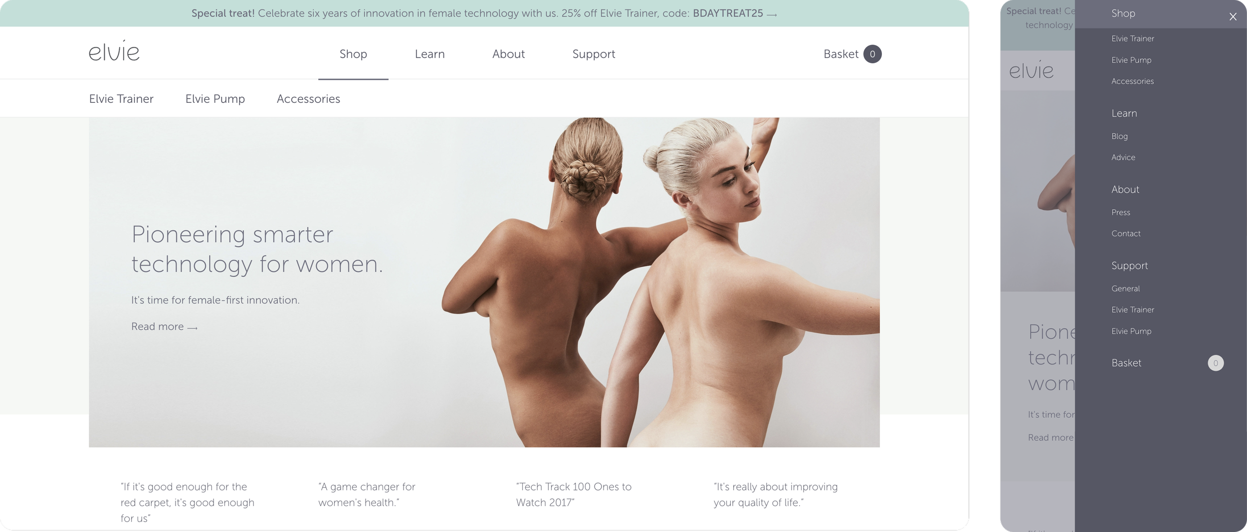
Navigation Redesign – First Iteration (Pre-Launch)
My initial focus was on addressing the accessibility issue with a higher contrast navigation design, ensuring compliance with WCAG guidelines. This quick win improved accessibility immediately without major changes to product layouts.
I prioritised implementing a higher contrast navigation to meet WCAG standards, providing an immediate “quick win” that improved accessibility while supporting the existing product lineup.
The updated navigation was a straightforward solution for the developers to implement, enabling us to address the accessibility issue quickly.
We planned to update the navigation again in the next design iteration, for the official product launch, incorporating the new Elvie Catch, Curve, and Stride products.
Navigation Redesign – Next Iteration (Post-Launch)
Design Implementation Challenges
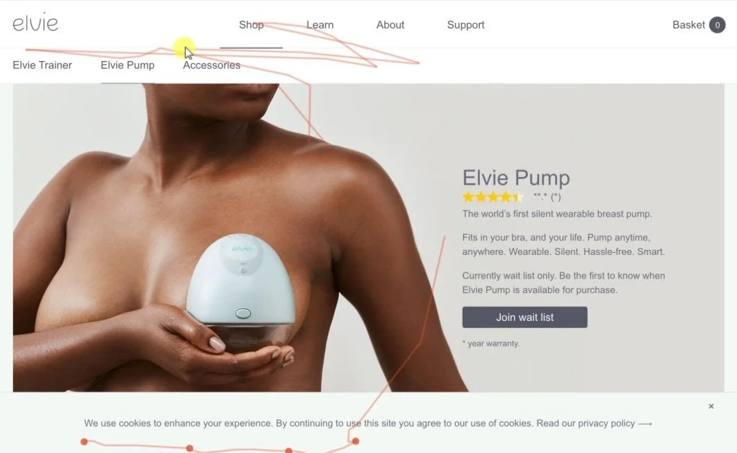
While incorporating product imagery in the navigation was a core element of my design, it was ultimately deprioritised due to performance and CMS constraints.
The development team identified that adding images to the navigation would negatively impact mobile load times, particularly for users with slower connections. Additionally, our CMS presented challenges in embedding dynamic images, which would have required significant development resources and delayed the project timeline.
Given these limitations, we chose to focus on optimisations that could deliver more immediate results, such as enhancing mobile usability and refining product categorisation to improve the overall user experience and conversion rates.

Results & Impact
Increased User Engagement:
Interaction rates with product pages increased by 35%, indicating that users engaged more deeply with content, exploring the site further.
Enhanced Mobile Experience:
Mobile bounce rates decreased by 20%, indicating that the site’s usability improvements helped keep users engaged longer.
Higher Conversion Rates:
Streamlined navigation and improved accessibility contributed to a 15% increase in completed purchases, boosting overall sales and providing a smoother user experience.
Conclusion
Through iterative design, research, and collaboration, I was able to optimise Elvie’s website navigation, enhancing accessibility, usability, and overall user engagement.
Despite initial setbacks, such as the delay in adding product imagery, the redesigned navigation improved mobile usability, reduced bounce rates, and increased conversions by 15%. These enhancements aligned with Elvie’s business goals and set the stage for future iterations based on continuous user feedback and data.
These improvements not only aligned with Elvie’s business objectives but also laid the foundation for future design iterations driven by ongoing user feedback and data analysis.