My Role
Senior Product Designer • Log my Care
Timeline: May - July 2025: approx. 2 months
What the project was
Data privacy in care isn't a nice to have. It's a safeguarding requirement - and the system carers use every day had no way to enforce it properly.
I designed a rota-based access control system for Log my Care, giving homecare providers precise control over which carers can see sensitive service user information and when.
In a sector that relies heavily on agency and temporary staff, the existing binary toggle wasn't enough.
Four access states, time based visit windows and a settings UI built for non technical care managers - designed end to end.
Before
After

Role, Reframe and Scope
Access control wasn't a settings problem…
It was a trust and safeguarding problem disguised as one.
My role was to design a new access control system for homecare providers. One that gave care managers precise control over which carers could see which service user information, and when.
The existing system offered two blunt options: show everyone, or show only assigned carers. For homecare providers working with agency staff, temporary workers and non-care visitors like cleaners, neither option worked.
I owned the access control logic and system design, the Care Office settings UI, the Carer App experience, the UI copy, and the acceptance criteria. I worked embedded in a squad with a PM lead.
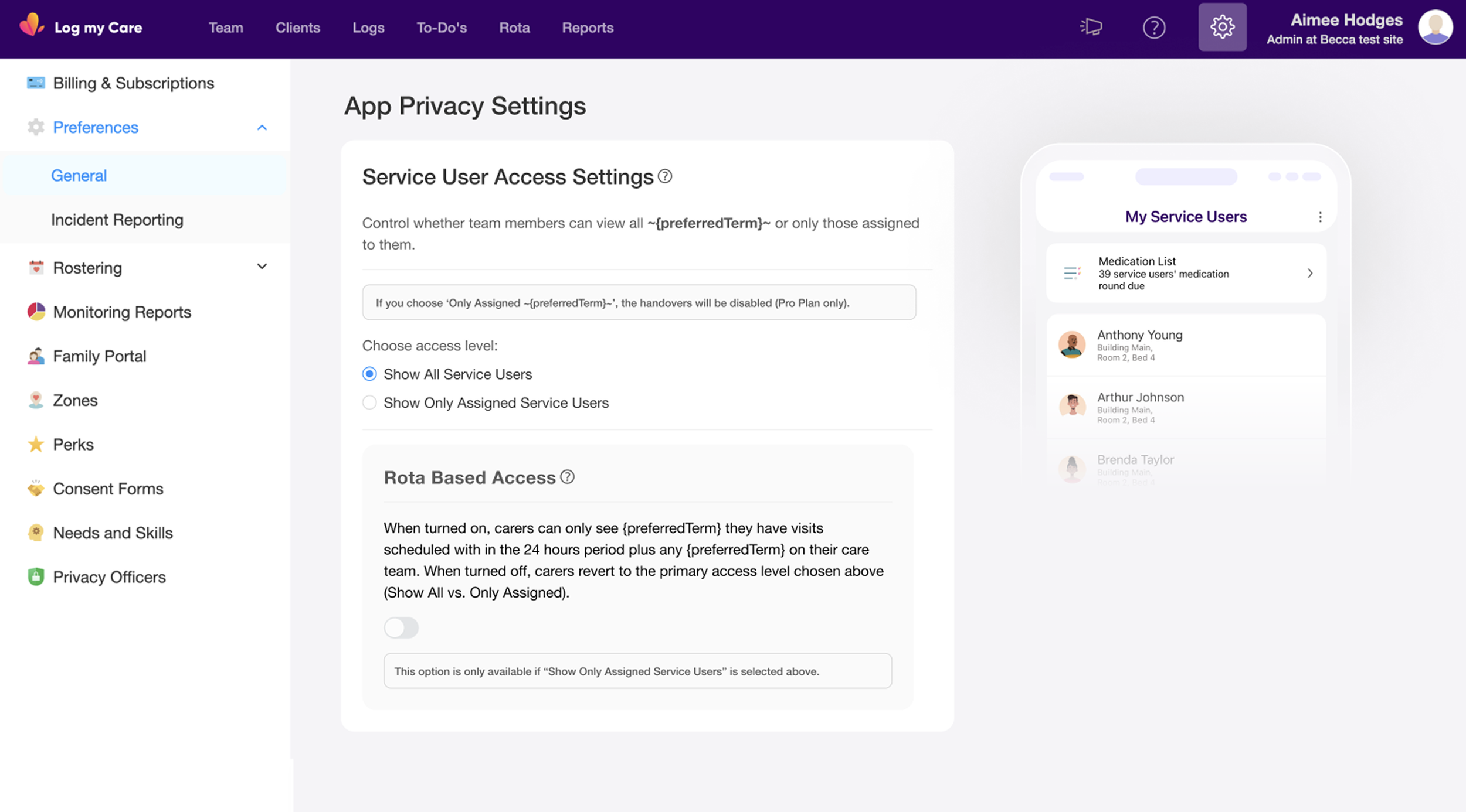
The brief came directly from consistent customer feedback: homecare providers wanted carers to only see service users they were scheduled to visit, within a defined time window. What looked like a toggle feature on the surface required a four-state access model, time based access logic, and UI that care managers with no technical background could actually understand and configure without making mistakes.
Scope
Designed the full four-state access control system from logic through to UI
Owned the Settings page design for both homes with and without rota functionality
Designed the Carer App experience across all four access states (SU tab, Logs, Todos, Rota)
Rewrote UI copy throughout, pushing back on PM suggested technical language that would have made the settings page unusable for non-technical care managers
Defined acceptance criteria across all scenarios and preference combinations
Contributed to key product decisions including zone behaviour, empty states and edge case handling
Context and Challenge
The existing access model was too blunt for how homecare actually works.
Log my Care is used daily by care teams across CQC-regulated UK settings. In homecare specifically, staffing is rarely static. Providers regularly use agency carers, temporary workers and non-care staff (cleaners, meal delivery) alongside permanent care teams. These workers don't need access to a service user's full care profile. In many cases, giving them that access creates a data protection and safeguarding risk.
The existing system gave providers two choices: all carers see all service users, or carers only see service users in their assigned care team. Neither option fit the reality of homecare staffing models.
The gap was specific and consequential:
Permanent carers needed ongoing access to their care team's profiles
Agency carers needed temporary access during a visit window, then nothing
Non-care staff (cleaners, meal delivery) needed to see visit logistics but not care information
No time-based access logic existed anywhere in the system
Providers were being asked to choose between oversharing sensitive data or under equipping their staff. That's not a UX inconvenience. In a regulated environment, it's a compliance and safeguarding exposure.
My Starting Point
The problem was clearly understood. The solution space was not.
When this feature came to me, the customer need was well established - consistent feedback from homecare customers had made the gap obvious. What didn't exist was a coherent model for how to solve it.
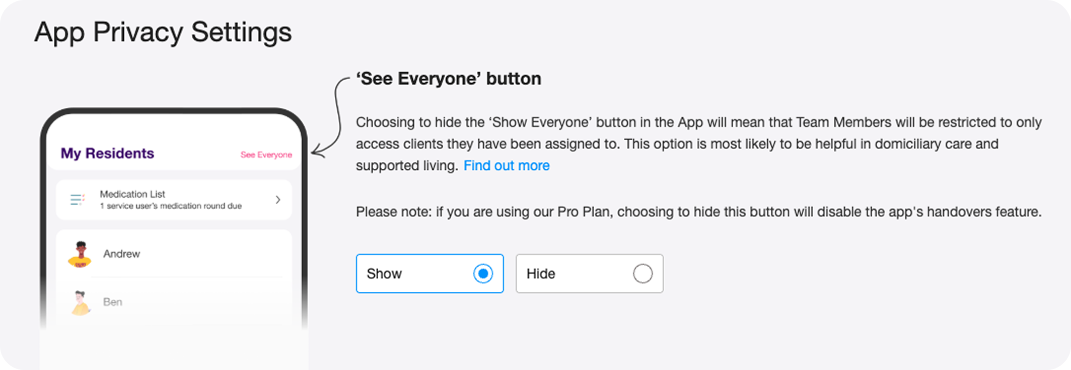
The existing UI was a single binary toggle: Show / Hide the 'See Everyone' button. Blunt, limited, and increasingly inadequate as homecare customers grew as a segment.
The PM brought a technical framing of the new system: four preference states, rota-based time windows, conditional toggle logic. Technically correct. But written and described in a way that mapped to the system architecture rather than to how a care manager thinks about their staff and their access needs.
My starting point was two problems running in parallel.
First: design a four-state access model that was flexible enough to serve genuinely different staffing models without creating confusion.
Second: make that complexity navigable for a care manager who isn't thinking in preference states and access windows - they're thinking about whether their agency carer should be able to see Margaret's care notes on Tuesday.
Care managers weren't confused by the feature...
They were confused by the language describing it.
The original design
The Reframe I Made
This wasn't a settings feature.
It was a staffing model problem that needed a settings feature.
The PM brief described four technical preference states. Accurate, but the wrong starting point for design. Before I touched a single screen, I mapped those states back to the three real staffing scenarios they were actually built to serve. That became my design framework, not the technical spec.
Permanent carers on a care team who always need access
Agency or temporary carers who need access only during a scheduled visit
Non-care visitors who need to see visit logistics but must never see care information
Designing from the scenarios rather than the preference states meant every UI decision had a clear human context behind it. It also surfaced the real risk: this wasn't going to cause confusion. It was going to cause silent misconfiguration. Care managers confidently setting the wrong thing.
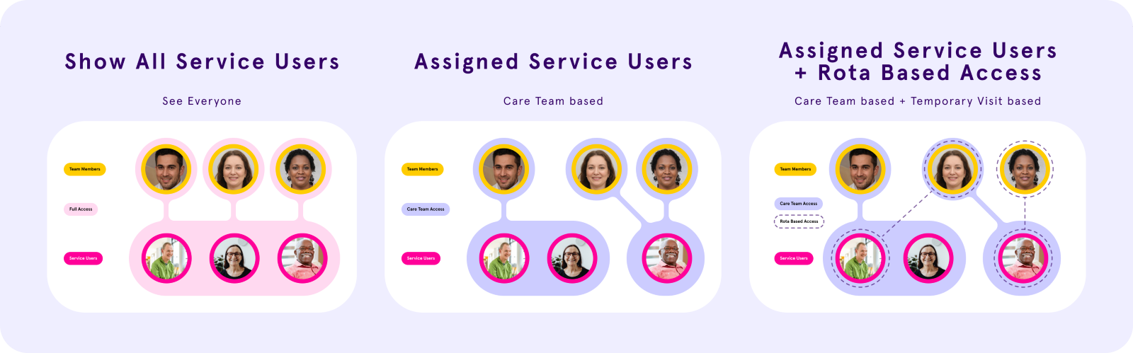
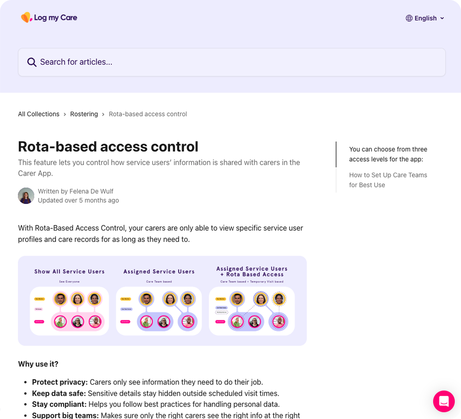
The four access states map directly to those three scenarios:
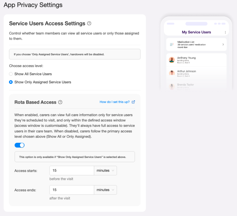
Homes without rota:
Show all service users - full access, no restrictions
Show only assigned service users - care team only, always
Homes with rota (plus a switch):
Rota-based access ON - care team always, plus agency/temporary carers get a 24 hour visit window (24hrs before start, 24hrs after end). Outside that window: limited visit info, no profile access
Rota-based access OFF - care team only, permanently. Visit assigned carers outside the team never see the care profile. Built for non-care visits: cleaners, meal delivery
The System I Designed
Four access states. Two surfaces. One coherent model.
I structured the design around two surfaces that had to work together: the Care Office settings page (where managers configure access) and the Carer App (where the access rules play out in practice).
The four access states:
Preference 1 - Full Access (homes without rota): All carers see all service users at all times. No restrictions.
Preference 2 - Care Team Only (homes without rota): Carers see only their assigned care team service users. No visit-based exceptions.
Preference 3 - Care Team + Rota-Based Access (homes with rota, switch ON): Carers see their care team service users at all times, plus any visit-assigned service users within a 24 hour access window (24hrs before visit start through 24hrs after visit end). Outside that window, visit information is visible but limited, and the SU profile is inaccessible.
Preference 4 - Care Team Only, Rota Switch OFF (homes with rota, switch OFF): Carers see only care team service users. Visit-assigned service users outside the care team are permanently restricted - useful for non-care visits like cleaning or meal delivery where access to the care profile is never appropriate.
The conditional logic between the settings controls was important to get right: the Rota Based Access switch is only available when "Show Only Assigned Service Users" is selected. If a manager selects "Show All Service Users," the rota switch is disabled. That dependency had to be visually legible without requiring an explanation.
The Copy Problem - and Why I Pushed Back
The settings page was heading toward a configuration minefield. I stopped it.
The PM's technical description of the feature was precise but written for engineers. When I saw the proposed copy translated into UI language, it was dense, jargon heavy, and structured around system logic rather than user decisions. A care manager landing on that settings page would either misconfigure it or avoid it entirely.
I pushed back. Not on the feature logic - but on the copy approach and the volume of it.
My position: a care manager shouldn't need to read three paragraphs to understand what a toggle does. The UI copy needed to describe the outcome for their staff, not the mechanism behind it. "Carers can only see service users they have a visit scheduled with, within 24 hours of that visit" is usable. A technical description of conditional access state logic is not.
I rewrote the copy throughout - settings labels, tooltip content, helper text - anchoring it in staffing outcomes rather than system states. The tooltips did the explanatory heavy lifting so the primary labels could stay clean. The support article that shipped with the feature reflects this directly: three plain-language access levels, written for care managers, not engineers.
This wasn't a small call in context. Copy in a settings page used by non-technical care managers in a regulated environment carries real risk. Getting it wrong means providers misconfigure access, which means the wrong people see sensitive data, which means safeguarding and compliance exposure. I treated the copy as a safety concern, not a polish task.
Design Iterations: Address decision
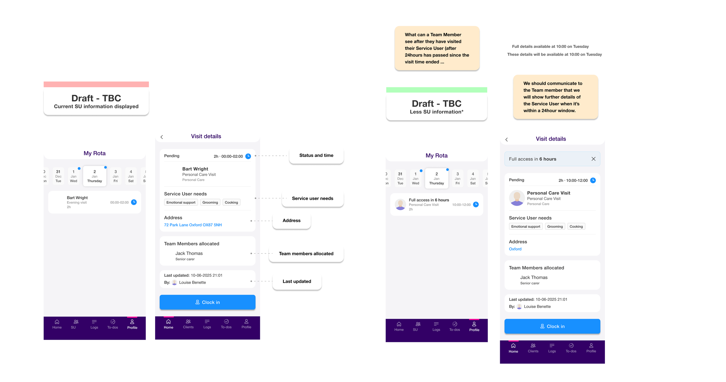
My first instinct was wrong. A discovery call corrected it.
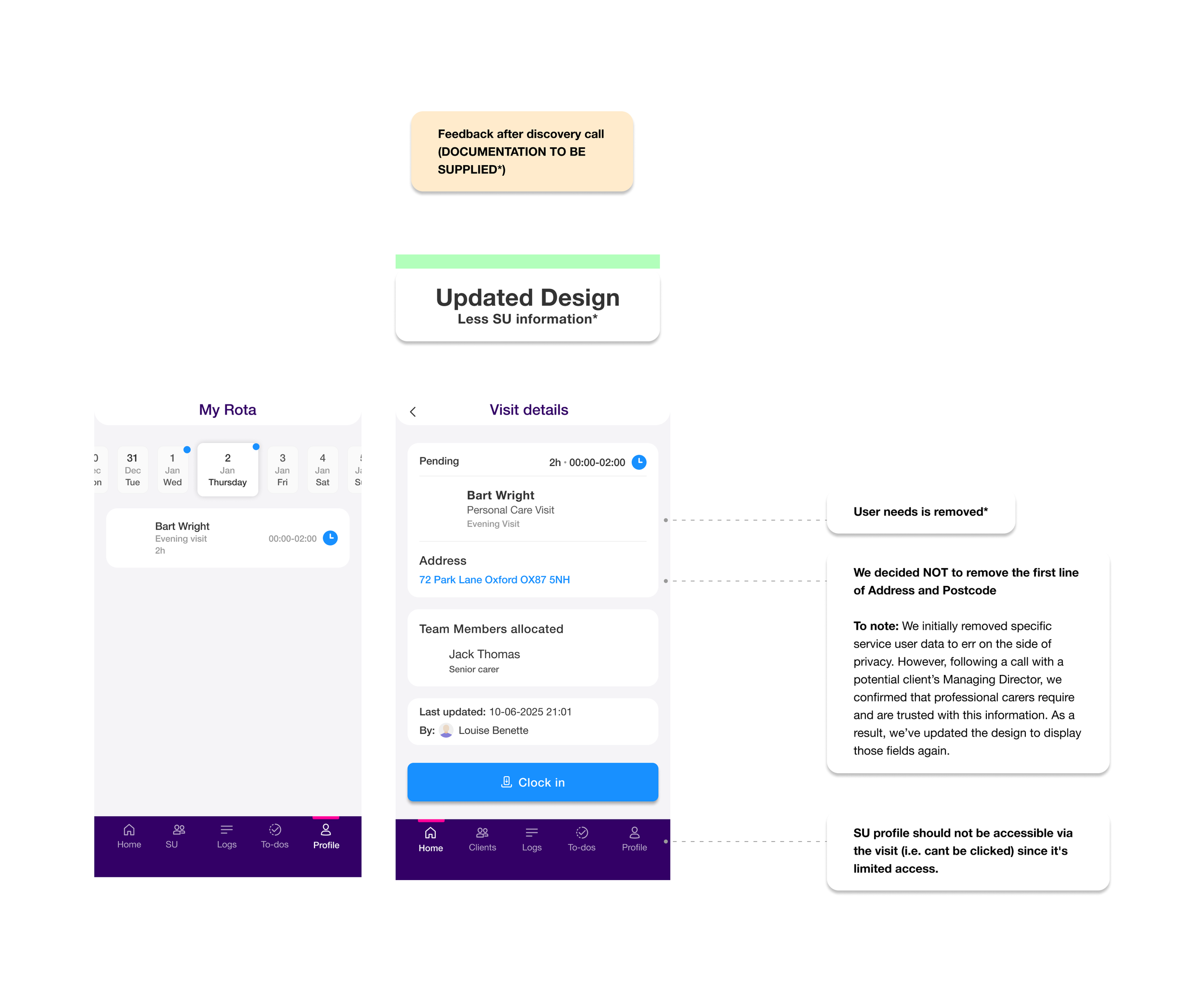
In my initial design for the limited-access visit screen (what a carer sees outside their access window), I removed address and postcode entirely. The reasoning was straightforward: if access is restricted, err on the side of privacy.
After a call with a potential client's Managing Director, that decision was challenged. Professional carers need an address to physically get to a visit. Removing it didn't protect the service user - it just broke the carer's ability to do their job.
I updated the design: address and first line of location stayed visible. What I kept removed was "Service User needs" - the care conditions and clinical needs. That's the information that's genuinely sensitive, that an agency carer or cleaner has no legitimate reason to see before or after a visit window.
That distinction matters. The first draft treated all information as equally sensitive. The updated design was more precise: operational information (where to go, when, who's allocated) stays visible. Clinical information (needs, conditions, care profile) is what gets restricted.
It's a small screen. But the decision behind it - what information is operationally necessary versus what's clinically sensitive - is the right framing for any access control design in a care context.
Discovery draft - Approved
Design Iterations: The Access Window - From Fixed to Configurable
My initial design set the rota-based access window at a fixed 24 hours before and 24 hours after a visit. The reasoning was straightforward: a consistent window reduced complexity in both the UI and the underlying logic.
Feedback from providers challenged that assumption. Care settings vary significantly. A 15 minute medication visit doesn't need the same window as a complex multi hour care session. Managers wanted control over the timing, not a system defined default.
I updated the design to make the access window configurable: managers set their own "access starts" and "access ends" values in minutes or hours, relative to the visit. The fixed 24 hour assumption was replaced with fields that defaulted to a sensible starting point but gave providers the flexibility their staffing models actually required.
The UI implication was real: a toggle that previously revealed a static description now revealed two configurable fields. That added UI complexity had to be justified by genuine user need, and it was.
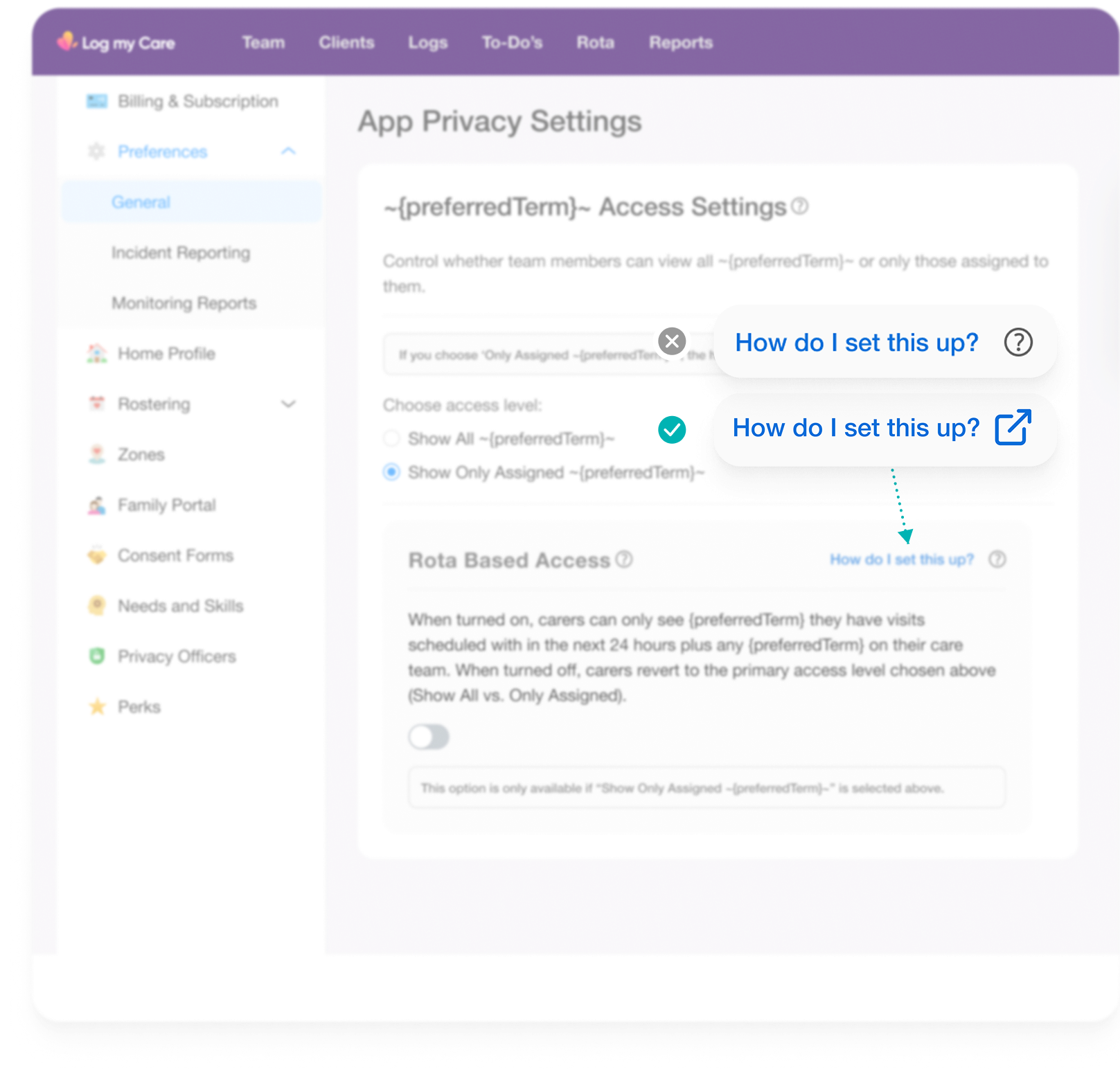
Design Iterations: Tooltip/link component fix
I also corrected an existing UI pattern on this screen. The original design used their ‘help’ / ‘tooltip’ icon to trigger a support article link, which misrepresented the interaction: tooltip icons signal contextual information, not navigation.
I replaced it with an explicit "How do I set this up?" text link (with the supporting icon), which accurately communicates that it opens an external page.
A small change, but pattern consistency matters in a settings UI where care managers are under time pressure and can't afford to misconfigure access. It's also the kind of correction that compounds across a product when a design system is in place to enforce it.
Impact and What I'd Measure Next
I left at the close of this feature's design phase. Post-release data isn't available to me, but the foundation I left was:
A four preference access control model that maps directly to real homecare staffing scenarios
Settings UI navigable by non-technical care managers without support documentation
Carer App behaviour defined consistently across all four access states and all relevant tabs
Acceptance criteria written to cover the full scenario matrix, reducing ambiguity at dev handoff
Copy rewritten throughout to describe outcomes, not mechanisms
What I'd measure next had I stayed:
Rate of settings misconfiguration (support tickets related to unexpected access behaviour)
Care manager confidence in configuring access = qualitative, via follow up interviews
Reduction in data access complaints or safeguarding incidents related to agency carer visibility
Whether the rota-based access option was adopted by the homecare segment it was designed for, and at what rate
Above Image - The shipped support article: Plain language, outcome focused, written for care managers not engineers. The copy approach I fought for made it into the product.
Reflection
Complexity at the logic layer has to be absorbed by design, not exported to users.
The four-state access model was the right solution. But technical correctness and usable design aren't the same thing. The spec was correct. The first copy pass was correct. Neither was usable.
The learning I'd carry forward: in B2B products used by non technical users making consequential configuration decisions, copy is infrastructure. It deserves the same rigour as interaction design. A misconfigured access control setting in a regulated care environment isn't an inconvenience - it's a risk.
The other thing this reinforced: reframing the problem before touching any UI isn't delay. In this case, understanding that this was a staffing model problem (not a settings problem) meant every design decision had a clear human context behind it. That's what kept a four state permission matrix from becoming a four state permission nightmare.