Designing Walmart’s very own AI Cold, Flu and Covid-19 Symptom Checker
As one of my first projects at Healthily, I designed Walmart’s own Cold, Flu, and COVID-19 Symptom Checker to support both user needs and business goals.
Walmart site visitors often felt overwhelmed, struggling to distinguish between cold, flu and COVID symptoms - leading to uncertainty, anxiety, and hesitation when purchasing OTC medicine. At the same time, Walmart’s Medicine Cabinet lacked tailored guidance, resulting in drop offs and missed e-commerce opportunities.
I led the end to end UX/UI redesign to create a faster, more intuitive symptom checker that reduced decision fatigue, clarified next steps, and guided users to the right products - ultimately increasing conversions and building user trust.
Impact & Key Results
🚀 Successfully launched within Walmart’s ‘Medicine Cabinet’, reaching thousands of American users nationwide.
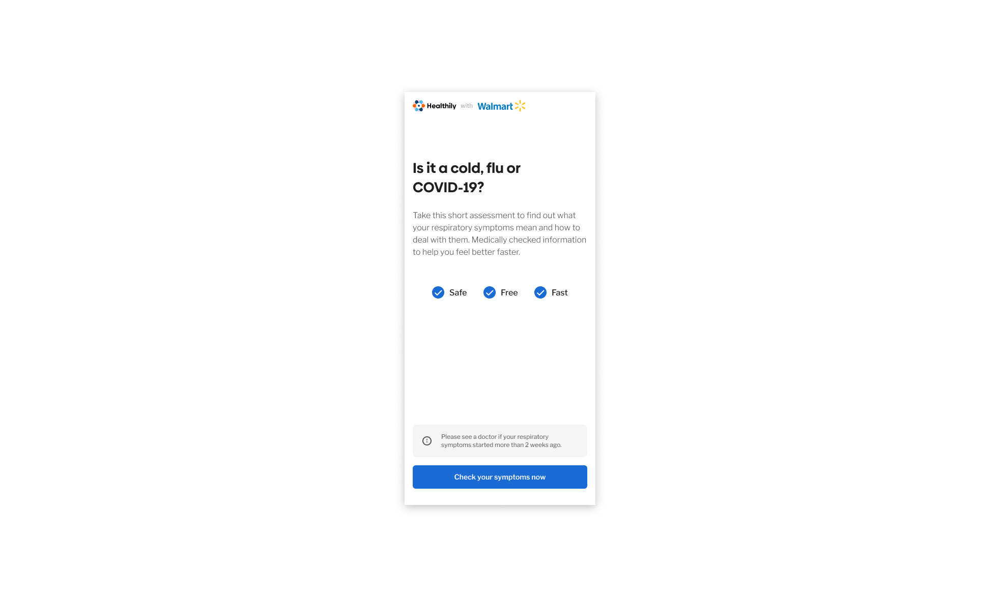
📈 Landing page conversion increased from ~10% to ~55% after A/B testing copy, hierarchy and layout.
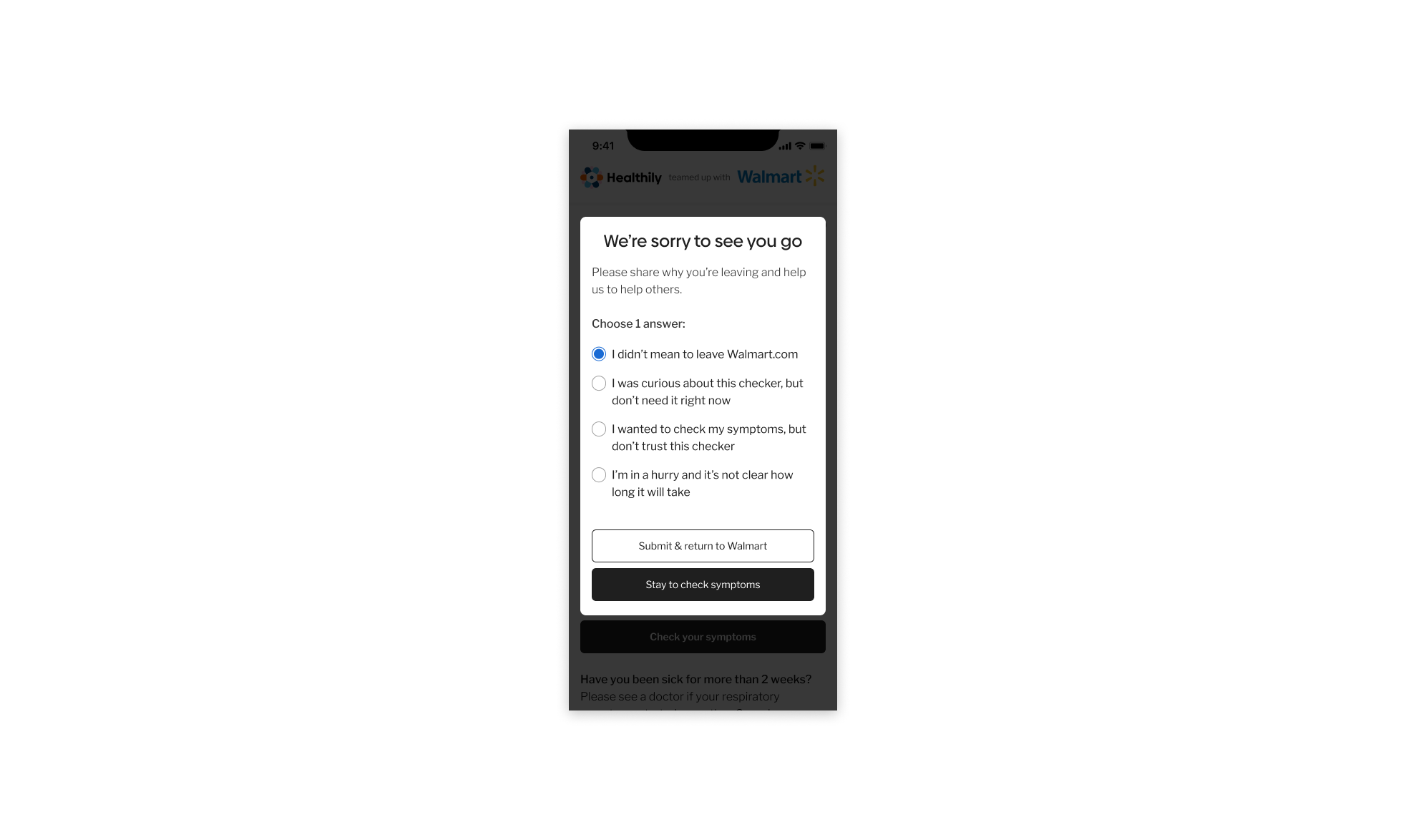
🔻 Drop offs reduced by ~45%, following changes informed by exit survey insights - including adding an upfront time estimate to set clearer expectations and increase journey completion.
🧭 33% of exiting users cited CTA confusion, which was addressed through clearer microcopy and intent messaging to reduce hesitation and misclicks.
🛒 Increased engagement with Walmart’s OTC product recommendations, contributing to basket size growth and supporting Walmart’s wider Health & Wellness strategy.
🔳 Supported in store promotion via QR codes, driving additional traffic and engagement with the checker experience.
🎯 Refined the post launch experience through ongoing A/B testing and exit-survey-led iteration.
⏳ Delivered the MVP in 3 months, aligning design, engineering, and data teams on a rapid delivery path.
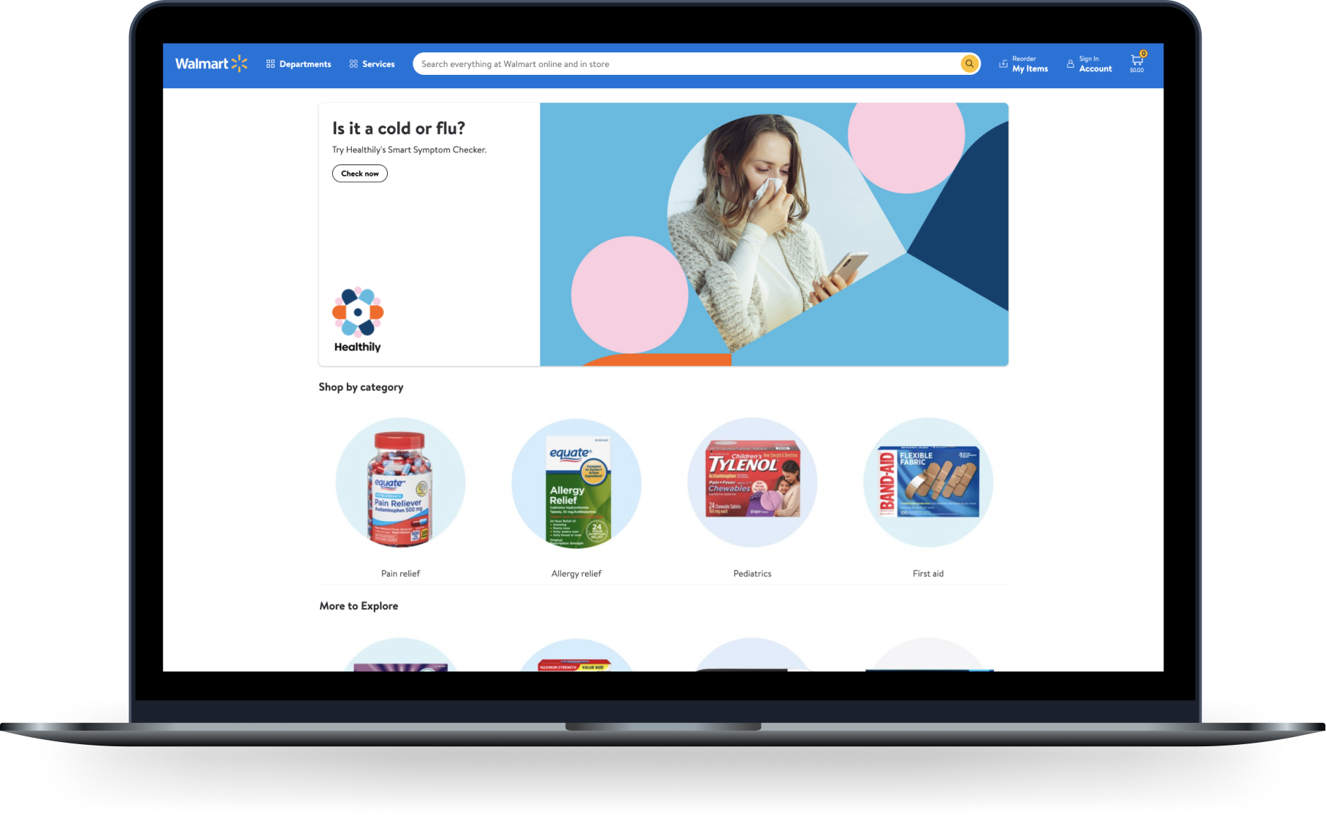
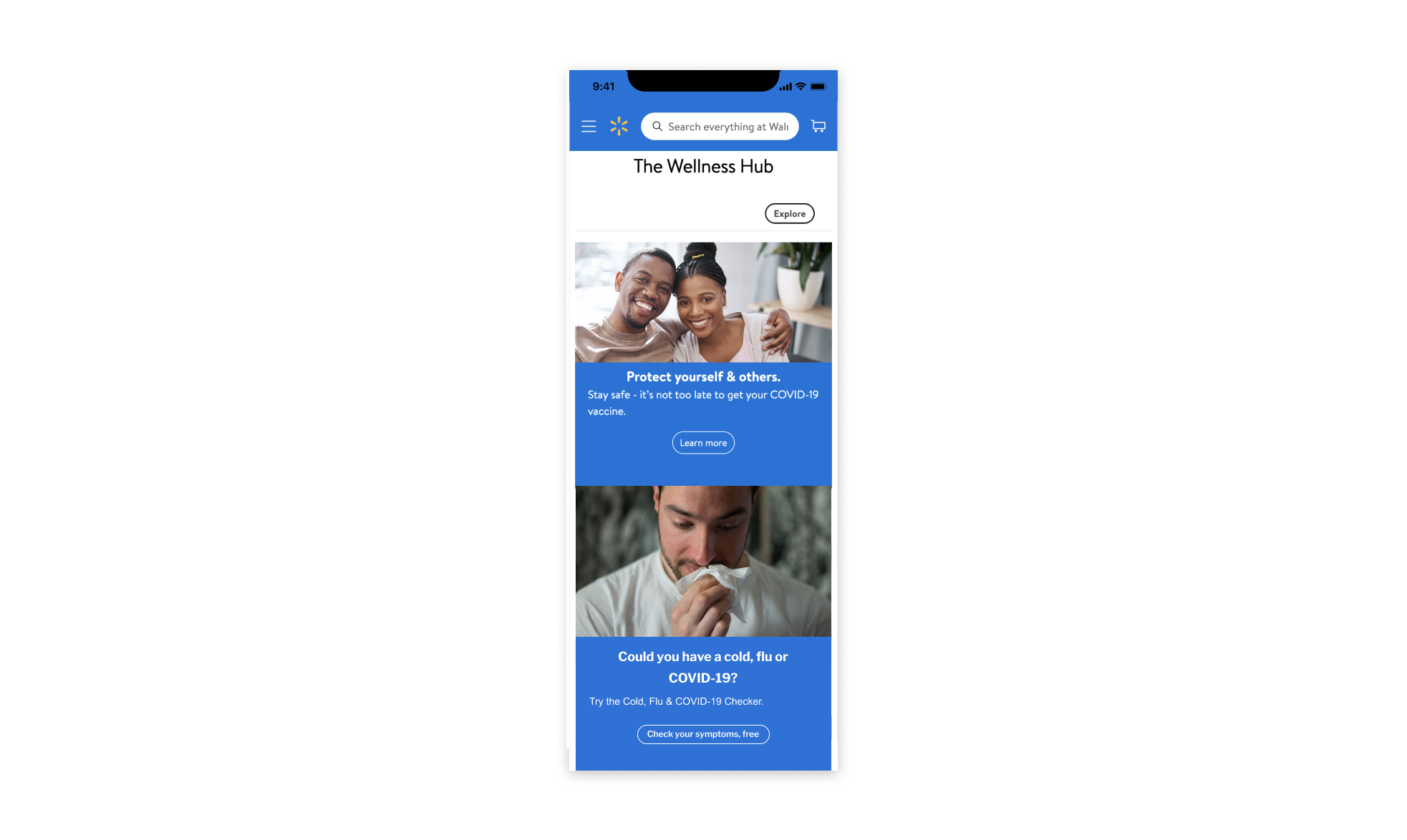
Live product on Walmarts Medicine Cabinet (US only*)
Challenge
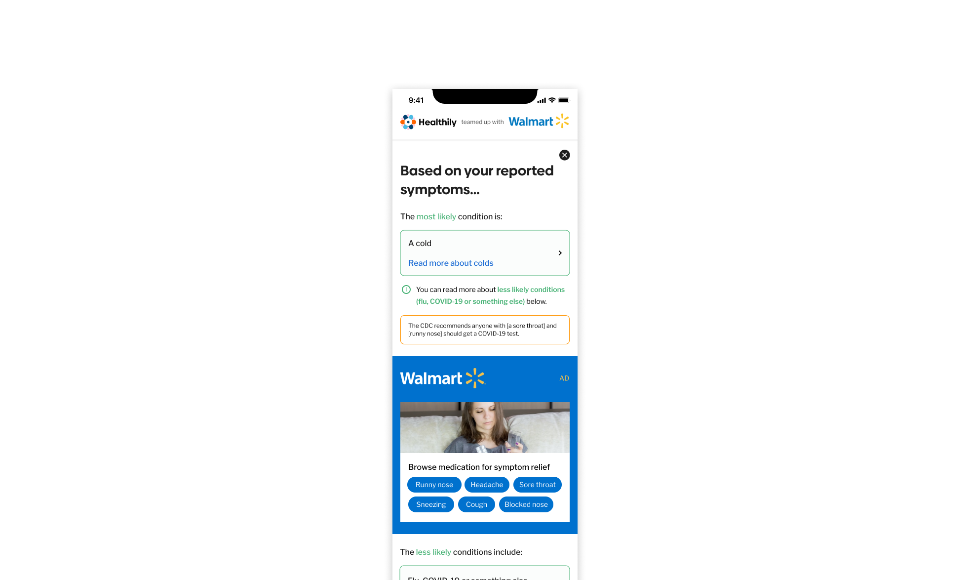
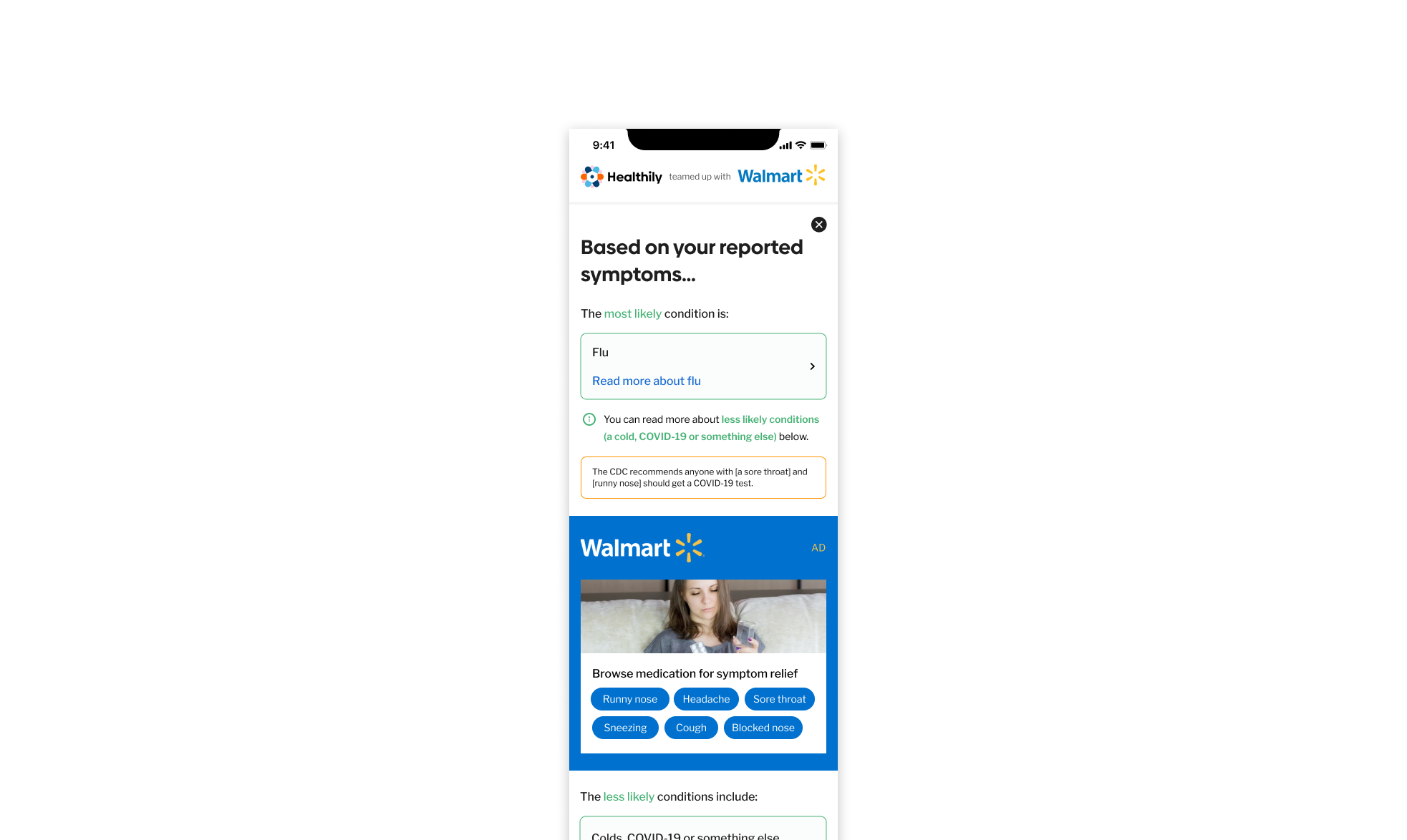
Users struggled to differentiate between cold, flu, and COVID-19, leading to uncertainty and hesitation when selecting OTC products.
For Walmart, this uncertainty meant missed opportunities to convert shoppers browsing the Medicine Cabinet into buyers… limiting the potential to increase OTC product sales and basket size.
Solution
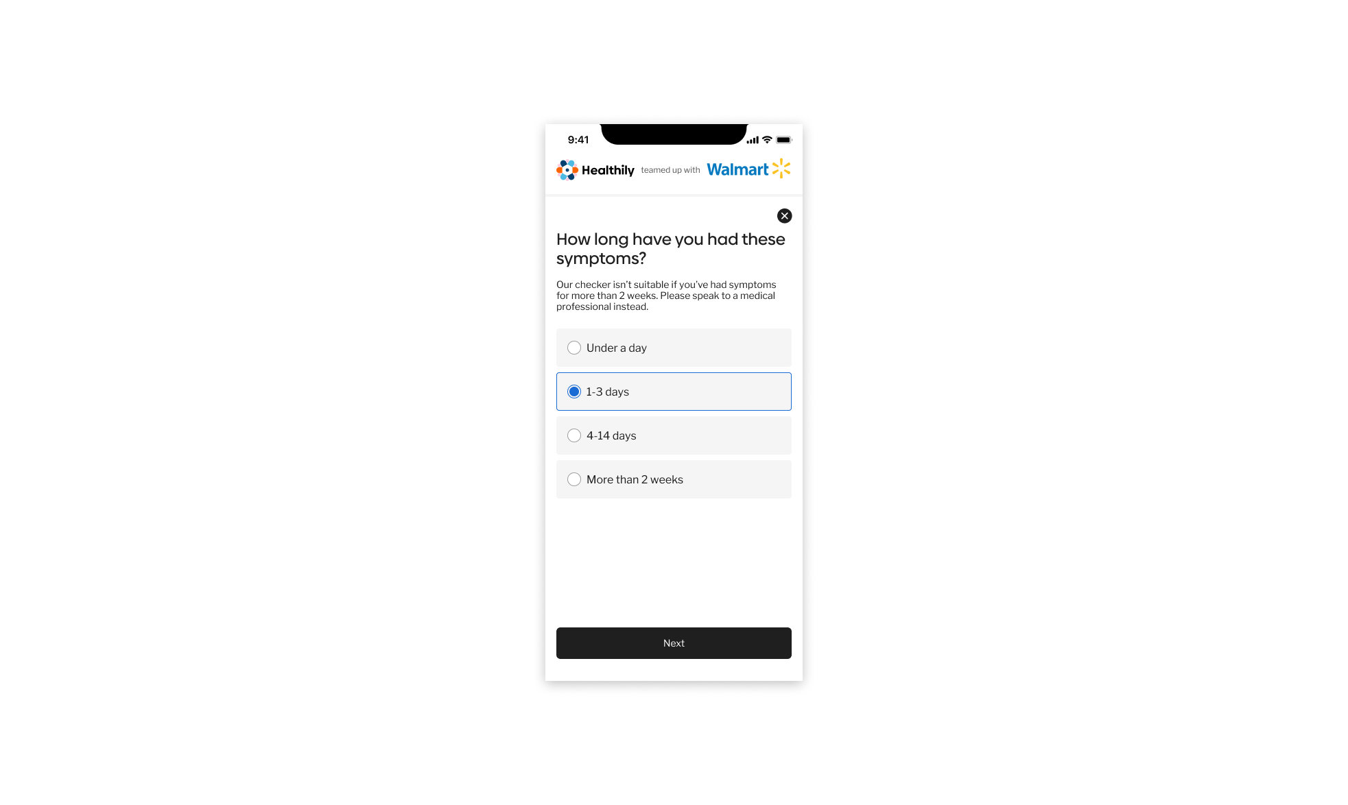
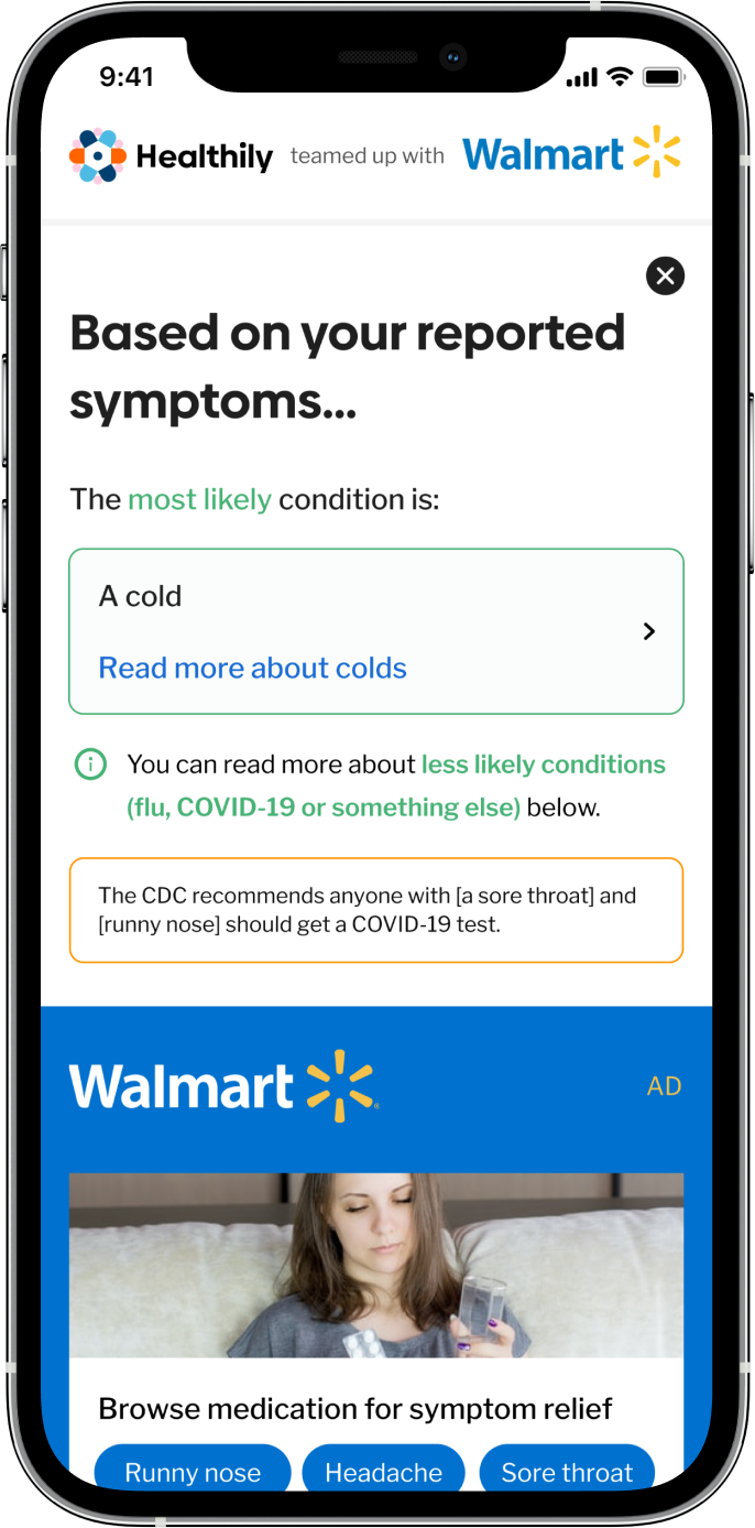
I designed a streamlined, step by step symptom checker that helped users input their symptoms and understand whether they were likely experiencing a cold, flu, or COVID-19.
This reduced friction and improved clarity, giving users confidence in what they were experiencing and which products to buy.
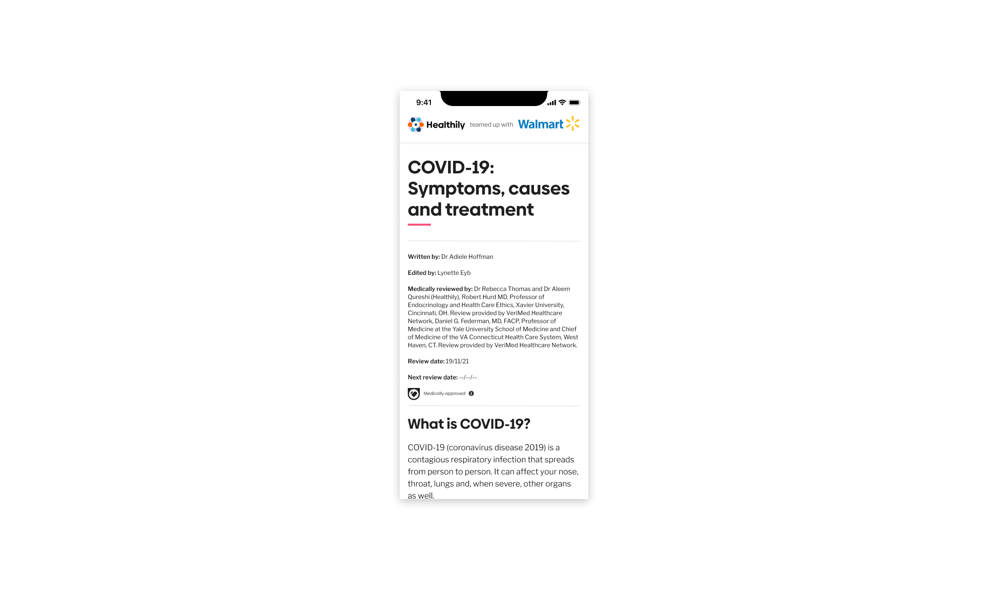
By guiding users toward medically verified recommendations and health articles and linking directly to Walmart’s health products, the experience increased shopper trust, improved conversions, and drove growth in OTC sales and basket size.
My Role: Senior Product Designer (later promoted to Senior Design Manager)
Team Composition: UX Researchers, Product Owners, Data Scientist, Medical Experts, Engineers and QA.
Timeline: September - December 2021 (~3 months)
My Responsibilities
🧠 UX strategy, information architecture and end to end flow design
Redesigned the full decision-support journey to reduce confusion and improve comprehension.
🔍 Behavioural insights analysis
Identified hesitation points and misunderstanding patterns through Usertesting.com sessions and analytics data.
📚 UX writing & medical copy refinement
Simplified clinical terminology, added contextual explanations and aligned content with safety requirements.
🧪 Prototyping & iterative testing
Built interactive prototypes and ran multiple rounds of unmoderated A/B tests to validate clarity, tone and flow improvements.
🤝 Cross functional collaboration
Worked with medical team, product managers and engineering to ensure the design was medically safe, technically feasible and matched the underlying decision engine.
📊 Data-driven optimisation
Reviewed drop off analytics with data science team and user hesitation metrics to target the highest impact steps for redesign.
🗣️ Stakeholder alignment
Improved clarity across product, content and medical teams, ensuring consistency in language and guidance across the platform.
🧩 Design system contribution
Updated UI patterns to support clearer guidance, improved step indicators and consistent cross product behaviour.
🔍
See the full case study for a deep dive into research insights, design decisions, testing, implementation details… and more!